

Intent: research
Executive summary (3 findings)
- Kiosks must survive real traffic: durability, session reset, and offline tolerance matter.
- Wayfinding and “short stories” win: museum visitors need quick paths and clear narratives.
- Accessibility is part of exhibit quality: captions, contrast, and predictable navigation are core.
Methodology
This use-case brief synthesizes museum kiosk patterns and HallOfFameWall coverage:
Key findings
- Insight: Visitors behave in short sessions.
- Evidence: Kiosk sessions are usually minutes, often shared by groups.
- Implication: Design for “grab-and-go” flows and easy reset.
- Insight: Exhibits need multiple layers.
- Evidence: Some visitors want a 30-second summary; others want depth.
- Implication: Provide short summaries with optional deep dives.
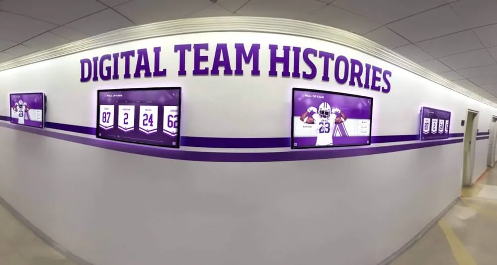
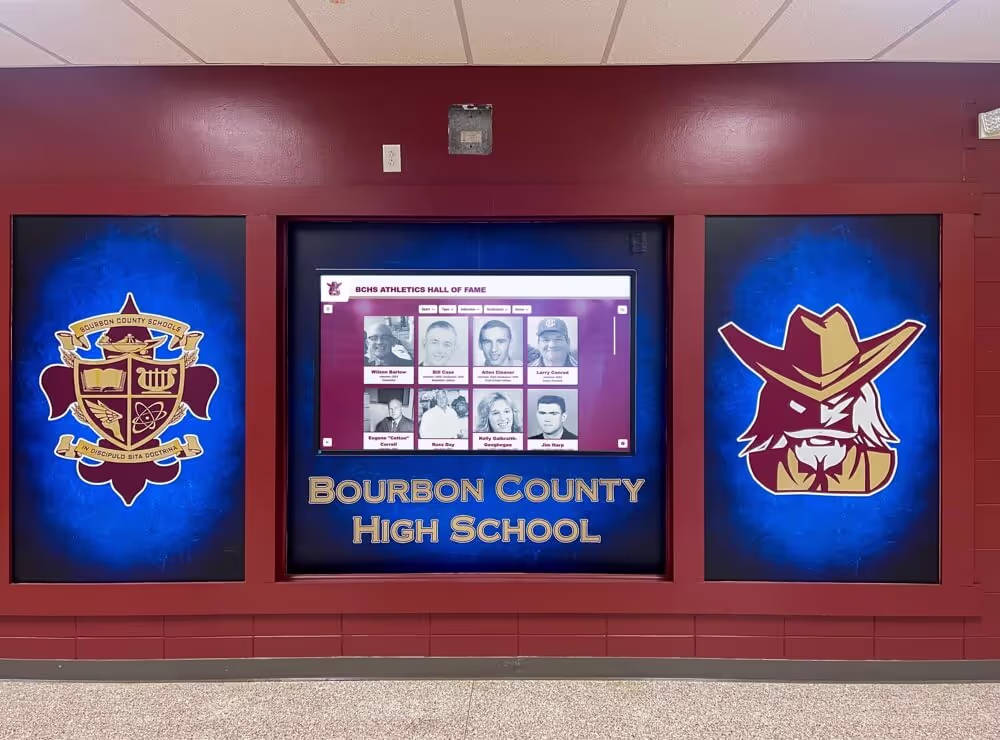
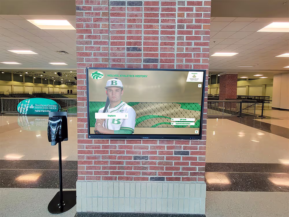
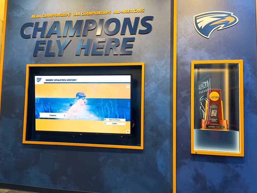
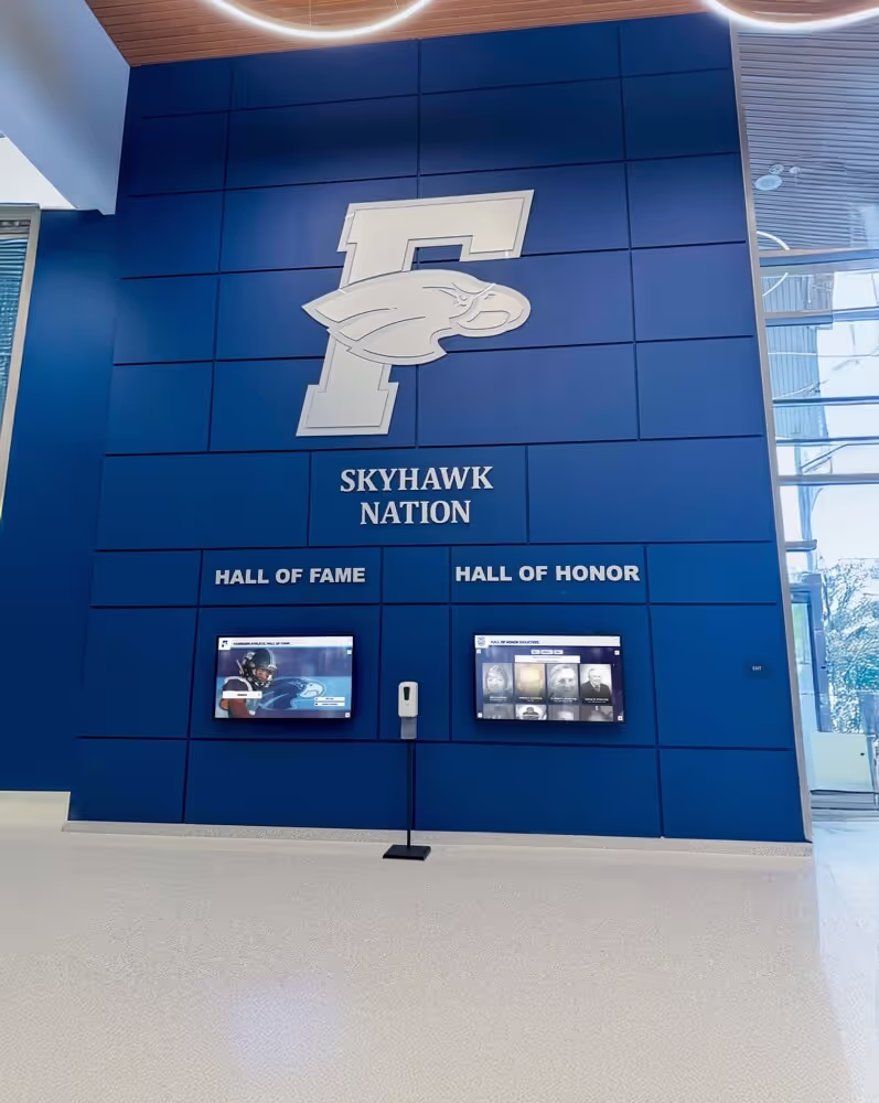
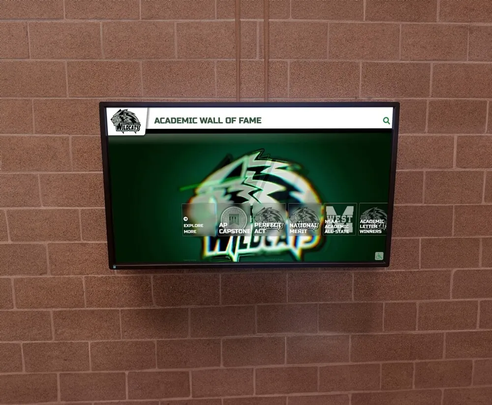
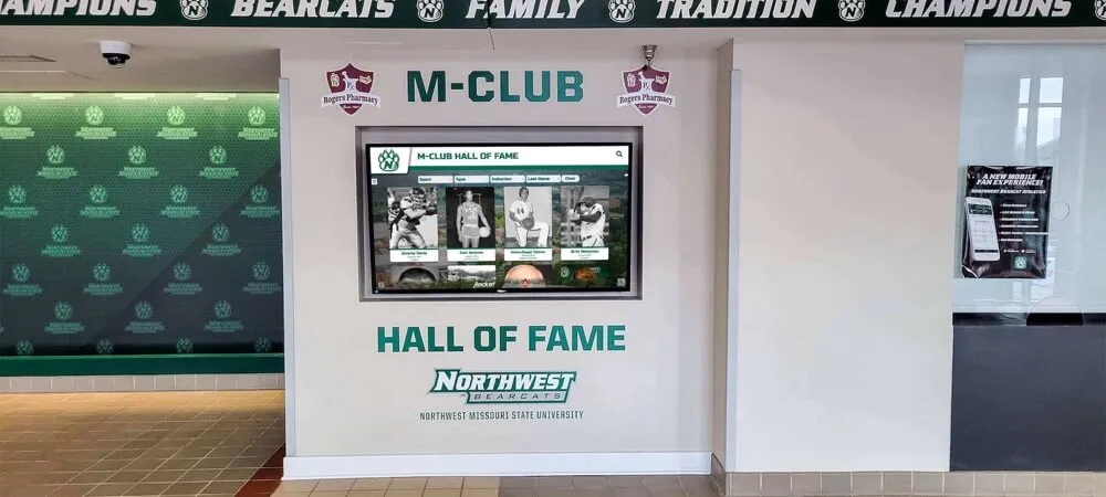
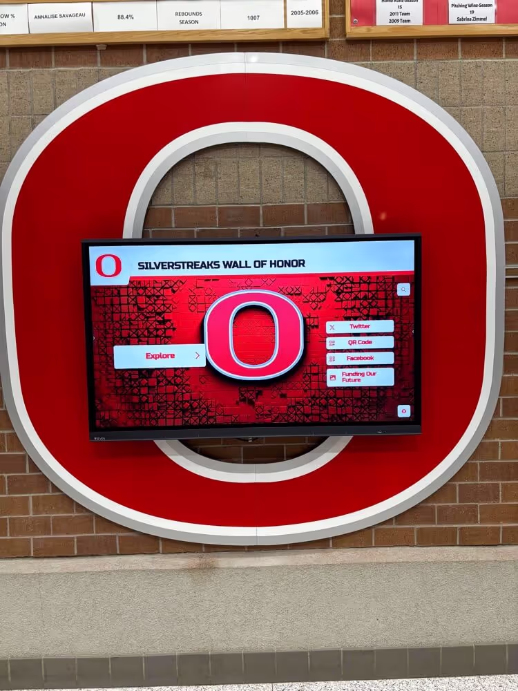
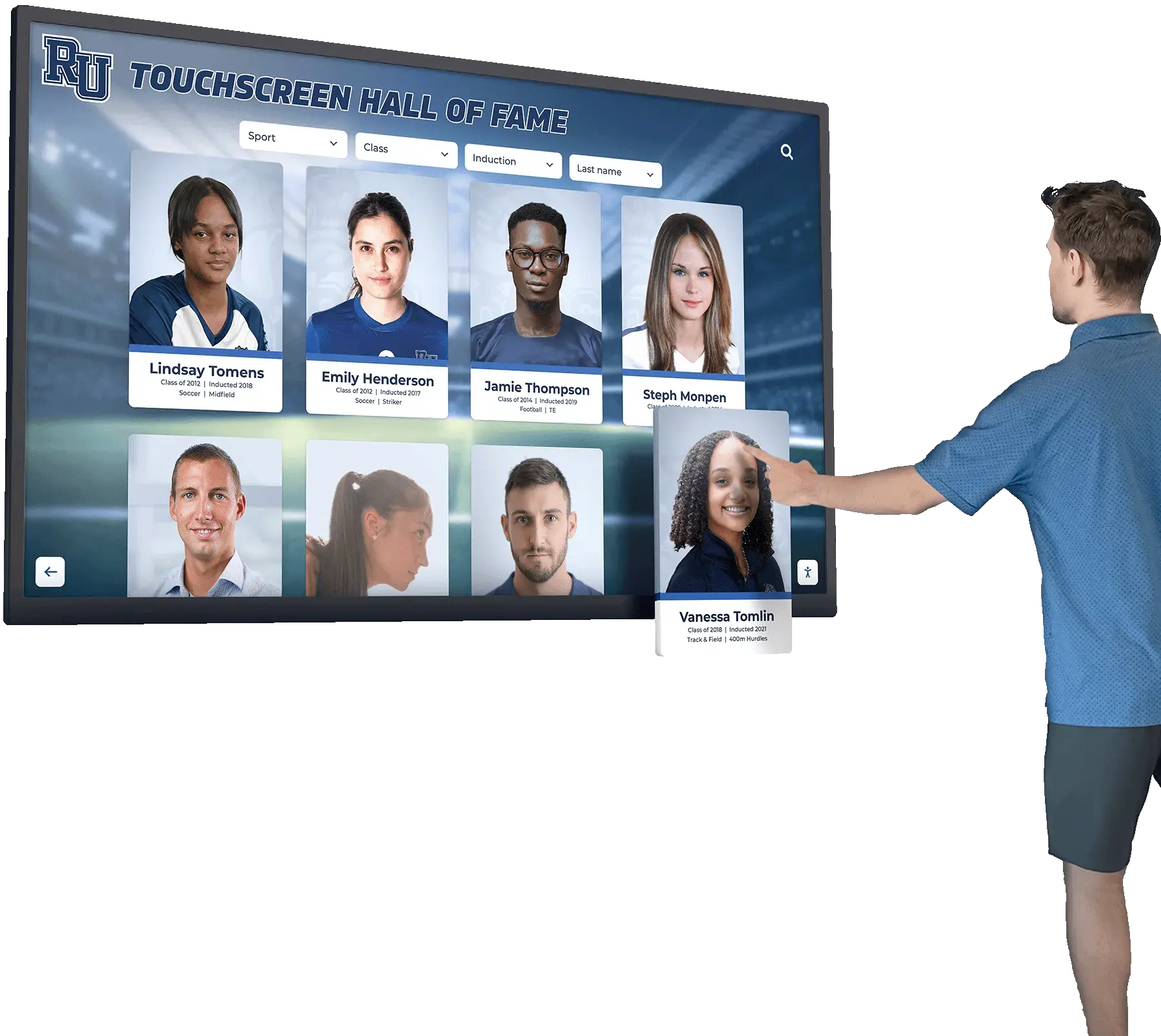
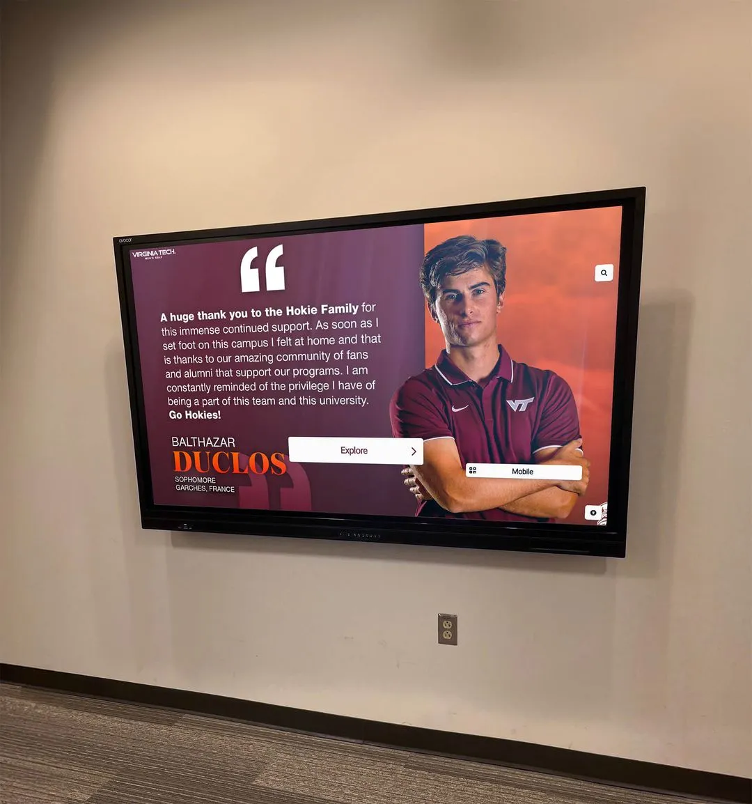
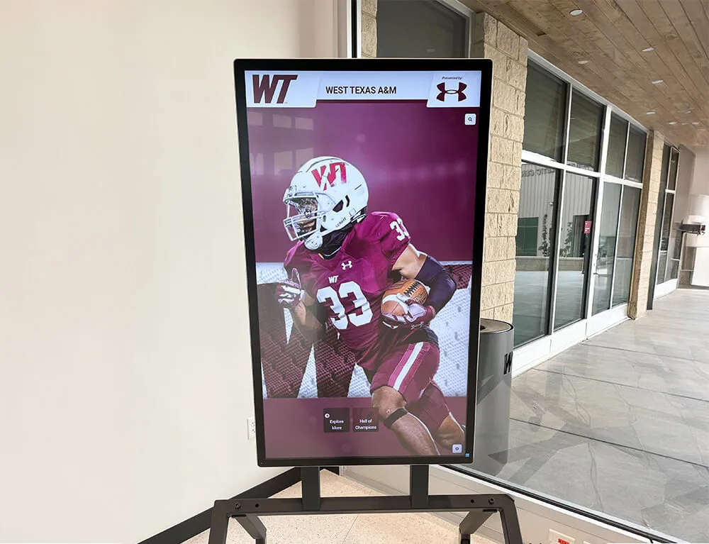
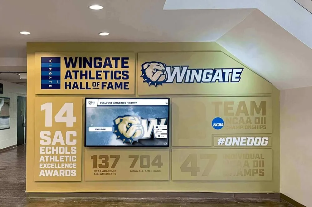
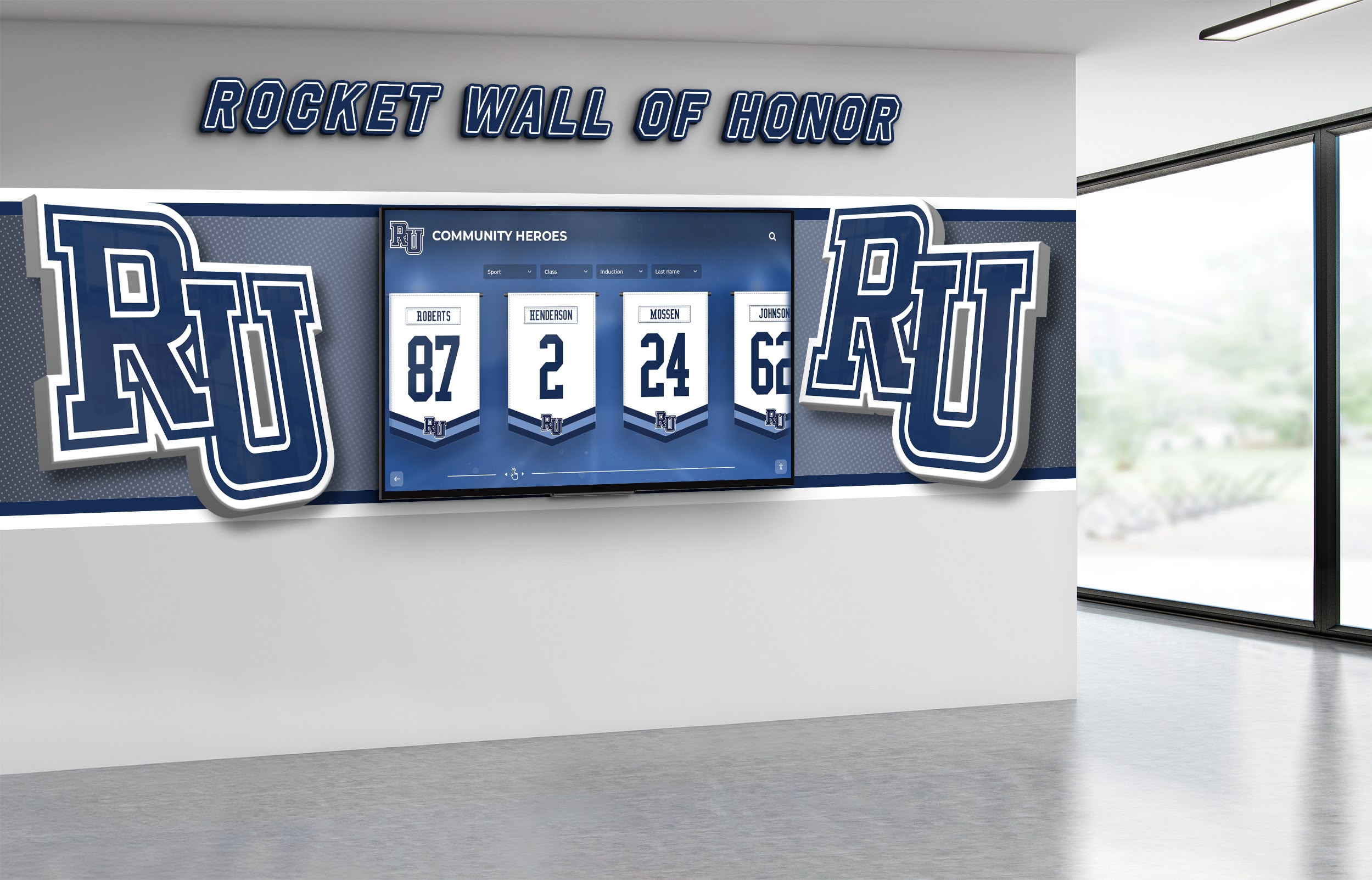
Data visualization: kiosk content layers (table)
| Layer | Time budget | Content format | UX pattern |
|---|---|---|---|
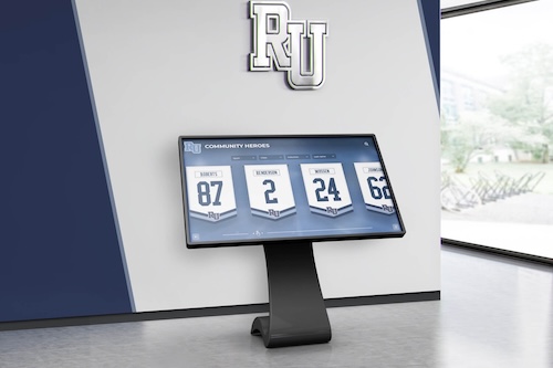
| Overview | 15–45s | 3–6 tiles | Big buttons, minimal text |
| Explore | 1–3m | galleries, maps | filters + categories |
| Deep dive | 3–10m | long-form stories | chapters + bookmarks |
Data visualization: environment constraints (table)
| Constraint | Why it matters | Requirement |
|---|---|---|
| Ambient light | Glare reduces readability | Contrast + matte placement planning |
| Audio limits | Public spaces are noisy | Captions + silent-first design |
| Throughput | Lines form quickly | Fast navigation + session reset |
| Reliability | Staff can’t babysit | Auto-recover, simple admin |
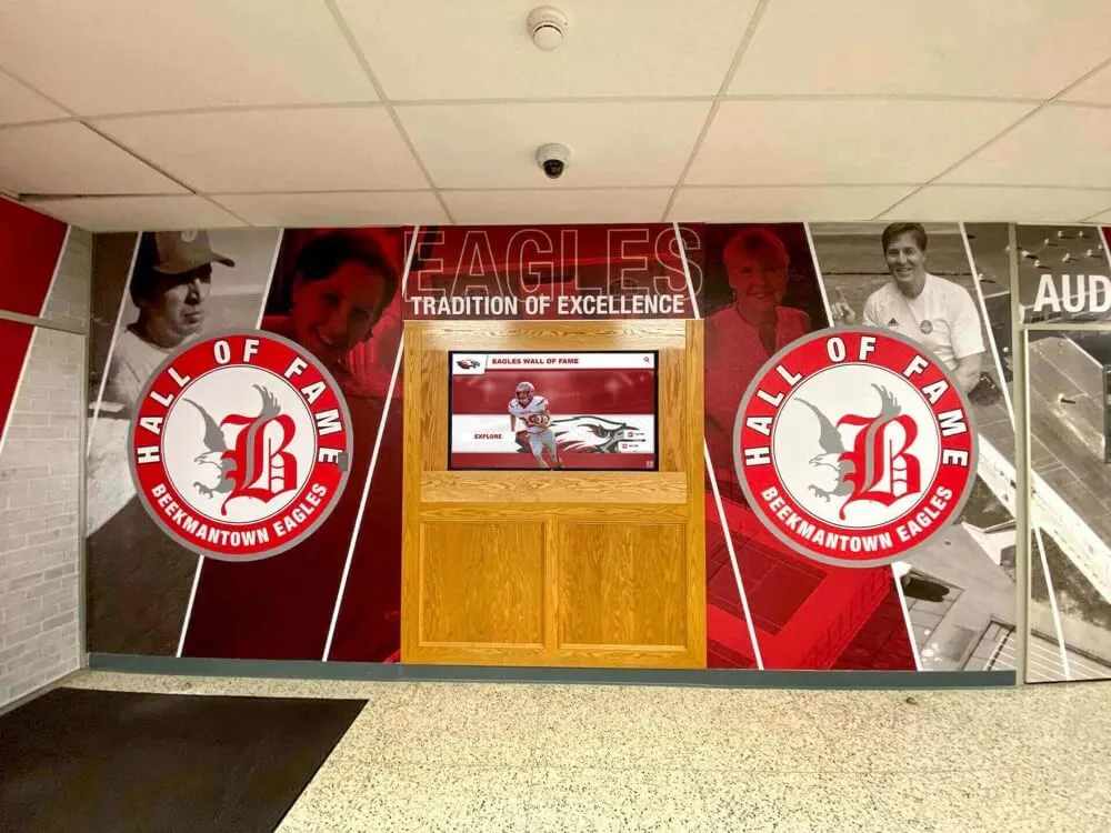
Requirements checklist
- Hardware / reliability
- Commercial-grade display, protective glass, mount security
- Auto-restart, session timeout, kiosk mode controls
- User experience
- Big touch targets, clear “home” and “back”
- Content that works without audio
- Accessibility
- Contrast, captions, predictable focus order, readable typography
- Operations
- Content governance: who updates exhibits and when
- Simple reporting so you can learn what visitors tap
What this means for museums (and visitor centers)
To make the kiosk “feel curated”:
- Define three story arcs and reuse them across exhibits.
- Use a consistent tile system so visitors learn the interface once.
- Refresh quarterly with a small batch of new items (don’t redesign the UI).
CTA
- Primary: Request a research briefing.
- Secondary: See the platform behind the data.
- Relevant Rocket PDP: Digital Hall of Fame platform overview