Yearbook spreads are the architectural blueprints of student memory — the two-page canvases where recognition becomes permanent record. A well-designed spread does more than place photos on a page. It creates visual hierarchy, tells a story, and communicates to every student who appears on it: your achievement mattered here, and it will matter to the people who open this book decades from now. For yearbook advisors, student editors, and school leaders tasked with building recognition culture, understanding what makes a spread iconic — rather than merely acceptable — is a foundational skill. This guide explores the layout concepts, design principles, and recognition frameworks that separate yearbook spreads people return to from those they flip past.
Walk into any school library and pull a yearbook from ten, twenty, or thirty years ago. Flip to a recognition spread — maybe an honor roll page, a senior superlatives section, or a hall of fame tribute. The books whose recognition spreads still command attention share a common quality: they treat recognized students not as names to be listed, but as individuals whose achievements deserve a visual environment equal to the accomplishment itself. This guide is about building that environment.
The Anatomy of a Recognition Spread
Before exploring specific layout concepts, it helps to understand the structural components every strong spread shares, regardless of theme or content type.
Visual Hierarchy: The Most Important Design Decision
Visual hierarchy is the arrangement of elements so the viewer’s eye moves through content in a deliberate sequence. On a recognition spread, hierarchy answers a single question: when someone opens this page, what do they see first, second, and third?
Strong recognition spreads typically establish hierarchy through three layers:
Dominant element: A large anchor photo, a bold graphic, or an oversized headline that commands immediate attention. This element should occupy 30–40% of the spread and set the emotional tone.
Secondary elements: Mid-size photos, pull quotes, or subheads that build context around the dominant element. These guide the eye toward the names and stories the spread is meant to celebrate.
Supporting text: Body copy, captions, and recognition lists that complete the story. These elements deserve careful attention to typography and spacing — dense, unstyled text lists undercut the visual investment made elsewhere on the page.
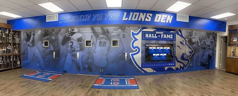
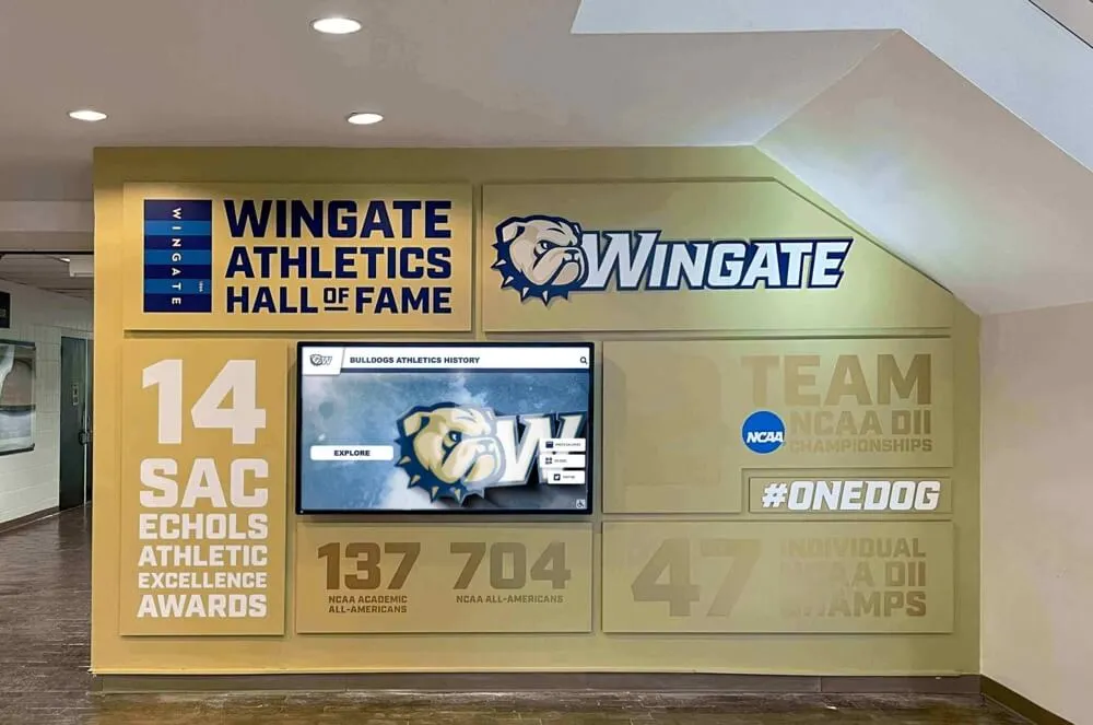
Schools that design athletic record boards, trophy cases, and hall of fame displays navigate the same hierarchy challenge. The principles behind effective gym wall art and athletic space design apply directly to the yearbook spread — make the achievement visible first, then invite deeper engagement.
White Space as an Active Design Element
Beginning yearbook designers often treat white space as wasted space. Experienced designers understand it as a deliberate tool. Adequate breathing room around recognition content signals to readers that what surrounds that space matters — that it deserves a frame rather than being crowded against competing elements.
Recognition spreads for honor societies, valedictorians, and award recipients benefit especially from intentional white space. A student whose name appears surrounded by open space reads as celebrated. The same name packed into a dense column of thirty others reads as catalogued.
Modular Grid Systems
Professional yearbook layouts use modular grids — invisible frameworks that organize the page into consistent columns, rows, and gutters. Grid-based designs look intentional even to viewers who cannot name the principle they’re responding to.
For recognition spreads specifically, grids serve an additional function: they allow designers to scale from small recognition lists to large ones without the spread falling apart visually. When a grid is set correctly, adding eight more honor roll names requires adjusting content, not redesigning the page.

Core Yearbook Spread Layout Concepts for Recognition
The following layout concepts represent proven approaches for recognition-focused spreads. Each can be adapted to different school sizes, recognition types, and production budgets.
The Portrait Grid Spread
The portrait grid is the most enduring recognition spread format. Uniform headshots, organized in rows across one or both pages, create a visual democracy: every recognized student receives equivalent space and visual weight.
When it works best: Honor roll lists, National Honor Society inductees, academic award recipients, and any recognition category where the number of honorees is large and roughly equal in status. The portrait grid signals: everyone here earned this.
Design considerations: The grid format risks feeling sterile when executed without care. Elevate it by:
- Using a consistent but high-quality photography style, with uniform backgrounds or lighting treatments that tie the page together
- Adding brief achievement captions beneath each photo rather than names alone — “3.9 GPA, Science National Honor Society, AP Scholar” communicates more than a name
- Establishing a strong headline that frames the entire grid with meaning (“The Class of 2026’s Academic Achievers” works; “Honor Roll” alone does not)
- Introducing subtle color blocking or tonal backgrounds that organize the grid into visual sections without disrupting the underlying equality of the format
Portrait grids connect directly to the logic behind student of the month bulletin boards and recognition wall displays — the same principle of visible, equitable acknowledgment applies in both contexts.
The Feature Spread with Dominant Profile
For recognition categories where one or a small number of students receive premier acknowledgment — valedictorian, salutatorian, most outstanding athlete, student body president — the feature spread creates a design environment that matches the significance of the honor.
Structure: A full bleed or near-full bleed portrait of the featured student anchors the spread. Surrounding elements — a first-person quote, a brief biography, smaller action or candid photos, and an achievement summary — radiate outward from that central image.
Design considerations: The feature spread succeeds when the photography carries genuine visual interest. A static headshot against a plain background cannot support a full spread. Commission or plan feature photography that captures the student in a context connected to their achievement: a valedictorian photographed in the school library surrounded by books, an athlete photographed at the venue where they broke their record, an arts award recipient photographed mid-performance.
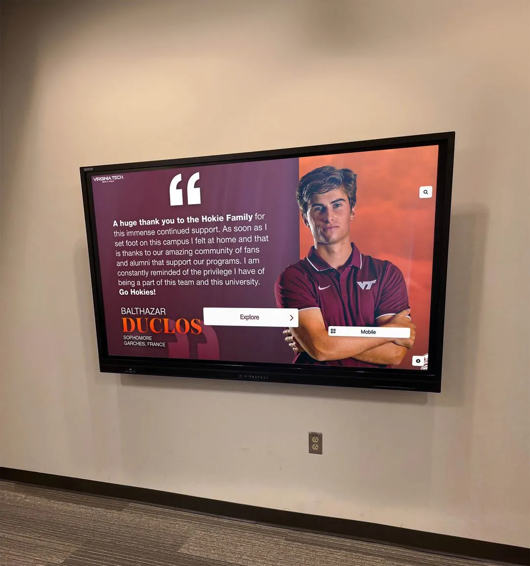
Typography choices matter significantly here. Pull quotes from the featured student set in a large, distinctive typeface add personality and give the spread a voice. A well-chosen quote from a recognized student transforms a profile from a record into a story.
The Timeline Spread
Timeline spreads work exceptionally well for four-year senior recognition, athletic achievement progressions, and program milestone celebrations. They communicate something the standard grid cannot: recognition is the result of a journey, not just a moment.
Structure: Years or milestones run horizontally across the spread, with photos, achievements, and brief annotations organized along the timeline. Visual scale can indicate significance — a championship year might receive more space than a rebuilding season; freshman year receives modest real estate compared to the senior capstone.
Design considerations: Timeline spreads require discipline to avoid clutter. The temptation to include every detail typically produces pages that overwhelm rather than celebrate. Select three to five defining moments per timeline subject and build around those, leaving deliberate white space between milestones to give the eye places to rest.
For athletic hall of fame recognition — a natural yearbook subject — timeline spreads are particularly powerful because they show a career arc rather than a single peak moment. Schools interested in how visual storytelling through career timelines translates to permanent display formats might explore resources on comprehensive donor walls and recognition installations that apply similar longitudinal storytelling principles to physical and digital environments.

The Category-Based Mosaic Spread
Mosaic spreads organize recognition across multiple categories on a single spread, using varied photo sizes, color coding, or visual dividers to distinguish achievement types. A spread recognizing both academic and athletic achievement might dedicate distinct visual zones to each, unified by a shared color palette and headline treatment.
When it works best: End-of-year recognition spreads, superlatives sections, and “best of the year” compilations that want to honor multiple achievement types without expanding the page count.
Design considerations: The mosaic format’s primary risk is visual chaos. Prevent it through:
- Consistent color coding that allows viewers to orient themselves immediately (“blue section is academic, gold section is athletic”)
- Size differentiation that signals relative importance — the category headers and anchor images should be larger than the supporting content
- Alignment discipline — even in varied layouts, elements that share an invisible alignment axis look intentional; misaligned elements look accidental
The Narrative Spread
Narrative spreads prioritize story over category organization. A central article or first-person account from a recognized student anchors the page, with photography, captions, and design supporting that narrative rather than competing with it.
When it works best: Senior class remembrances, tribute pages for long-serving coaches or teachers, in-depth profiles of extraordinary student achievements, and recognition spreads where the human story behind the accomplishment is as important as the accomplishment itself.
This format resonates deeply because it approaches recognition the way schools approach gifts for retiring teachers and end-of-career honors — with an acknowledgment that what matters is not just the record of service, but the story behind it.
Design considerations: Strong narrative spreads require strong writing. The visual design can support prose but cannot rescue it. Yearbook advisors who want to attempt narrative spreads should plan substantial editorial time for the written content alongside the layout work.
Typography choices become critical here. A readable serif or humanist sans-serif body type set at appropriate size and line length invites sustained reading. A condensed typeface squeezed to fit more content discourages it.
Theme-Driven Recognition Spread Design
Beyond layout structure, the most memorable yearbook spreads embed their recognition content within a visual and editorial theme that connects to school identity, the specific achievement being honored, or the cultural moment the year represents.
Connecting Recognition to School Identity
Spreads that integrate school colors, mascots, and institutional symbols create a visual language where recognition feels native to the school’s identity rather than imported from a generic template.
This approach is worth pursuing carefully. Schools that build strong visual identity across their yearbook spreads, athletic facilities, and recognition displays create environments where students develop genuine attachment to institutional symbols. The connection between school spirit and recognition culture is not incidental — schools that recognize well tend to have stronger spirit, and stronger spirit tends to elevate the perceived importance of recognition.
Practical applications: Use school color palettes as primary design colors. Integrate mascot imagery as decorative or framing elements rather than dominating subjects. Incorporate architectural details from recognizable school spaces as background elements in recognition photography. These touches are subtle but they add up to a spread that feels like it belongs to this school rather than any school.
Achievement-Specific Visual Language
The most thematically precise recognition spreads build visual language from the nature of the achievement itself. An academic excellence spread might borrow visual language from academic environments — books, microscopes, mathematical notation used as decorative elements, photography in classroom or laboratory settings. An athletic recognition spread builds from the sport’s visual vocabulary — field surfaces, equipment, action photography that captures the physical demands of the discipline.
This specificity serves recognition by honoring the actual work behind achievement. Students who see their accomplishments represented in a visual environment drawn from that accomplishment’s world feel more genuinely seen than students whose achievement is represented by generic “success” imagery.
For schools recognizing athletes with varsity letters and competitive records, the historical and symbolic dimensions of those awards can inform spread design. Understanding what a varsity letter represents historically and what it still means today helps designers approach athletic recognition spreads with appropriate weight and visual ambition.
Year-in-Review Recognition Themes
Some of the strongest recognition spreads anchor their design in the specific year they document. A spread from a state championship year carries different visual energy than a spread from a rebuilding year. Recognition spreads that lean into the specific character of the year they represent — the tone of national events, the aesthetic trends of the moment, the specific challenges and triumphs of that school community — age well because they are precisely dated.
This is more editorial philosophy than design technique, but it shapes decisions: which recognition stories to elevate, which photographs to feature, how to write the captions and headlines that will define how future readers understand what that year meant.
Typography in Recognition Spreads
Typography is the element most often underestimated in recognition design. A recognition spread with strong photography and weak typography will underperform a spread with moderate photography and deliberate typographic choices.
Headline Typography
Recognition spread headlines do two things: they identify the subject clearly, and they set a tone. “National Honor Society Class of 2026” is clear but tonally flat. “Scholars, Leaders, Servants: Introducing the NHS Class of 2026” is equally clear and carries emotional weight.
Typographic treatment should match that tonal ambition. A bold serif typeface set in a large point size communicates permanence and gravitas — appropriate for hall of fame inductions and highest-honor recognition. A contemporary sans-serif at generous size communicates energy and currency — appropriate for year-in-review and achievement highlight spreads.
Caption and Body Typography
Captions are the highest-leverage text on most recognition spreads because they are what readers actually read after viewing photos. Strong captions include the student’s name, the specific achievement being recognized, and one sentence of context that would be unknown to a viewer with no other information. “Emma Torres, magna cum laude, plans to study biochemistry at the University of Michigan after earning the school’s first perfect ACT score in a decade” provides meaningful recognition. “Emma Torres, senior” does not.
For students recognized for perfect test performance, understanding the significance of high ACT score achievement and what it represents in students’ academic careers helps yearbook staff write captions that honor the achievement’s actual weight.
Body typography — the running text in narrative spreads and extended feature profiles — should be set conservatively: readable point size (minimum 9pt for yearbook production, ideally 10-11pt), comfortable line spacing (1.3–1.5× point size), and column widths that allow comfortable eye travel without excessive line lengths.
Name Treatment in Recognition Lists
When recognition spreads include lists of honorees — honor roll names, award recipients, scholarship winners — name typography deserves specific attention. The default approach of a plain roman font in a standard weight produces lists that function but do not celebrate.
Consider: bold weighting the names within the list so they visually separate from any accompanying descriptors. Adding a subtle color or tonal treatment to names. Using a slightly larger point size for names than for the surrounding text. These small adjustments communicate that the names themselves are the point — that they deserve to stand out from the supporting context rather than disappearing into it.
Academic honors like Latin honors designations — summa, magna, and cum laude — appear frequently in recognition spreads and deserve typographic treatment that reflects their academic weight. Italicizing Latin honors designations (which is the conventional typographic treatment for Latin phrases) while bolding the student name creates clear visual hierarchy within each recognition entry.
Photography Direction for Recognition Spreads
No design choice improves a recognition spread more reliably than strong photography. Schools that invest in directed recognition photography — planning and staging shots specifically for spread use rather than repurposing available candids — produce categorically better recognition sections.
Planning Recognition Photography as a Separate Shoot
Standard yearbook photography captures school life as it happens. Recognition photography requires a different approach: planning shoots that place recognized students in visual environments that communicate their achievements and provide the design team with usable, composable images.
For academic recognition spreads, schedule portrait sessions in spaces associated with academic achievement — the library, a science lab, a computer lab, the AP classroom where a teacher has led dozens of students to exceptional results. Even a background that reads as academic rather than generic dramatically improves the spread’s ability to communicate what it is about.
For athletic recognition spreads, action photography at venues and in uniform provides the most design flexibility. Close-up photography that captures emotional moments — the reaction after a record-breaking performance, the quiet focus of pregame preparation — gives designers images that carry narrative weight.
Photography Quantity and Spread Planning
Experienced yearbook advisors plan photography and layout simultaneously because the two are inseparable. A feature spread requires one excellent hero image, two to three secondary images, and potentially one detail or context shot — a total of four to five strong photos. Going into layout with two mediocre photos forces designers into compromises that undermine the spread’s potential.
When planning recognition shoots, plan for more images than you expect to use. Extra options provide the design team flexibility; a shortage forces them to fill space with weaker choices.
Consistency Within Recognition Sections
When a yearbook section contains multiple recognition spreads — different awards, different class years, different categories — visual consistency across those spreads creates a coherent section that reads as intentional. This does not mean identical layouts; it means shared design vocabulary: consistent color palettes, typeface families, photo treatment styles, and headline approaches that make the section cohesive rather than episodic.
Recognition Spread Ideas by Category
The following spread concepts target specific recognition contexts common across school yearbook programs.
Academic Excellence Spreads
Honor Roll Spreads: Portrait grid format, alphabetical organization by class year, achievement metadata beneath each portrait. Strong headline treatments and a brief introductory paragraph elevate the standard format. Consider a secondary graphic element — a banner or sidebar — that lists the criteria for recognition so readers understand what earning this distinction requires.
Scholarship Recognition Spreads: Scholarship recognition deserves deliberate design because it acknowledges achievements that directly shape students’ futures. Feature format for major scholarships, supported by a portrait grid for the full scholarship recipient cohort. Including the scholarship name, award amount (where schools share this), and intended institution creates recognition that communicates the scope of what students earned.
For schools recognizing students heading to college after major athletic and academic achievements, resources on national college signing day recognition can inform the design and editorial approach for these high-visibility spreads.
Graduation Honors Spreads: Students earning honors graduation recognition through stoles, cords, and academic distinctions represent a significant segment of recognition spread content. Photography of students in full regalia, with honors designations visible, provides compelling visual material for these spreads.
Athletic Recognition Spreads
All-State and All-Conference Spreads: Athletes receiving all-state or all-conference recognition represent the intersection of individual excellence and competitive achievement — the exact content that warrants feature spread treatment. Action photography dominates; stat lines and recognition citations provide supporting context.
Record-Breaking Achievement Spreads: When students set school, regional, or state records, the yearbook has an obligation to capture those moments with proportional design investment. A well-executed record-breaking spread becomes one of the most referenced pages in the book across decades. Include the record itself as a graphic element — large typography that puts the number front and center — alongside photography and historical context.
Athletic Hall of Fame Induction Spreads: Some schools use the yearbook to formally document hall of fame class inductions each year. This content benefits from the timeline spread format, showing career arc alongside the induction recognition itself. Schools building comprehensive athletic recognition culture can find models in how established athletic recognition programs like the Naismith Hall of Fame approach donor and legacy recognition.
For hockey programs specifically, championship documentation benefits from detailed visual treatment of the specific hardware involved. Understanding how programs display and honor championship trophies and tournament hardware informs how yearbook spreads should approach these same symbols of achievement.
Faculty and Staff Recognition Spreads
Recognition spreads for faculty and staff — retiring educators, teachers of the year, long-service honorees — require different design approaches than student recognition spreads. The emotional register is often more formal, and the storytelling obligation is more substantial.
Retirement Recognition Spreads: A retiring teacher with thirty years of service represents dozens of classes of students, hundreds of individual relationships, and an institutional continuity that the yearbook has an opportunity to honor meaningfully. Feature format with extensive narrative content, multiple photography eras (early career through present), and student testimonials creates a spread worthy of the career it commemorates.
For schools planning tribute recognition beyond the yearbook itself, resources on recognition plaques and permanent acknowledgment displays can complement the yearbook documentation with physical or digital recognition displays.
Teaching Excellence and Staff Appreciation Spreads: Schools that formally recognize teaching excellence and staff contributions benefit from yearbook spreads that document these honors. The recognition spread becomes part of the institutional record of who elevated this school community in a given year.
Connecting this recognition to the broader calendar of school staff appreciation and recognition opportunities helps yearbook teams align their coverage with the recognition moments that matter most to the school community.
Community and Service Recognition Spreads
Service recognition has historically received less yearbook real estate than academic and athletic achievement, despite representing equally significant student investment and equally compelling stories.
Community Service Spreads: Students who complete significant service hours, lead community initiatives, or receive service-based recognition deserve spread coverage that captures the human impact of their work. Photography showing students in service contexts — building, tutoring, organizing, serving — provides inherently compelling visual material. Recognition of national philanthropy and service recognition programs elevates the significance of service-oriented recognition spreads.
Senior Legacy and Superlative Spreads: Superlatives sections are among the most-returned-to pages in any yearbook. They succeed when they feel earned rather than arbitrary — when the students recognized feel genuinely representative of the qualities ascribed to them, and when the photography captures something authentic about the individuals involved.
Connecting Yearbook Spreads to Permanent Recognition Culture
The most forward-thinking school communities understand yearbook spreads as one layer in a broader recognition architecture rather than an isolated annual publication. Schools that build comprehensive recognition culture create environments where student achievement is visible in multiple formats simultaneously — the yearbook spread documents the moment, while permanent displays, digital platforms, and institutional memory sustain the recognition across time.
The Yearbook as a Building Block
Yearbook recognition content is valuable far beyond its publication year. Photos, biographical information, and achievement documentation created for yearbook spreads can serve as source material for:
- Hall of fame nomination submissions years or decades later
- Alumni engagement initiatives that reconnect graduates with their school histories
- Institutional marketing that demonstrates educational outcomes and community investment
- Digital recognition displays that give physical space to achievement stories
Schools that treat yearbook production as a recognition documentation process — capturing comprehensive information and high-quality imagery with an eye toward long-term use — create archives with exponentially greater value than schools that treat the yearbook as an annual publication with a one-year lifespan.
Digital Displays and Interactive Recognition
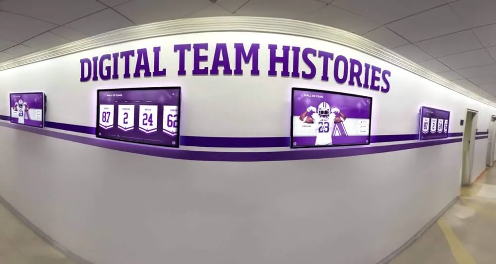
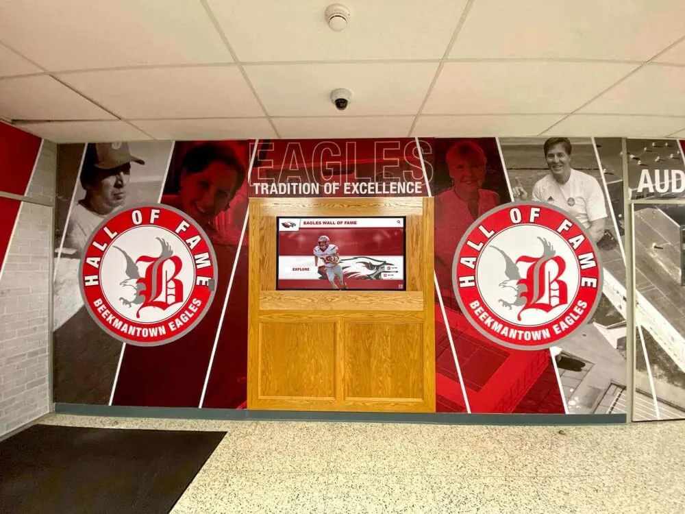
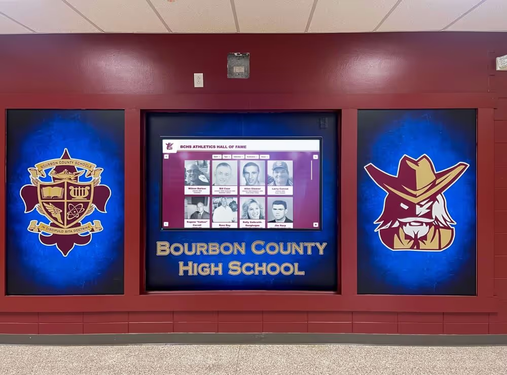
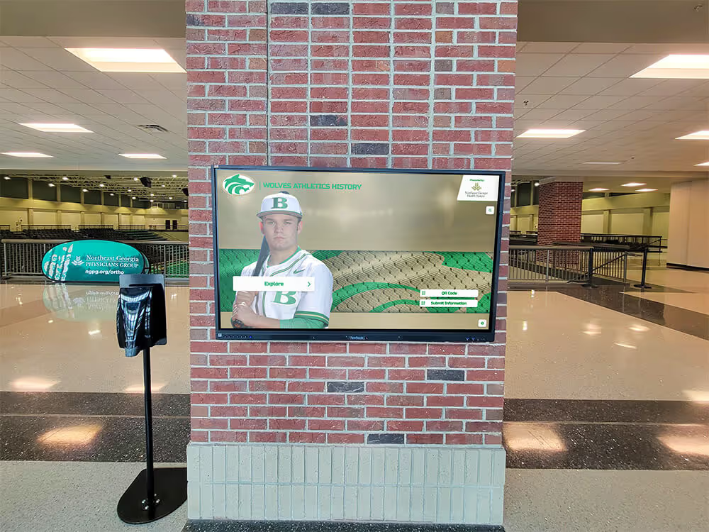
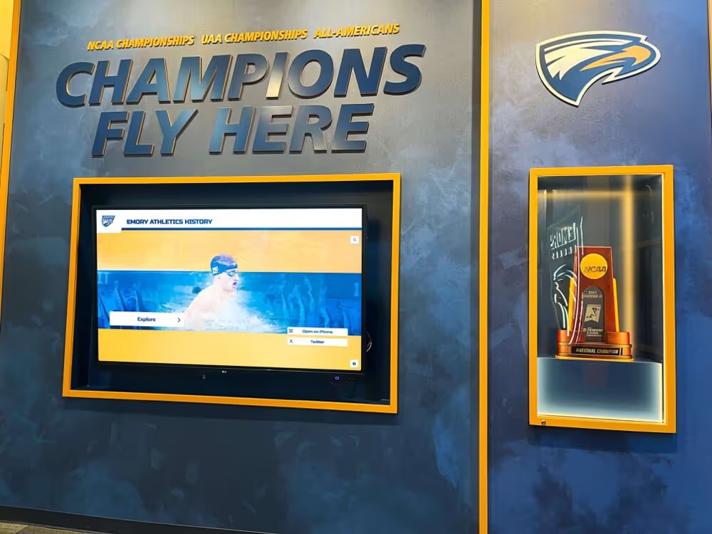
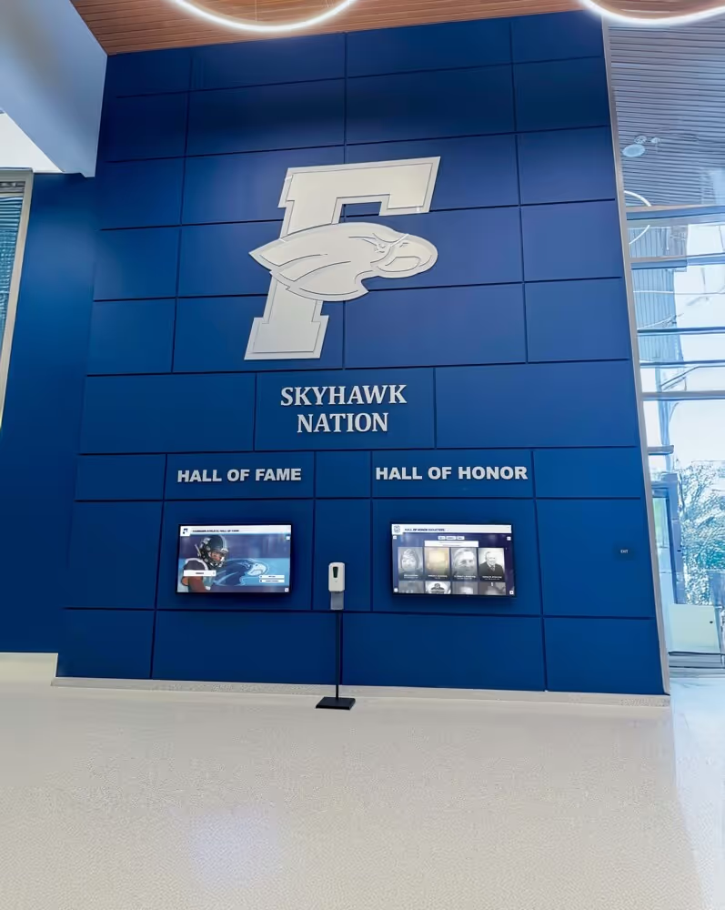
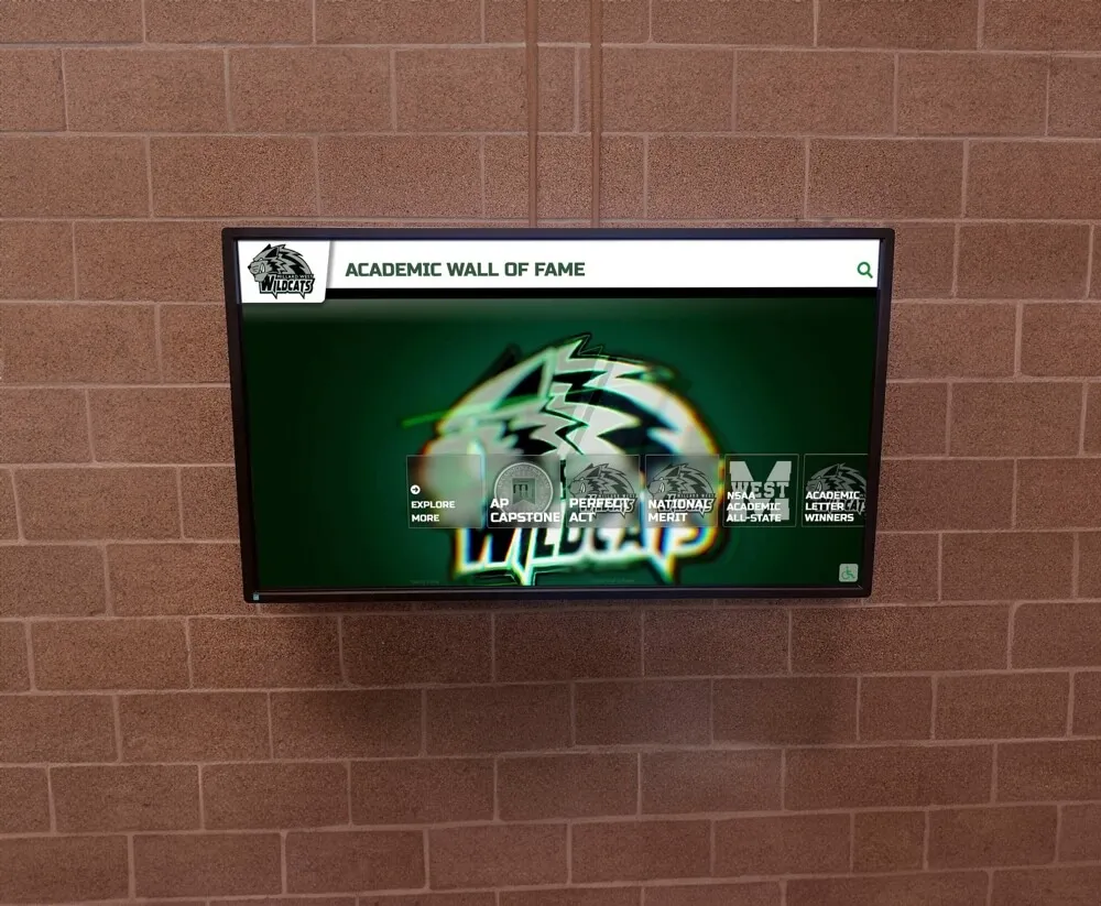
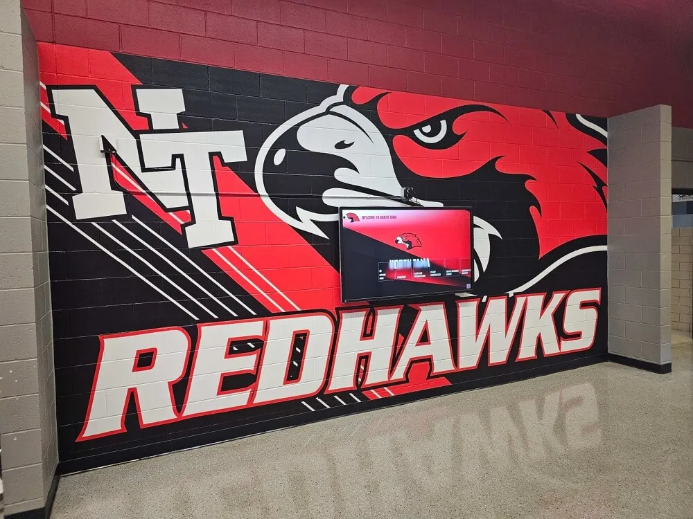
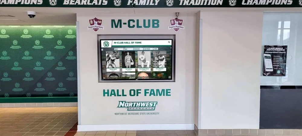
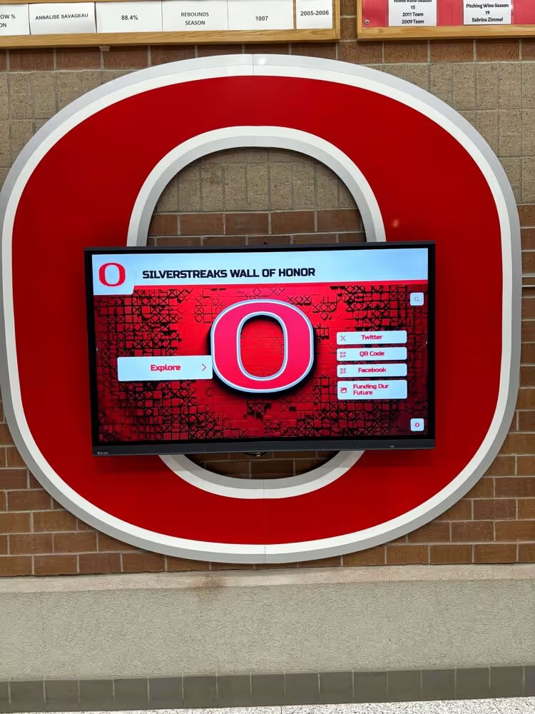
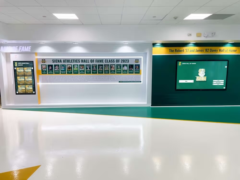
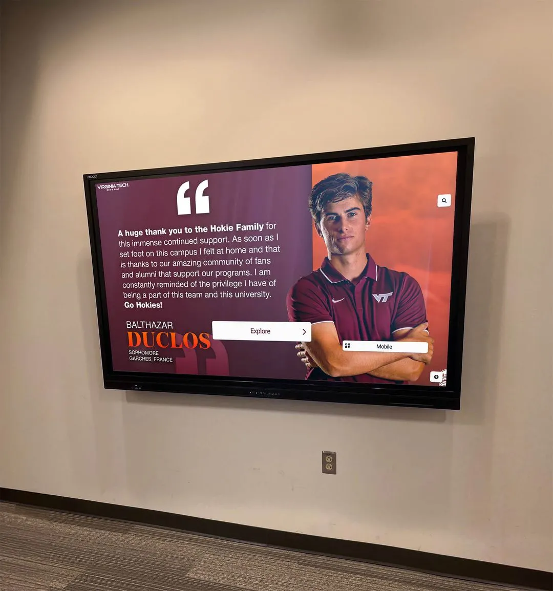
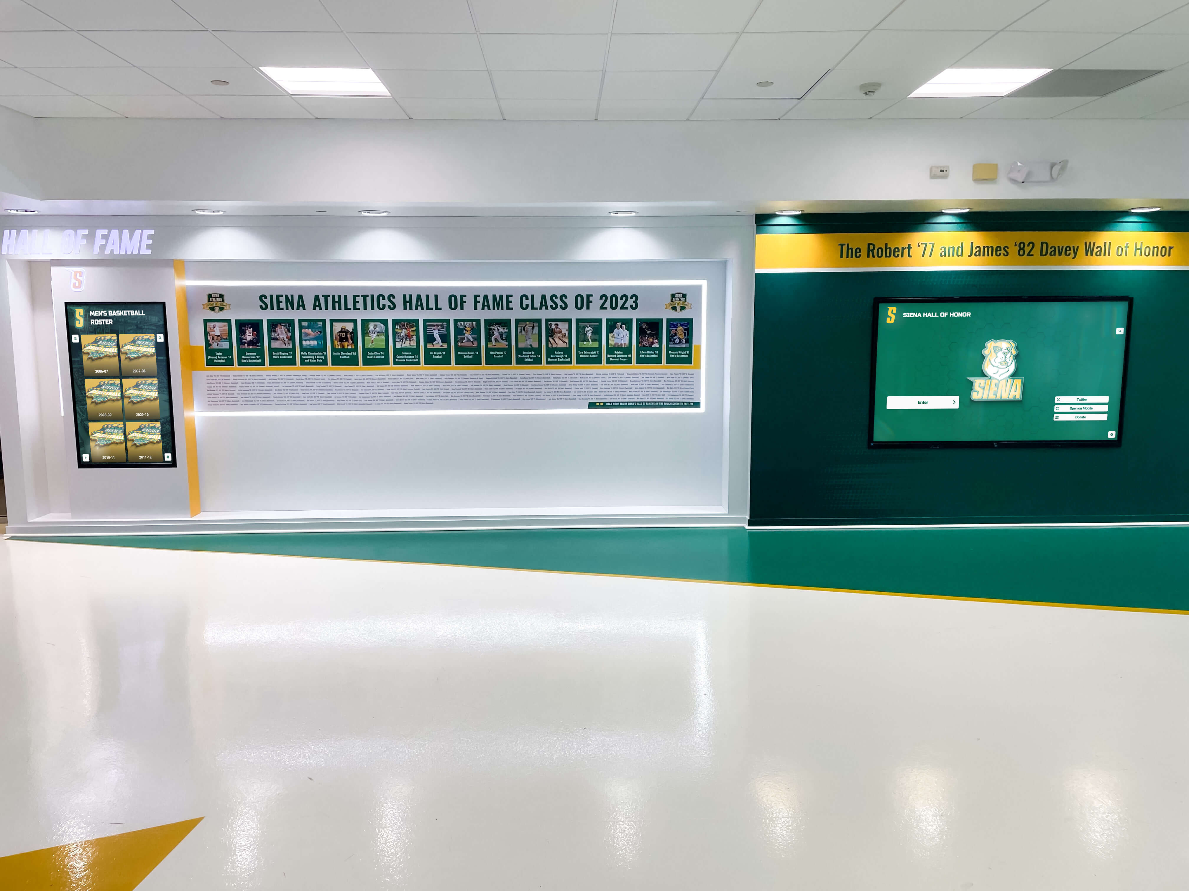
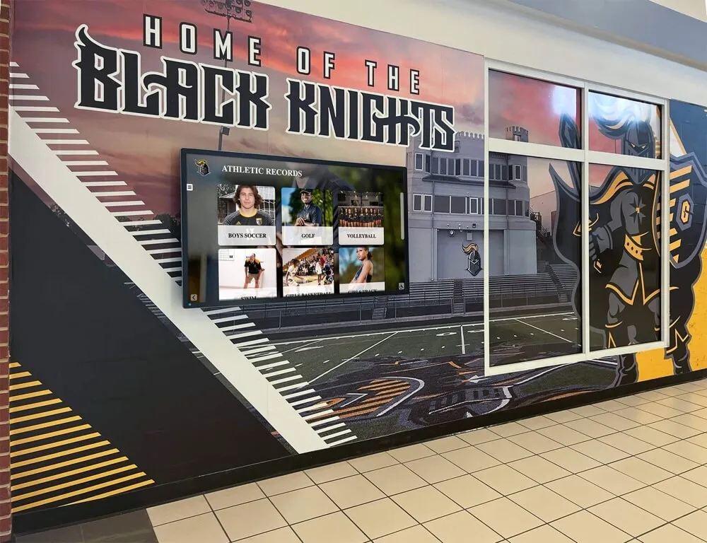
The recognition content built for yearbook spreads maps naturally onto digital display systems that schools deploy in hallways, lobbies, and athletic facilities. Digital trophy walls and interactive recognition displays can surface yearbook-era content alongside contemporary achievement, creating a visual continuum of school excellence.
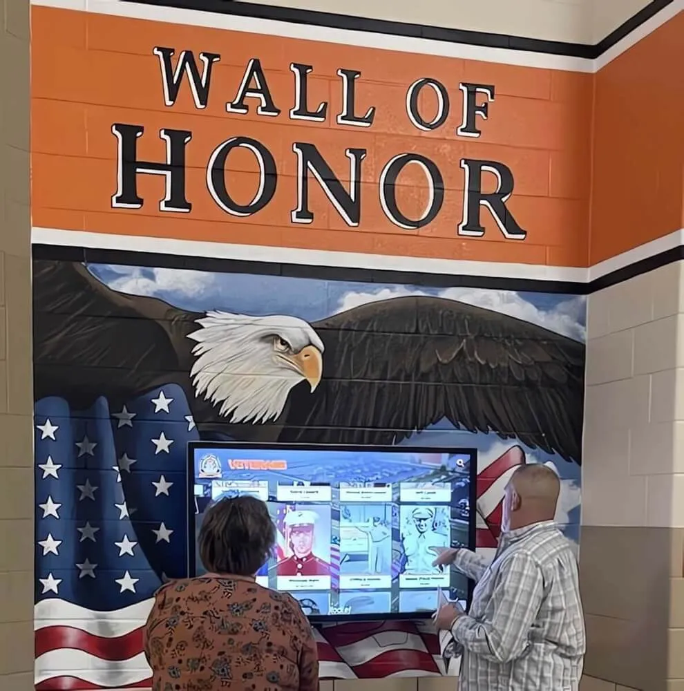
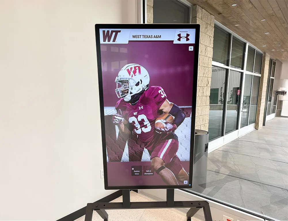
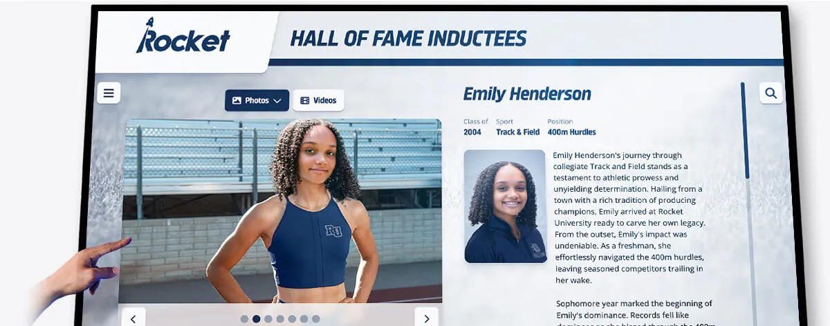
Interactive kiosk systems in school lobbies can present recognition content in the same visual language as yearbook spreads — portrait grids, feature profiles, timeline formats — while allowing visitors to navigate through years and categories in ways a printed book cannot support. Resources on interactive touchscreen kiosk implementations in school lobbies illustrate how schools bring this kind of comprehensive recognition to life in physical spaces.
For schools exploring how to create genuinely engaging physical and digital recognition environments — the kind that draw students and visitors back repeatedly — interactive exhibit design principles for educational spaces provide a useful framework.
Donor and Alumni Recognition Integration
Schools with active advancement programs recognize that yearbook spreads documenting achievement also serve as evidence of institutional quality for donors and alumni. Recognition documentation — students going to college on scholarships, athletes breaking records, graduates earning Latin honors — tells the story of what a school produces and what an investment in it supports.
Donor recognition walls and formal acknowledgment programs create permanent recognition environments that complement the annual recognition documentation yearbook spreads provide. Schools that connect these recognition channels — using yearbook content to inform donor recognition platforms, and using donor recognition standards to inform what the yearbook documents — build stronger recognition cultures than schools that treat these as separate programs.
Production and Workflow Considerations
Strong recognition spread design requires more than design skill — it requires workflow systems that ensure the right content arrives in the right format at the right time to support meaningful design.
Recognition Content Collection Systems
Build content collection processes that gather, for each recognized student:
- High-resolution portrait photography (minimum 300 DPI at intended print size)
- Accurate name spelling and graduation year (verified against school records)
- Specific achievement description (not just category, but the actual achievement: “ranked 14th nationally in FBLA” rather than “FBLA member”)
- One to two sentence personal statement or quote
- Any supplementary photography that places the student in an achievement context
Systems that collect this information consistently — whether through Google Forms, yearbook software integrations, or advisor-coordinated outreach — produce better spread content than ad hoc processes that leave design teams working with incomplete data.
Collaboration Between Advisors and Student Editors
Recognition spread design benefits from genuine collaboration between faculty advisors, who typically have stronger institutional knowledge and editorial judgment, and student editors, who bring the peer perspective that makes recognition content resonate with its primary audience.
Advisors should hold firm on design fundamentals — hierarchy, typography standards, photography quality requirements — while giving student editors significant latitude on editorial choices: which recognition stories to feature, what quotes to pull, how to frame the year’s achievement narrative. The combination of design discipline and editorial authenticity produces recognition spreads with both visual quality and genuine voice.
Software and Template Standards
Yearbook production software — Adobe InDesign, Canva for Education, Walsworth, Herff Jones platforms — all support grid-based layout work. Establishing spread templates for each recognition category at the beginning of the production year ensures consistency across staff members and production phases.
Templates should encode the grid structure, typography standards, color palette, and photo sizing guidelines for each spread type. Staff members working within established templates make faster decisions with less variance, producing more consistent results than staff members designing from scratch each time.
Evaluating and Improving Recognition Spreads Year Over Year
The strongest yearbook programs treat each year’s recognition spreads as both a completed product and a set of data points for future improvement. Post-production review of what worked, what missed, and what recognition content proved most significant sets up the following year’s team for better outcomes.
Post-Publication Review Process
After each yearbook publishes, gather feedback from the people whose recognition it captured. Which spreads did recognized students share with family members? Which pages generated the most visible reaction at yearbook distribution? What recognition content felt underrepresented relative to its actual significance in the school year?
This feedback is most valuable when collected while memories are fresh — within weeks of publication rather than months later. A brief survey to recognized students, a faculty debrief session, and a student editor retrospective create enough data to identify patterns that should inform next year’s approach.
Archiving Recognition Documentation
Schools that maintain organized archives of recognition spread content create resources with compounding value. A student recognized in the yearbook twenty years ago who becomes a significant alumnus, donor, or public figure can be honored again using original documentation. A school celebrating an anniversary can surface recognition content across decades. School recognition calendars and systematic recognition documentation provide frameworks for building these archives deliberately rather than accidentally.
Digital archiving of yearbook recognition content — organized by year, category, and individual — supports the kind of longitudinal recognition culture that turns a school’s history into an asset rather than simply a record.
Frequently Asked Questions About Yearbook Spread Design
How many photos should a recognition spread include?
The answer depends on the spread format and recognition category. Feature spreads work best with four to six strong photos, allowing design flexibility without crowding. Portrait grid spreads scale to whatever number of honorees exist, with individual photo size adjusted accordingly. As a general principle, include the number of photos the spread can display with adequate size and breathing room — compressed, thumbnail-sized photos undermine recognition rather than supporting it.
What is the minimum photo resolution for yearbook print production?
Standard yearbook print production requires 300 DPI at the intended print size. A photo printed at 3×4 inches needs to be at least 900×1200 pixels. Digital-first productions for online or tablet yearbooks can work with lower resolutions, but planning for print quality ensures images are usable across all formats.
How do you handle recognition spread design when the number of honorees varies significantly year to year?
Grid-based modular templates accommodate this well — the grid defines the underlying structure, and individual cell sizes scale to fill available space consistently. For very large honoree counts, consider splitting content across multiple spreads or using a smaller photo format (headshots only) with additional text space per entry. For very small counts, resist the temptation to artificially expand spacing; instead, use the additional space for enhanced storytelling content about each honoree.
How should yearbook spreads handle students who transfer out, have family privacy concerns, or decline recognition?
Establish consistent policies before collection begins. Most schools include only students who are currently enrolled and have not opted out of directory information sharing. Students or families who request omission should be removed from recognition lists and portrait grids before final layout — building opt-out tracking into your collection process is more reliable than managing exceptions during production. When a recognized student’s photo is unavailable, either use a consistent placeholder treatment applied uniformly or omit the photo space entirely rather than using inconsistent substitutes.
What are the most common design mistakes in recognition spreads?
The five most consistent mistakes: (1) Typography that treats all text at equal visual weight, making names indistinguishable from supporting context. (2) Photography that wasn’t planned for spread use, leaving designers with images that don’t compose well. (3) Insufficient white space, particularly around high-honor recognition that deserves visual breathing room. (4) Headlines that name the category without framing the significance (“Honor Roll” vs. “The Scholars Who Defined This Year”). (5) Inconsistent visual treatment across recognition spreads within the same section, making the section feel assembled rather than designed.
Building yearbook spreads that genuinely celebrate student recognition requires the same intentionality that schools bring to every other dimension of recognition culture: clear standards, deliberate design, and authentic commitment to making students feel that their achievements mattered and will continue to matter. The pages your team produces this year will be opened again in ten, twenty, and thirty years by people for whom this recognition was not a design project but a defining moment. Design them accordingly.
For schools building recognition culture that extends beyond the yearbook into permanent physical and digital environments, Rocket Alumni Solutions offers touchscreen hall of fame walls, digital recognition displays, and interactive alumni platforms that give yearbook-era recognition content a permanent home in school hallways, athletic facilities, and online — creating recognition infrastructure as durable as the achievements it celebrates.