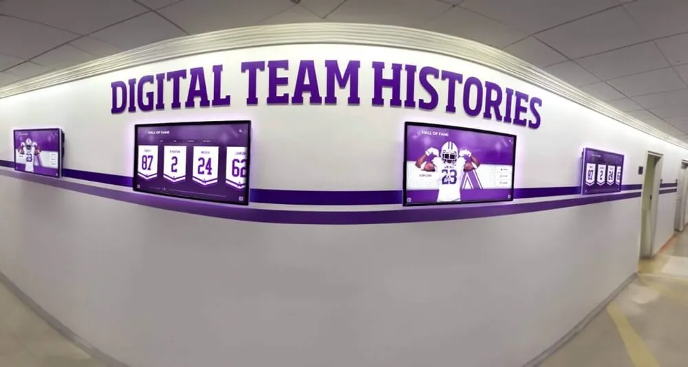
Introduction: Why UX Design Determines Digital Hall of Fame Success
After investing in premium hardware and powerful software for your digital hall of fame, nothing matters more than user experience design. A beautifully designed interface transforms passive viewers into engaged explorers, while poor UX turns expensive displays into ignored wall decorations.
This comprehensive guide examines proven UX design principles specifically for digital halls of fame and interactive recognition displays. From navigation architecture to visual hierarchy, interaction patterns to accessibility considerations, you’ll discover how to create intuitive, engaging experiences that honor achievements while delighting users.
Understanding the Unique UX Challenges of Digital Recognition Displays
Digital hall of fame displays present distinct user experience challenges that differ from typical touchscreen applications or websites.
Multi-Generational User Base
Diverse Age Groups:
- Young students (comfortable with touch interfaces)
- Middle-aged parents and faculty (varied tech comfort)
- Elderly alumni and community members (may need guidance)
- First-time vs. returning visitors (different familiarity levels)
Design Implications:
- Larger touch targets accommodating various dexterity levels
- Multiple interaction methods (touch, voice, gestures)
- Clear visual affordances showing what’s interactive
- Forgiving interfaces that prevent accidental navigation
Public Space Constraints
Unlike private devices, digital recognition displays operate in public environments with unique constraints:
- Brief interaction windows: Users may have limited time
- Social viewing: Multiple people may watch simultaneously
- Environmental factors: Ambient noise, lighting variations, foot traffic
- Privacy concerns: Personal information displayed publicly
- Vandalism resistance: Interfaces must handle abuse gracefully
Content Depth vs. Discoverability
Successful digital hall of fame implementations balance comprehensive content with easy discovery:
- Hundreds or thousands of individual profiles
- Multiple content layers per honoree
- Historical archives spanning decades
- Various media types (photos, videos, documents)
- Complex relationships between people, events, and achievements
Foundational UX Principles for Recognition Displays
These core principles guide every successful digital hall of fame interface design.
Principle 1: Zero Learning Curve
Users should immediately understand how to interact without instructions or training.
Implementation Strategies:
- Use familiar patterns from smartphones and tablets
- Provide immediate visual feedback for all interactions
- Show clear affordances (buttons look like buttons)
- Include subtle animation cues guiding next actions
- Avoid hidden features requiring discovery
Anti-Pattern Warning: Many displays fail by implementing clever but unfamiliar interaction patterns. If users need instructions, your interface has failed. Solutions like Rocket Alumni Solutions prioritize intuitive navigation that works immediately.
Principle 2: Progressive Disclosure
Present information in layers, revealing complexity gradually as users show interest.
Home Screen:
- High-level overview
- Featured honorees
- Search functionality
- Clear category navigation
- Visual appeal attracting attention
Second Level:
- Category listings
- Filtered results
- Preview cards
- Year/sport/department filters
- Related content suggestions
Deep Dive:
- Full profiles
- Biographical details
- Photo galleries
- Video content
- Achievement timelines
- Related honorees
This approach prevents overwhelming users while rewarding those seeking depth.
Principle 3: Forgiving Interaction
Public touchscreens must gracefully handle errors, accidents, and exploration.
Error Prevention:
- Confirmation dialogs for destructive actions (though rare in recognition displays)
- Undo capabilities for navigation
- Clear “back” buttons always visible
- Timeout handling returning to home screen
- Auto-save of user preferences or session state
Graceful Degradation:
- Missing photos don’t break layouts
- Failed video loads show alternatives
- Network interruptions handled transparently
- Partial content displays while loading
Principle 4: Accessibility First
Inclusive design ensures all community members can engage with recognition content.
Every interface element must work for users with:
- Visual impairments
- Motor skill challenges
- Cognitive differences
- Hearing limitations
- Language barriers
Accessible digital wall of fame design isn’t optional—it’s essential for serving diverse communities.
Information Architecture for Digital Recognition Systems
Organizing hundreds or thousands of honorees requires thoughtful information architecture supporting multiple discovery paths.
Navigation Structures That Work
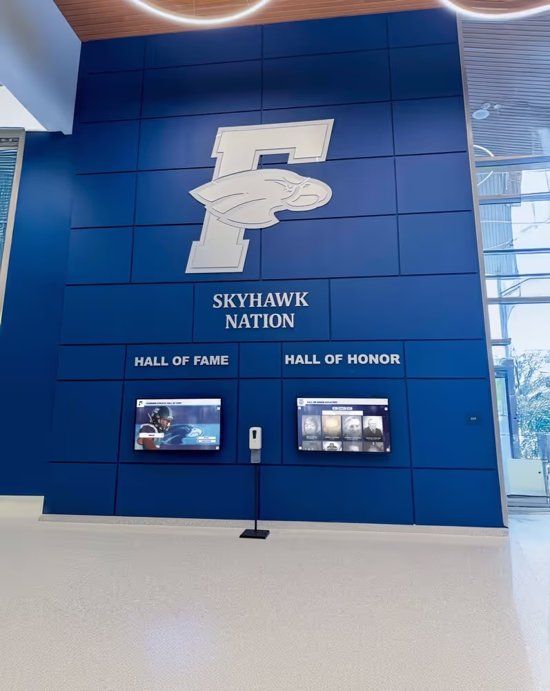
Hub-and-Spoke Model
The most successful pattern centers on a clear home screen connecting to specialized sections:
Home Screen (Hub)
├── Search (Global access to all content)
├── Browse by Year
├── Browse by Sport/Department
├── Featured Honorees
├── Recent Inductees
└── About/History
This structure provides multiple entry points while maintaining clear wayfinding.
Breadcrumb Navigation
Always show users their current location and provide easy return paths:
Home > Football > Class of 2020 > John Smith
Breadcrumbs should be large enough for easy touch and constantly visible.
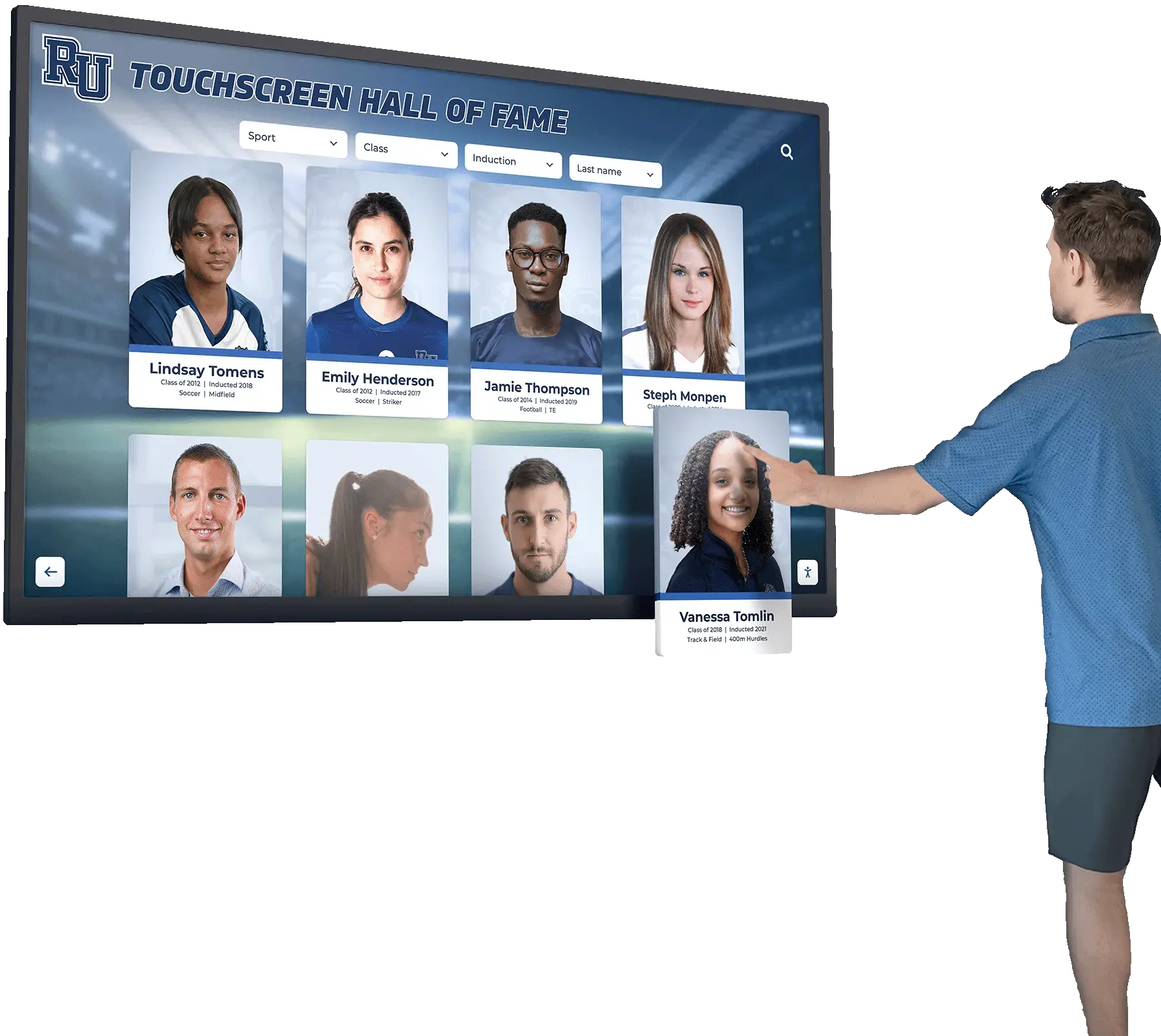
Search as Primary Navigation
For displays with extensive content, search becomes the most important navigation tool.
Effective Search Features:
- Auto-complete showing matches as users type
- Fuzzy matching handling spelling variations
- Search by name, year, sport, achievement type
- Visual results showing photos for quick recognition
- Recent searches for returning users
- Popular searches helping discovery
Search UI Best Practices:
- Search box prominently featured on home screen
- Large touch target for search activation
- On-screen keyboard optimized for names (easy capitals, hyphens)
- Clear cancel/back option
- Results grouped logically (alumni vs. teams vs. achievements)
Filtering and Faceted Navigation
Multi-dimensional filtering helps users narrow large result sets:
Filter Categories:
- Decade/year
- Sport or department
- Award type
- Gender (for athletic records)
- Induction class
Filter UI Considerations:
- Visual chips showing active filters
- Clear count of results remaining
- One-tap filter removal
- Filter combinations that make sense together
- Reset all option
Visual Design Principles for Maximum Engagement
Interface aesthetics significantly impact perceived quality and user engagement.
Visual Hierarchy
Guide attention deliberately through typographic and layout choices.
Primary Elements (Largest):
- Main headline on home screen
- Featured honoree photos
- Search box
- Primary navigation categories
Secondary Elements (Medium):
- Section headings
- Category labels
- Preview card text
- Interaction cues
Tertiary Elements (Smallest):
- Metadata (years, dates)
- Supporting text
- Secondary navigation
- Footer information
Visual Weight Beyond Size:
- Color contrast draws attention
- Motion attracts eyes
- Whitespace creates focus
- Alignment creates relationships
Color Strategy
Color choices communicate brand, create mood, and guide interaction.
Institutional Brand Colors: Use school or organization colors strategically without overwhelming:
- Primary brand color for key interactive elements
- Secondary brand color for accents
- Neutral backgrounds preventing fatigue
- High contrast ensuring readability
Semantic Color Usage:
- Interactive elements in consistent blue
- Success feedback in green
- Warnings in amber
- Destructive actions in red (rare in recognition displays)
Accessibility Considerations:
- Minimum 4.5:1 contrast ratio for text
- 3:1 contrast for interactive elements
- Never rely on color alone to convey information
- Test with color blindness simulators
Typography for Touchscreen Displays
Text must be legible from 3-6 feet away on large screens.
Font Size Guidelines:
- Headlines: 72-96pt minimum
- Body text: 36-48pt minimum
- Metadata: 24-32pt minimum
- Never smaller than 24pt for any text
Font Selection:
- Sans-serif fonts for digital clarity
- High x-height improving readability
- Medium to bold weights ensuring visibility
- Avoid condensed fonts reducing legibility
Layout and Spacing
Generous spacing prevents accidental touches and improves visual clarity.
Touch Target Sizing:
- Minimum 44px × 44px (industry standard)
- Prefer 60-80px for primary actions
- 100px+ for frequently used navigation
- Account for finger obscuring target while touching
Spacing Considerations:
- 16-24px minimum between interactive elements
- Generous padding within buttons (12-16px)
- Ample whitespace preventing crowded appearance
- Consistent spacing creating predictable rhythm
Interaction Design Patterns for Touchscreens
Physical touch interaction requires different patterns than mouse-based interfaces.
Core Gestures to Support
Essential Gestures:
- Tap: Primary action, selection
- Swipe: Navigate between items, dismiss
- Scroll: Vertical content browsing
- Pinch/Zoom: Photo enlargement (optional)
Avoid Complex Gestures:
- Multi-finger taps (hard to discover)
- Long press (unclear feedback)
- Rotation (accidental triggers)
- Edge swipes (off-screen starting points)
Feedback and Affordances
Every interaction must provide immediate, clear feedback.
Touch Feedback:
- Visual highlight on touch-down (not touch-up)
- Slight scale or color change
- Haptic feedback where hardware supports
- Audio feedback (subtle, optional)
Loading States:
- Skeleton screens showing content structure
- Progress indicators for actions taking >0.5 seconds
- Optimistic UI updates (assume success, roll back if needed)
- Background loading while showing partial content
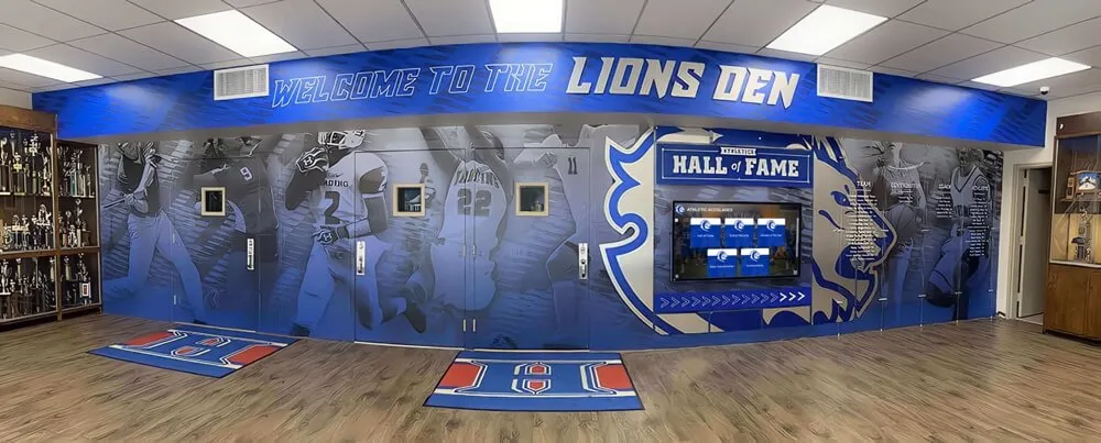
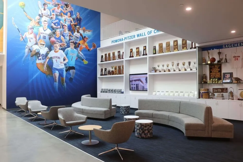
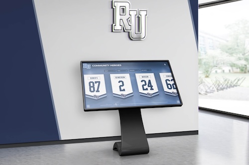
Card-Based Layouts
Cards provide flexible, touch-friendly content containers.
Card Design Best Practices:
- Clear visual boundaries (subtle shadows or borders)
- Consistent internal structure
- Prominent photo when available
- Essential information visible without tapping
- Clear tap target area
- Hover states showing interactivity (for preview purposes)
Card Sizing:
- Large enough for photos and text (minimum 200px × 200px)
- Consistent sizing within categories
- Responsive to screen size
- Grid layouts with proper gutters
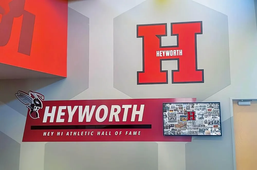
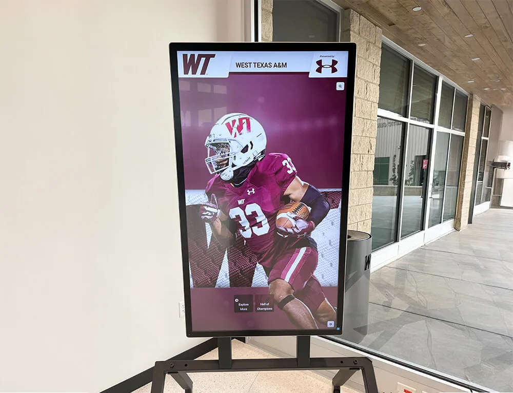
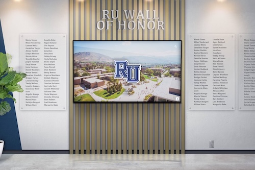
Photo and Media Presentation
Visual content drives engagement in recognition displays.
Photo Display Strategy:
- High-resolution images (300 DPI minimum at display size)
- Consistent aspect ratios within categories
- Graceful fallbacks for missing images
- Portrait photos for individuals
- Landscape photos for teams and events
- Zoom capabilities for detail viewing
Video Integration:
- Auto-play with muted audio
- Clear play button for audio activation
- Closed captions for accessibility
- Loading states showing duration
- Easy exit without watching completely
Content Presentation Best Practices
How information appears dramatically affects user engagement.
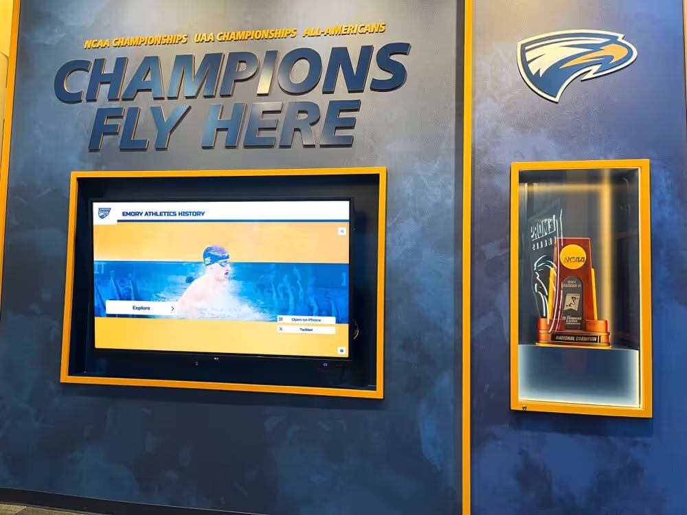
Profile Page Structure
Individual honoree profiles should follow consistent, scannable structure:
Recommended Layout:
Hero Section:
- Large professional photo
- Name in prominent typography
- Key achievement or induction year
- Sport/department affiliation
Quick Facts:
- Graduation year
- Years active
- Major achievements (bulleted)
- Records held
Biography:
- 2-3 paragraphs maximum
- Conversational tone
- Personal anecdotes
- Current information when available
Media Gallery:
- Additional photos
- Video highlights
- Newspaper clippings
- Award photos
Related Content:
- Teammates
- Contemporaries
- Similar achievements
- Historical context
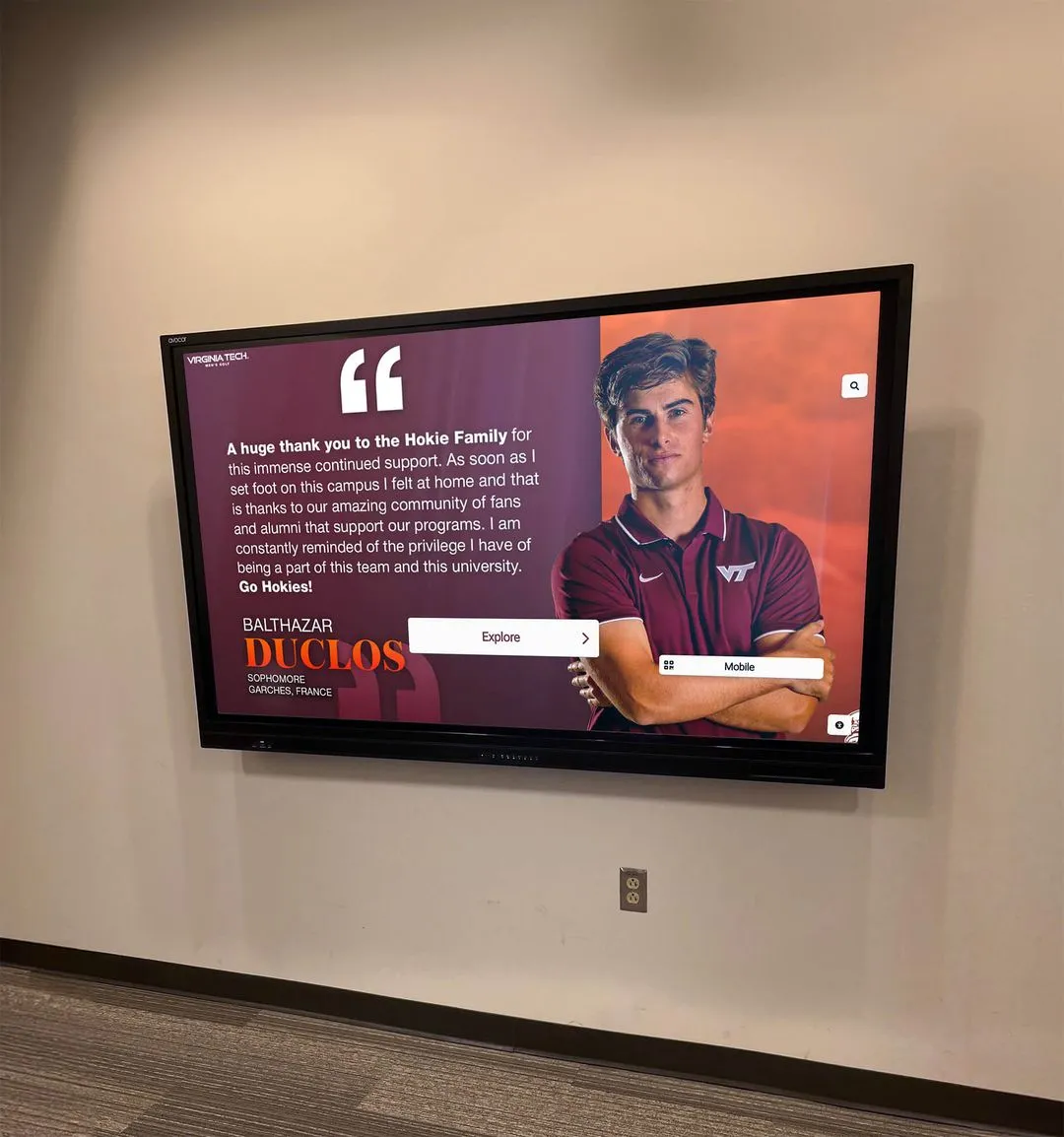
Balancing Text and Imagery
Recognition displays must be visual-first while providing depth.
Visual-First Principle:
- Every screen includes prominent imagery
- Text supplements rather than dominates
- Break long text into digestible chunks
- Use pull quotes for key achievements
- Avoid walls of text
Text Formatting:
- Short paragraphs (3-4 sentences maximum)
- Bulleted lists for scannable information
- Bold key facts
- Ample line spacing (1.5-2.0)
- Left-aligned text (never justified)
Handling Diverse Content Types
Recognition displays present various content requiring different treatments.
Individual Athletes/Alumni: Standard profile structure works well
Teams: Group photos prominent Individual member links Season statistics Championship information
Events: Date and context prominent Participant listings Historical significance Related events
Records: Clear current holder Historical progression Context and conditions Record-breaking moment media
Solutions like interactive touchscreen software provide templates handling these variations consistently.
Animation and Motion Design
Subtle motion enhances engagement without causing distraction.
When to Use Animation
Beneficial Animation:
- Page transitions showing navigation direction
- Element entrance drawing attention to new content
- Loading states showing system responsiveness
- Interactive feedback confirming actions
- Tutorial hints demonstrating gestures
Avoid Excessive Animation:
- Continuous animations causing distraction
- Long transitions frustrating impatient users
- Complex animations slowing perceived performance
- Decorative motion without purpose
Animation Principles
Duration:
- Fast: 100-200ms for feedback
- Medium: 250-400ms for transitions
- Slow: 500-800ms for major changes
- Never exceed 1 second unless absolutely necessary
Easing:
- Ease-out for elements entering screen
- Ease-in for elements exiting
- Ease-in-out for transitions
- No linear motion (feels robotic)
Accessibility Considerations
Some users experience motion sensitivity:
- Provide option to reduce motion
- Respect system-level motion preferences
- Essential information never conveyed through motion alone
- Fade alternatives to sliding/scaling
Testing and Iteration: Perfecting Your UX
Great UX emerges from systematic testing and refinement.
Usability Testing Methods
Observational Testing: Watch real users interact without intervention:
- Recruit diverse participants representing your audience
- Give realistic tasks (“Find alumni from your graduation year”)
- Observe without helping or commenting
- Note confusion points, errors, and successful paths
- Record sessions for later analysis
Think-Aloud Protocol: Ask users to verbalize thoughts while interacting:
- “Tell me what you’re looking for”
- “What do you expect this button to do?”
- “Why did you choose that option?”
- Reveals mental models and expectations
- Identifies unclear labeling or structure
A/B Testing: Compare two design variations:
- Test one variable at a time
- Ensure sufficient sample size
- Measure objective metrics (completion rate, time on task)
- Combine with qualitative feedback
- Implement winner, test next variable
Key Metrics to Track
Engagement Metrics:
- Average session duration
- Screens viewed per session
- Search usage rate
- Profile views
- Return visit percentage
Usability Metrics:
- Task completion rate
- Time to complete tasks
- Error rate
- Help/instruction views
- Abandonment points
Content Metrics:
- Most viewed profiles
- Popular search terms
- Filter usage patterns
- Media engagement (video plays)
- Social sharing frequency
Technical Metrics:
- Page load times
- Error frequencies
- Crash reports
- Touch accuracy
- Network reliability
Common UX Problems and Solutions
Problem: Users Don’t Realize Screen is Interactive
Solutions:
- Subtle animation on idle screen
- “Touch to Explore” prompt after 5 seconds
- Demo mode showing interaction examples
- Motion attracting attention
Problem: Users Get Lost in Navigation
Solutions:
- Persistent navigation always visible
- Prominent home button
- Clear breadcrumbs
- Simplified information architecture
- Reduced nesting depth
Problem: Search Produces No Results
Solutions:
- Fuzzy matching for spelling variations
- Suggested searches
- Alternative browsing methods
- Clear error messages with next steps
- Search history showing successful past queries
Problem: Text Too Small to Read
Solutions:
- Increase base font size
- User-controlled text sizing
- Better contrast ratios
- Reduce text density
- Prioritize essential information
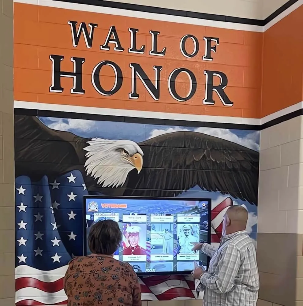
Accessibility: Designing for Everyone
Accessible design isn’t a separate consideration—it’s integral to excellent UX.
Visual Accessibility
For Low Vision Users:
- High contrast mode option
- Scalable text sizing
- Clear focus indicators
- No essential information in color alone
- Screen reader compatibility
For Color Blind Users:
- Multiple visual indicators beyond color
- Patterns or icons supplementing color coding
- Tested with color blindness simulators
- Sufficient contrast regardless of color perception
Motor Accessibility
Touch Accommodation:
- Large touch targets (60-80px minimum)
- Generous spacing between interactive elements
- No timing-dependent interactions
- Alternative input methods (voice, keyboard)
- Undo/cancel options for accidental taps
For Limited Dexterity:
- No gestures requiring precision
- Forgiving hit areas
- Avoid double-tap requirements
- Alternative to drag interactions
- Adjustable display height when possible
Cognitive Accessibility
Clear, Simple Interfaces:
- Consistent navigation placement
- Predictable interaction patterns
- Clear labels avoiding jargon
- One primary action per screen
- Visual progress indicators
Reduced Cognitive Load:
- Simplified language
- Chunked information
- Clear visual hierarchy
- Familiar metaphors
- Minimal distractions
Auditory Accessibility
For Deaf or Hard of Hearing Users:
- Closed captions on all video content
- Visual alternatives to audio feedback
- Text transcripts for audio interviews
- Visual alerts instead of audio-only cues
Learn more about accessibility compliance for digital recognition systems.
Performance Optimization for Responsive UX
Perceived performance dramatically affects user satisfaction.
Speed Optimization Strategies
Instant Feedback:
- Optimistic UI updates
- Skeleton screens during loading
- Cached content for instant display
- Progressive image loading
- Background data fetching
Actual Performance:
- Optimized image sizes
- Lazy loading off-screen content
- Efficient database queries
- Content delivery networks
- Edge caching strategies
Offline Considerations
Network interruptions shouldn’t break the experience:
- Cache recently viewed content
- Queue actions for sync when connection returns
- Clear offline state indicators
- Graceful degradation
- Core features work offline
Mobile Companion Experiences
While optimizing the physical display, consider complementary mobile experiences.
QR Code Integration
Allow users to continue exploration on personal devices:
- QR codes on profile pages
- Transfer to mobile for deeper browsing
- Share specific profiles easily
- Save favorites for later
- Extended content unavailable on public display
Responsive Web Portals
Maintain design consistency across touchpoints:
- Shared design language
- Synchronized content
- Mobile-optimized layouts
- Touch-friendly interactions
- Progressive web app capabilities
Discover how content strategies for digital recognition extend across multiple platforms.
Emerging UX Trends in Recognition Displays
Stay ahead of evolving user expectations.
Voice Interaction
Voice control supplements touch interaction:
- “Show me 2020 football alumni”
- “Find John Smith”
- “Go back”
- Accessibility benefit for vision-impaired users
- Privacy considerations in public spaces
Gesture Recognition
Camera-based gesture control enables touchless interaction:
- Wave to wake
- Point to select
- Swipe gestures from distance
- Useful for high-traffic, hygiene-conscious environments
- Reduces screen wear
Personalization
Tailored experiences increase engagement:
- Remember returning users
- Customized recommendations
- Personal connection highlighting
- Interest-based content surfacing
- Privacy-respecting personalization
Augmented Reality Integration
AR bridges physical and digital recognition:
- Point phone at trophy case for digital stories
- Historical photos overlaid on current spaces
- 3D model interactions
- Virtual museum experiences
- Enhanced storytelling capabilities
Conclusion: User Experience as Competitive Advantage
Exceptional user experience design separates forgettable displays from community treasures. Organizations investing in thoughtful UX research, testing, and refinement create digital halls of fame that genuinely engage, inform, and inspire.
The difference between a rarely-used display and a beloved community resource often comes down to interface details: button sizing, navigation clarity, content organization, and accessibility considerations. These seemingly small decisions compound into dramatically different user experiences.
Key Success Factors:
- Prioritize intuitive navigation requiring zero learning
- Test extensively with diverse real users
- Implement progressive disclosure revealing complexity gradually
- Ensure complete accessibility for all abilities
- Provide immediate feedback for all interactions
- Optimize performance for instant responsiveness
- Iterate continuously based on usage data
Ready to implement professional-grade user experience design for your digital hall of fame? Contact Rocket Alumni Solutions for expert guidance on UX best practices, user testing methodologies, and interface design that transforms engagement and creates lasting impact.