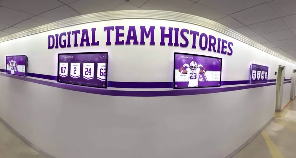


Creating a stunning digital hall of fame touchscreen display layout requires more than just placing photos and text on a screen. It demands understanding visual hierarchy, user experience principles, accessibility standards, and how people naturally interact with large-format touchscreens in public spaces.
The best touchscreen layouts feel intuitive from the moment someone approaches. Visitors instinctively understand what to touch, where information lives, and how to navigate without instruction. This seamless experience doesn’t happen by accident—it results from deliberate design decisions grounded in proven principles and informed by how real people interact with recognition displays.
This comprehensive guide walks through every aspect of designing compelling touchscreen display layouts for digital halls of fame. Whether you’re creating your first recognition display or refining an existing system, you’ll discover practical strategies for designing interfaces that honor achievements while engaging users through intuitive, visually striking design.
Understanding Touchscreen User Experience Fundamentals
Before diving into specific design techniques, understanding how people interact with touchscreen displays in public spaces establishes the foundation for effective layout design.
How Public Touchscreen Interaction Differs from Mobile Devices

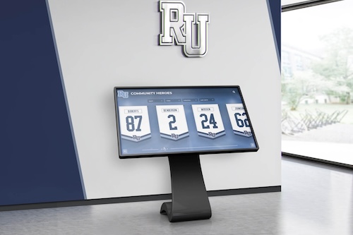
Physical Scale Changes Everything: Wall-mounted touchscreen displays measure 43-86 inches diagonally compared to smartphone screens of 5-7 inches. This dramatic scale difference fundamentally changes user interaction patterns. What works on mobile devices fails on large-format touchscreens, and vice versa.
Users stand 18-36 inches from wall-mounted displays rather than holding devices 12-14 inches from their faces. This viewing distance demands larger interface elements, higher-contrast text, and design decisions accounting for extended arm reach rather than thumb-based navigation.
Public vs. Private Contexts: Mobile device interaction happens in private or semi-private contexts where users feel comfortable taking time, exploring features, and tolerating learning curves. Public touchscreen interaction occurs in shared spaces where social pressure discourages extended engagement that might appear to monopolize shared resources.
Effective public touchscreen design minimizes perceived complexity, reduces interaction time, and creates confidence that users can accomplish goals quickly without looking confused in front of peers or colleagues.
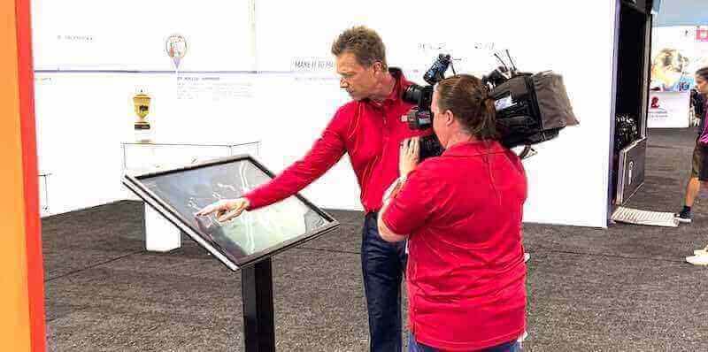
Multi-User Consideration: Unlike personal devices, public touchscreens often attract group interaction. Multiple people simultaneously viewing from different angles creates design requirements absent from mobile development. Text and images need visibility from off-angles, and navigation should support social sharing rather than solely individual interaction.
The Three-Second Rule for Public Displays
Research on public interactive displays reveals a critical threshold: visitors decide whether to engage within three seconds of approach. If the interface appears confusing, cluttered, or intimidating during this initial glance, most people simply walk past without touching the screen.
Design Implications of the Three-Second Rule:
- Home screens must immediately communicate purpose and functionality
- Primary navigation should be instantly recognizable
- Visual design should signal “this is touchable” through clear affordances
- Initial screens should showcase compelling content drawing people in
- Interface complexity should reveal progressively, not overwhelm immediately
Think of your home screen as a storefront window. It must attract attention, communicate value, and invite exploration—all within seconds as people pass by.
Touch Target Sizing for Standing Users
Mobile device guidelines recommend touch targets of at least 44×44 pixels. Wall-mounted touchscreens require significantly larger targets accounting for different interaction mechanics.
Recommended Touch Target Sizes:
- Minimum touch target: 60×60 pixels for minor interface elements
- Primary navigation buttons: 80-120 pixels for comfortable tapping
- Featured content cards: 200+ pixels for prominent selections
- Target spacing: Minimum 20-pixel separation between tappable elements
Standing users extend arms to interact with wall-mounted displays, creating less precise motor control than thumb-based mobile interaction. Larger targets with generous spacing accommodate natural variation in touch accuracy, reducing user frustration and failed selections.
Reachable Zones: Not all screen areas are equally accessible. The “comfort zone” extends from roughly 36 inches from the floor to 60 inches—the area most adults can reach without bending or stretching. Place primary navigation and frequently accessed content within this zone, reserving top and bottom screen areas for less critical information or purely visual elements.
Visual Hierarchy Principles for Recognition Displays
Visual hierarchy guides users’ eyes through content in intentional sequences, ensuring they see important information first and understand relationships between elements.
Size and Scale as Hierarchy Indicators
Creating Clear Information Hierarchies: The human brain processes larger elements before smaller ones. Leverage this natural tendency by assigning size according to information importance:
- Primary headlines: 60-80 pixel font size
- Secondary headings: 40-50 pixel font size
- Body text: 24-32 pixel font size (larger than web standards due to viewing distance)
- Supporting metadata: 18-24 pixel font size
Proportional Relationships: Maintain consistent scale relationships across your interface. If primary buttons are 2x larger than secondary buttons on one screen, maintain this 2:1 ratio throughout your application for predictable visual hierarchy.
Avoid creating too many hierarchy levels. Three to four levels typically suffice. More levels create confusion rather than clarity.
Color and Contrast for Visual Prominence

Strategic Color Application: Color directs attention more powerfully than nearly any other design element. Use color strategically to establish hierarchy:
- Primary calls-to-action: Bright, saturated institutional colors (school colors, brand colors)
- Secondary actions: Muted versions of primary colors or neutral tones
- Content areas: Subtle background colors providing visual separation without competing for attention
- Error states or warnings: Red or amber, used sparingly to maintain their urgency signaling
Contrast Requirements: The Web Content Accessibility Guidelines (WCAG) recommend minimum contrast ratios of 4.5:1 for body text and 3:1 for large text (24px+). Public displays benefit from even higher contrast—aim for 7:1 or greater whenever possible, especially for text users need to read from several feet away.
Test your color combinations using online contrast checkers before implementation. What looks adequate on your design screen may prove illegible on actual display hardware viewed from typical distances.
White Space and Content Breathing Room
Amateur designers fear empty space, cramming every pixel with content. Professional designers understand white space (negative space) is an active design element that improves comprehension and reduces cognitive load.
Strategic White Space Application:
- Generous margins: Minimum 60-80 pixels around screen edges preventing content from feeling cramped
- Content separation: 40-60 pixels between distinct content sections
- Line spacing: 1.5-2x line height for body text improving readability
- Card padding: 30-40 pixels inside content cards keeping text from touching borders
White space creates visual rhythm, groups related elements, separates distinct concepts, and provides rest areas where eyes can briefly pause before processing additional information. Resist pressure to fill all available screen space. Strategic emptiness improves rather than detracts from effective communication.
Grid Systems and Layout Structures
Grid systems provide invisible structure organizing content into predictable, harmonious layouts that feel professional and intentional.
Column-Based Grid Fundamentals
Standard Grid Options: Most digital hall of fame interfaces use 12-column grids providing maximum flexibility. 12 divides evenly by 2, 3, 4, and 6, allowing diverse layout combinations while maintaining alignment:
- Full-width hero sections: 12 columns
- Two-column layouts: 6 + 6 columns
- Three-column galleries: 4 + 4 + 4 columns
- Asymmetric layouts: 8 + 4 columns or 3 + 9 columns
Grid Discipline: Grids work only when you commit to using them consistently. All interface elements should align to grid columns. Text blocks, images, buttons, and containers should start and end at column boundaries rather than arbitrary positions.
This disciplined approach creates subconscious order. Users may not consciously notice grid alignment, but they feel the difference between gridded layouts (which feel organized and professional) and free-form layouts (which feel chaotic and amateur).
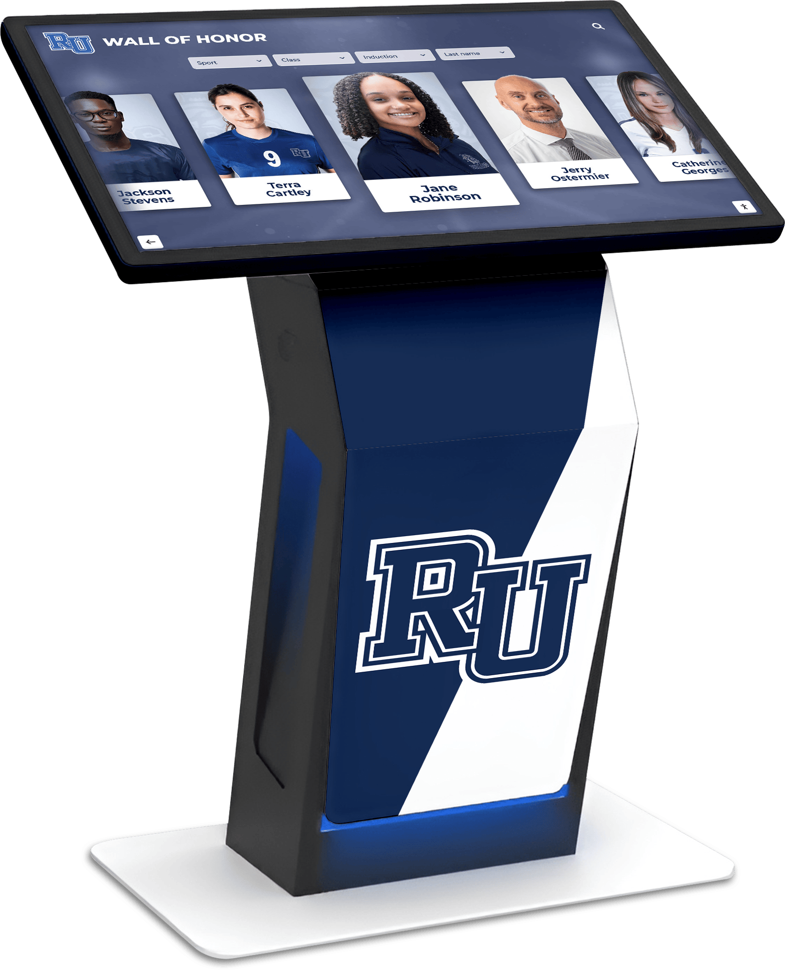
Modular Grid Systems for Content Cards
Content planning for digital hall of fame displays often involves organizing individual honoree profiles as discrete cards users can browse and select.
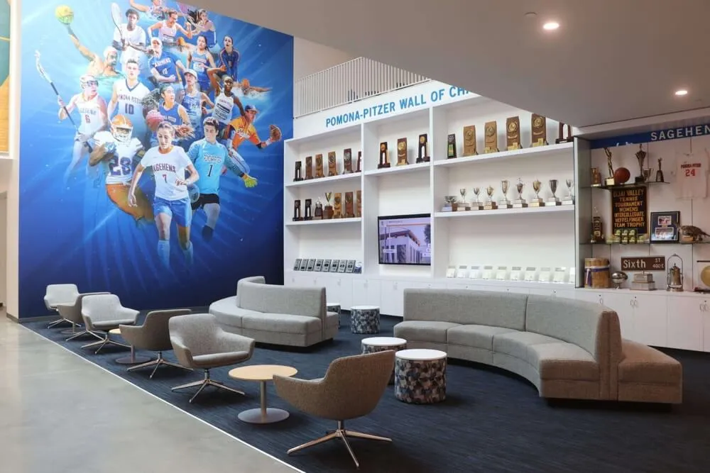
Modular Grid Benefits: Modular grids divide space into rows and columns, creating rectangular modules that contain individual content pieces. This system works perfectly for recognition displays showing multiple honorees:
- Consistent card sizing: All profile cards share identical dimensions creating visual unity
- Flexible arrangements: Add or remove cards without disrupting layout structure
- Scalability: Accommodate different honoree quantities by filling available grid positions
- Responsive adaptation: Adjust column counts for different screen sizes and orientations
Module Sizing Recommendations: For portrait-orientation screens (common in entrance displays), 2-3 column grids work well. For landscape displays (typical in athletic facilities), 3-4 column grids provide good balance between content density and individual card size.
Calculate module height maintaining comfortable aspect ratios for profile photos (typically 3:4 for portrait crops) while ensuring touch targets meet minimum size requirements.
Hierarchical Grids for Feature-Priority Layouts
Not all content deserves equal visual weight. Hierarchical grids organize content by importance rather than strict uniformity.
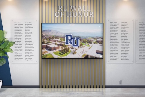
Feature-Priority Design: Digital hall of fame home screens often benefit from hierarchical layouts featuring prominent content:
- Hero featured honoree: Large card occupying 50-60% of initial viewport
- Recent inductees: Medium-sized cards showing 3-4 latest additions
- Browse categories: Smaller navigation buttons for year, sport, or achievement type
- Search functionality: Prominent search input in consistent location
This approach immediately showcases compelling content while providing clear navigation to additional content layers.
Navigation Design Strategies
Intuitive navigation determines whether users successfully explore your content or abandon the display in frustration.
Persistent Navigation Patterns
Always-Visible Home Button: The single most important navigation element is a persistent home button visible on every screen. Users should never feel trapped in your interface without a clear path back to the starting point.
Position home buttons in consistent locations—typically the top-left corner (following web convention) or bottom-center (within easy reach). Use universally recognized iconography (house icon) supplemented by text labels ensuring clarity.
Breadcrumb Navigation: For interfaces with multiple content levels (e.g., All Athletes → Basketball → 2010s → John Smith Profile), breadcrumb trails help users understand their current location and provide shortcuts to previous levels.
Display breadcrumbs prominently near the top of content areas using clickable segments allowing users to jump directly to any previous level rather than repeatedly hitting back buttons.
Progressive Disclosure for Complex Information
Overwhelming users with all available information simultaneously creates cognitive overload. Progressive disclosure reveals information in layers as users request it.
Layered Information Architecture:
- Level 1 - Overview: Grid of honoree photos with names and primary achievement
- Level 2 - Summary: Single honoree with expanded photo, key achievements, dates, and statistics
- Level 3 - Details: Full biography, image galleries, video content, and comprehensive records
- Level 4 - Related Content: Teammates, similar achievers, or historical context
Each level provides logical stopping points where users can choose to go deeper or return to browsing. Never force users through all levels to access specific information—offer shortcuts (search, filters) accommodating different exploration styles.
Filter and Search Interface Design
As recognition databases grow, powerful filtering and search become essential for content discovery.
Effective Filter Patterns:
- Category filters: Sport, achievement type, decade, department displayed as large, tappable chips or buttons
- Multi-select capability: Allow applying multiple filters simultaneously (e.g., “Basketball” + “1990s” + “All-State”)
- Active filter display: Show currently applied filters prominently with easy removal options
- Result counts: Display how many results each filter option contains preventing dead-ends
Search Interface Considerations: Typing on touchscreen keyboards is slower and more error-prone than physical keyboards. Design search interfaces accommodating this reality:
- Generous tap targets: Large keys with clear separation
- Predictive suggestions: Show matching results as users type, allowing selection before completing full words
- Voice search integration: Consider voice input for touchscreen systems supporting this capability
- Forgiving matching: Accommodate spelling variations, nicknames, and partial matches
Typography for Large-Format Displays
Typography for touchscreen displays requires different considerations than web or print design.
Font Selection for Readability
Sans-Serif Superiority: Sans-serif typefaces (fonts without decorative serifs) perform better on screens, especially viewed from distances of 2-4 feet. The simpler letterforms maintain clarity without the fine details serifs require.
Recommended Typeface Characteristics:
- Open apertures: Letters like ‘c’, ’e’, and ’s’ with open counters remain legible at smaller sizes
- Distinct characters: Clear differentiation between similar letters (I, l, 1) and (O, 0)
- Generous x-height: Taller lowercase letters relative to capitals improve readability
- Regular weight availability: Not ultra-thin or ultra-bold for body text
Popular typeface choices for recognition displays include Open Sans, Lato, Roboto, Source Sans Pro, and Proxima Nova. These open-source or widely available fonts provide excellent screen readability.
Text Sizing and Line Length
Viewing Distance Calculations: Standard web typography assumes 16-24 inch viewing distances. Wall-mounted touchscreens are viewed from 24-36 inches or more. Adjust text sizes accordingly:
- Minimum body text size: 24 pixels (compared to 16px web standard)
- Comfortable reading size: 28-32 pixels
- Primary headings: 60-80 pixels
- Hero text: 100+ pixels for prominent featured content
Optimal Line Length: Readability research suggests optimal line lengths of 45-75 characters (approximately 10-12 words) for body text. Longer lines tire readers forcing their eyes to travel excessive distances. Shorter lines create choppy, interrupted reading rhythm.
For touchscreen displays, err toward shorter line lengths (45-60 characters) as reading from standing positions is inherently less comfortable than sitting positions typical for web browsing.
Accessible Text Hierarchy
Clear typographic hierarchy helps all users, including those with cognitive disabilities, quickly understand content structure.
Hierarchy Implementation:
- Consistent sizing: H1 headings always use the same size, H2 subheadings always smaller, etc.
- Weight variation: Bold headings contrasted with regular body text
- Color differentiation: Headings in primary institutional colors, body text in dark gray or black
- Spacing distinction: More white space above headings than below, visually associating headings with content they introduce
Never rely solely on color to convey information hierarchy. Users with color blindness or viewing from angles where color fidelity suffers need additional hierarchy cues through size, weight, and positioning.
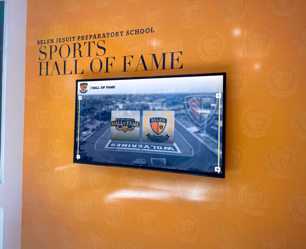
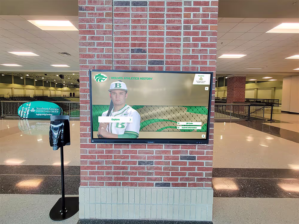
Creating Compelling Home Screens
Your home screen is your display’s first impression and primary engagement driver.
Hero Content Selection
What Makes Effective Hero Content: The featured content occupying prominent home screen positions should be:
- Visually striking: High-quality photos with good composition and lighting
- Emotionally resonant: Images capturing moments of achievement, celebration, or pride
- Regularly updated: Fresh content signals an active, current display rather than forgotten installation
- Representative: Showcase diverse achievements, time periods, and community segments
- Action-oriented: Images of people in action rather than static posed portraits when possible
Rotation Strategies: Static home screens become invisible through familiarity. Implement content rotation ensuring regular visitors see different featured honorees:
- Time-based rotation: Change featured content daily, weekly, or monthly
- Random selection: Display randomly selected honorees from qualifying pools
- Seasonal relevance: Feature basketball honorees during basketball season, graduating class members near graduation dates
- Recent additions: Automatically feature newly added inductees for defined periods
Call-to-Action Design
Clear calls-to-action guide visitors toward initial engagement.
Effective CTA Characteristics:
- Action-oriented language: “Explore Our Champions,” “Search All Honorees,” “View This Year’s Inductees”
- High visual contrast: Buttons standing out clearly from backgrounds through color and size
- Generous size: Large enough to tap confidently without precision
- Logical positioning: Placed where users naturally look after viewing hero content
- Limited choices: 2-3 primary actions rather than overwhelming option arrays
Testing Your CTAs: Before finalizing designs, test with actual users. Stand 6-8 feet from your display and ask: “What would you do first?” If users hesitate or express confusion, your calls-to-action need clarification or more prominent positioning.
Attract Loop Design
When no one actively uses the display, “attract loops” (animated sequences) draw attention from passersby.
Attract Loop Components:
- Scrolling honoree gallery: Automated scrolling through featured profiles
- Highlight reels: Brief video clips showing achievements or testimonials
- Animated text: Statistics, quotes, or facts appearing and transitioning
- Call-to-action reminders: Periodic prompts encouraging interaction (“Touch to Explore”)
Attract Loop Best Practices:
- Motion draws eyes: Subtle movement attracts attention without feeling chaotic
- Clear idle state signals: Obvious visual difference between attract loop and active use prevents confusion
- Immediate responsiveness: Single touch immediately exits attract mode and enters interactive interface
- Timeout and return: After 60-90 seconds of inactivity, return to attract loop allowing next user to engage
Individual Profile Layout Design
Once users navigate to specific honoree profiles, layout design determines how effectively you communicate achievements.
Photo Presentation Strategies
Primary Photo Prominence: The honoree’s main photograph should occupy significant screen space—typically 30-40% of the profile viewport. This visual anchors recognition while creating personal connection.
Photo Quality Requirements: Digital displays mercilessly expose poor photo quality. Establish minimum standards for inclusion:
- Resolution: Minimum 1200×1600 pixels for portrait orientation
- Focus and clarity: Sharp focus without excessive grain or compression artifacts
- Lighting: Even illumination without harsh shadows or blown-out highlights
- Composition: Subjects clearly visible with appropriate framing
When high-quality photos are unavailable, consider tasteful illustration placeholders over using poor-quality images that detract from perceived display quality.
Achievement Presentation Methods
Interactive hall of fame systems offer multiple approaches for presenting achievements within individual profiles.
Visual Achievement Display:
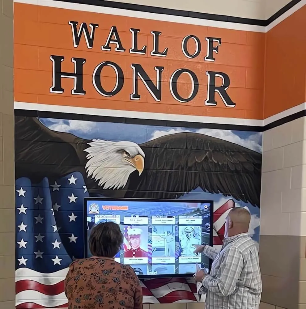
- Icon systems: Custom icons representing achievement types (trophy for championships, medal for individual awards, ribbon for recognition)
- Timeline layouts: Chronological achievement presentation showing career progression
- Statistics displays: Key numbers (points scored, records set, years active) in large, easily scannable format
- Award badges: Visual representations of honors, selections, or recognitions
Text Achievement Presentation: For achievements requiring context or explanation, structured text presentation maintains scannability:
- Bulleted lists: Quick-to-scan format for multiple achievements
- Year-achievement pairing: “1998 - State Champion” format creates clear chronological reading
- Category grouping: Athletic achievements separate from academic recognition
- Hierarchical organization: Most significant achievements first, supporting details following
Biography and Story Integration
Beyond facts and statistics, compelling stories create emotional engagement with honorees.
Biography Presentation:
- Concise core biography: 100-150 words covering essential background, achievement context, and significance
- Expandable full biography: “Read More” interaction revealing complete story for interested users
- Quotation highlights: Pull quotes in larger text featuring memorable statements from or about honoree
- Storytelling structure: Beginning (background), middle (journey/challenges), end (achievement/impact)
Multimedia Story Enhancement: Text alone cannot match multimedia storytelling power:
- Video interviews: 30-90 second clips of honorees sharing experiences
- Photo galleries: Additional images showing career progression or achievement moments
- Audio clips: Broadcast recordings of significant achievements or commentary
- Documents and artifacts: Digitized letters, awards, or memorabilia adding historical depth
Mobile-Responsive Design Considerations
While this guide focuses on large-format touchscreens, modern recognition systems often include companion web experiences requiring responsive design.
Adapting Layouts Across Screen Sizes
Responsive Breakpoint Strategy: Define specific breakpoints where your layout adjusts for different devices:
- Large touchscreens (1920px+ wide): 3-4 column layouts, extensive white space, maximum content visibility
- Desktop computers (1200-1920px): 2-3 column layouts, comfortable reading widths
- Tablets (768-1200px): 2 column layouts, touch-friendly targets, streamlined navigation
- Mobile phones (320-768px): Single column stacking, thumb-friendly navigation, condensed content
Consistent Design Language: While layouts adapt across devices, maintain visual consistency through shared color palettes, typography systems, iconography, and interaction patterns. Users should recognize your digital hall of fame whether viewing on public touchscreen or personal smartphone.
Touch vs. Cursor Interaction Patterns
Different input methods require different interaction patterns.
Touch-Optimized Interactions:
- Swipeable galleries: Horizontal swipe gestures for browsing photo collections
- Expandable sections: Tap to expand/collapse additional information
- Pull-to-refresh: Vertical pull gesture updating content lists
- Large tap targets: All interactive elements meet minimum size requirements
Cursor-Optimized Interactions:
- Hover states: Visual feedback when cursors hover over interactive elements
- Tooltips: Additional information appearing on hover
- Precise selection: Smaller interface elements acceptable with mouse precision
- Right-click contexts: Additional actions available through right-click menus
When designing systems supporting both interaction modes, prioritize touch optimization while ensuring cursor interactions remain functional.
Accessibility and Inclusive Design
Accessible design ensures all community members can engage with recognition displays regardless of physical, cognitive, or sensory abilities.
WCAG 2.1 Compliance Fundamentals
The Web Content Accessibility Guidelines provide the standard for digital accessibility.
Key WCAG Requirements for Recognition Displays:
- Contrast ratios: 4.5:1 minimum for body text, 3:1 for large text and interface components
- Text resizing: Support text enlargement up to 200% without breaking layout
- Keyboard navigation: Full functionality accessible without mouse or touch
- Focus indicators: Clear visual indication of which element currently has focus
- Alternative text: Descriptive text for all images and media
- Captions and transcripts: Text alternatives for audio and video content
Meeting WCAG 2.1 Level AA standards ensures your display serves the widest possible audience while meeting legal accessibility requirements in many jurisdictions.
Screen Reader Compatibility
While wall-mounted touchscreens rarely integrate with personal screen reader devices, web-based companion experiences should support screen reader users.
Screen Reader Best Practices:
- Semantic HTML: Use proper heading tags (h1, h2, h3), landmark regions (nav, main, aside), and semantic elements (article, section)
- Meaningful link text: “View John Smith’s Profile” rather than “Click Here”
- Image alt text: Descriptive alternatives for photos conveying relevant information
- Form labels: Explicit labels associated with all input fields
- Skip navigation links: Allow screen reader users to bypass repetitive navigation
- ARIA labels: Supplement semantic HTML where additional context helps screen reader users
Physical Accessibility Considerations
Touchscreen displays for schools must accommodate users of varying heights and physical abilities.
Installation Height Standards: The Americans with Disabilities Act (ADA) recommends mounting interactive controls between 15 and 48 inches from the floor for forward approach (48 inches maximum when reaching over obstruction). For touchscreen displays:
- Optimal installation height: Bottom edge approximately 36-40 inches from floor
- Primary interaction zone: Most important controls and content within 36-60 inch height range
- Clear approach space: Minimum 30×48 inch clear floor space in front of display allowing wheelchair approach
- Display angle: Slight downward tilt (5-10 degrees) improves visibility for wheelchair users and shorter individuals
Adjustable Content Positioning: When installation heights are fixed, design interfaces placing critical controls within reachable zones while using top and bottom screen areas for display-only content or less frequently accessed functions.
Color Theory and Branding Integration
Strategic color use reinforces institutional identity while improving usability.
Institutional Color Implementation
Branded Color Roles: Your institution’s colors should appear prominently but strategically:
- Primary navigation: School colors for main buttons and headers
- Accent elements: Secondary school colors for highlights and callouts
- Content areas: Neutral backgrounds allowing branded elements to stand out
- Typography: School colors for headings, black or dark gray for body text
Avoiding Color Overload: Just because your institution has school colors doesn’t mean every pixel should use them. Restrained application creates more impact than saturating every element with branded colors.
Use institutional colors for approximately 20-30% of interface elements, allowing neutral colors (grays, whites, blacks) to provide balance and prevent visual chaos.
Emotional Color Psychology
Colors evoke subconscious emotional responses influencing user perception and behavior.
Color Emotional Associations:
- Blue: Trust, stability, calm (popular for educational institutions)
- Red: Energy, excitement, urgency (common in athletic displays)
- Green: Growth, success, harmony
- Gold/Yellow: Achievement, excellence, prestige (frequent in hall of fame contexts)
- Purple: Dignity, wisdom, tradition
- Gray: Sophistication, neutrality, professionalism
Select accent colors and supporting palettes complementing institutional colors while evoking emotions appropriate for recognition contexts—pride, accomplishment, tradition, excellence.
Dark Mode and High-Visibility Options
Different environments require different display modes for optimal visibility.
Dark Mode Benefits: Dark interfaces with light text reduce eye strain in dimly lit environments and can reduce energy consumption on OLED displays. Consider dark mode options for:
- Evening viewing areas: Lobbies and hallways with reduced lighting after hours
- Theater and auditorium installations: Dark backgrounds prevent displays from creating distracting bright spots
- User preference options: Allow users to toggle display modes based on comfort
High-Contrast Modes: Some users benefit from extreme contrast modes enhancing visibility:
- Maximum contrast text: Pure black on pure white or white on pure black
- Simplified color palettes: Reduced color variety eliminating subtle distinctions
- Enhanced focus indicators: Extra-prominent highlighting of active elements
Provide easy access to accessibility modes without requiring complex configuration or settings navigation.
Animation and Motion Design
Thoughtful animation enhances user experience, while excessive motion creates distraction and annoyance.
Purposeful Animation Principles
When to Animate:
- Drawing attention: Subtle motion directing eyes toward important elements
- Providing feedback: Confirming actions like button presses or menu selections
- Creating continuity: Smooth transitions between screens maintaining spatial context
- Revealing functionality: Demonstrating swipeable galleries or expandable sections
- Loading states: Indicating system activity during content loading
When to Avoid Animation:
- Constant motion: Continuous animation creates visual noise and user fatigue
- Unnecessary effects: Animation for decoration rather than functional purpose
- Slow transitions: Extended animations delaying user progress through content
- Accessibility barriers: Rapid motion triggering vestibular disorders or seizures
Transition and Microinteraction Design
Screen Transition Patterns: Smooth transitions between screens help users maintain spatial orientation:
- Slide transitions: New screen slides in from right while current screen slides left (or vice versa)
- Fade transitions: Cross-fade between screens for less directional relationships
- Expand/collapse transitions: Cards expanding to fill screen, maintaining visual continuity
- Duration guidelines: 200-400 milliseconds for most transitions (longer feels slow, shorter feels jarring)
Button and Interface Microinteractions: Small animations acknowledging interaction enhance perceived responsiveness:
- Press states: Buttons slightly compressing when touched
- Hover effects: Subtle highlighting as cursor approaches clickable elements
- Loading spinners: Indicating system activity for actions taking more than 1-2 seconds
- Success confirmations: Brief check marks or color changes confirming completed actions
Performance Optimization for Smooth Motion
Animation must perform smoothly at 60 frames per second to appear fluid rather than choppy.
Performance Best Practices:
- GPU-accelerated properties: Animate transform (translate, scale, rotate) and opacity rather than positional properties (top, left, width, height)
- Reduce simultaneous animations: Limit number of elements animating concurrently
- Simplify motion paths: Straight-line movements perform better than complex curves
- Test on actual hardware: Animation performance on design workstations may exceed display hardware capabilities
Choppy, stuttering animation is worse than no animation. If performance constraints prevent smooth motion, opt for instant transitions rather than compromised animation.
Multi-User and Social Interaction Design
Public displays often attract group viewing and interaction, requiring design considerations beyond individual use.
Social Viewing Angles
Off-Axis Visibility: Multiple people simultaneously viewing displays stand at various angles rather than directly centered. Design elements must remain visible from 30-45 degree viewing angles:
- High-contrast text: Remains legible even when display color and brightness shift from off-angles
- Redundant information encoding: Don’t rely solely on color; use icons, text, and positioning together
- Centered critical content: Place most important information in center screen areas visible from widest angle range
Group Interaction Patterns: When multiple people interact together, design should facilitate rather than hinder collaborative exploration:
- Side-by-side touch targets: Allow two people to make separate selections simultaneously without interference
- Clear action confirmation: Visual feedback helps group members understand which person’s touch the system registered
- Read-aloud friendly content: Text sizes and hierarchies supporting one person reading information aloud to others
Gamification and Engagement Features
Light gamification elements can increase engagement with recognition displays.
Appropriate Gamification for Recognition Contexts:
- Achievement collections: “Discover 10 Different All-State Athletes” progress tracking
- Quiz features: “Test Your School History Knowledge” with questions about honorees
- Comparison tools: “Compare Records Across Decades” visualization tools
- Exploration rewards: Unlockable content or easter eggs for thorough exploration
- Social sharing: “Take a Photo with Your Favorite Athlete” selfie opportunities
Avoiding Gamification Pitfalls: Recognition displays honor real achievements and real people. Gamification should enhance rather than trivialize this purpose. Avoid:
- Competitive scoring: Ranking users creates inappropriate competitive contexts
- Superficial engagement: Games distracting from actual recognition content
- Juvenile themes: Tone-deaf approaches undermining the dignity of recognition
Timeout and Reset Behaviors
Interactive timeline displays in public spaces must automatically reset after users complete interactions.
Timeout Strategy: After periods of inactivity, displays should return to attract loops or home screens:
- Standard timeout: 60-90 seconds of no interaction
- Activity extensions: Each interaction resets the timer
- Warning countdown: 10-second warning before reset allowing continued use
- Gradual timeout: Dim display or show subtle prompt before full reset
Privacy Considerations: Timeout and reset protect user privacy by clearing personal searches or selections someone might not want following users to see. This privacy protection creates comfort for exploration without concern about leaving traces.
Testing and Iteration Strategies
Even thoughtfully designed interfaces require testing and refinement based on real user behavior.
Prototype Testing Methods
Before investing in full development, test design concepts through prototypes.
Prototype Testing Approaches:
- Paper prototypes: Print screen designs at full scale, simulating interaction by manually switching between printed screens as testers “tap” buttons
- Clickable wireframes: Tools like Figma or Adobe XD create interactive prototypes testable on tablets approximating touchscreen interaction
- Wizard of Oz testing: Show designs on actual display hardware with test facilitator manually controlling responses to touch input
Effective Test Scenarios: Create realistic tasks for test participants:
- “Find information about [specific athlete name]”
- “Discover who won state championships in [specific year]”
- “Explore basketball achievements from the 1990s”
- “Watch a video about any honoree”
Observe where users struggle, what they instinctively try to touch, and what information they expect to find.
Analytics and Usage Monitoring
Once displays are operational, analytics reveal how real users interact with your design.
Valuable Metrics to Track:
- Session duration: Average time users spend interacting
- Bounce rate: Percentage of users who touch once then leave
- Popular content: Most-viewed honorees, most-used features
- Navigation paths: Common routes users take through content
- Search queries: What users look for helping inform content organization
- Dead ends: Places users get stuck or abandon exploration
Modern touchscreen kiosk software typically includes analytics dashboards revealing usage patterns without identifying individual users.
A/B Testing Layout Variations
When uncertain between design approaches, A/B testing reveals which performs better.
Testable Layout Elements:
- CTA button placement: Top vs. bottom, left vs. center vs. right
- Grid density: 2 vs. 3 vs. 4 column layouts for honoree browsing
- Image sizes: Larger featured photos vs. more visible text
- Color schemes: Different accent color approaches
- Navigation styles: Tab-based vs. menu-based vs. category cards
Implement variations for defined periods (1-2 weeks each), measure engagement metrics, and adopt the approach generating better results.
Software and Tools for Layout Design
Designing touchscreen layouts requires appropriate software tools.
Design Software Options
Professional Design Tools:
- Figma: Web-based collaborative design tool with excellent prototyping capabilities. Popular for interface design, with free tier for individual use.
- Adobe XD: Adobe’s interface design and prototyping tool, included with Creative Cloud subscriptions.
- Sketch: Mac-only design tool popular among professional interface designers ($99/year).
Alternative Design Tools:
- Canva: User-friendly design tool suitable for simpler layouts and graphics ($120/year for Pro features).
- PowerPoint or Keynote: Presentation software can prototype simple layouts for concept testing.
- GIMP: Free, open-source image editing for organizations with zero budget.
For serious interface design work, Figma offers the best balance of capabilities, collaboration features, and cost (free for many use cases).
Template and Design System Approaches
Rather than designing every screen from scratch, template systems dramatically improve efficiency and consistency.
Component-Based Design: Create reusable components for common elements:
- Honoree profile cards: Standardized layouts for athlete or alumni cards
- Navigation menus: Consistent navigation components appearing across screens
- Button styles: Primary, secondary, and tertiary button templates
- Type styles: Predefined heading and body text formatting
- Color variables: Centralized color definitions ensuring consistency
Modern design tools support component libraries allowing edits to propagate across all instances automatically.
Implementation Considerations
Great designs must translate from concept to functional interfaces.
Working with Developers
Successful implementation requires effective designer-developer collaboration.
Design Handoff Best Practices:
- Annotated specifications: Note exact spacing, sizes, and behaviors that aren’t obvious from visual design
- Interactive prototypes: Demonstrate intended interactions and transitions
- Asset preparation: Export images, icons, and media in appropriate formats and resolutions
- Style guides: Document color codes, font specifications, and component behaviors
- Edge case documentation: Specify behavior for unusual scenarios (very long names, missing photos, etc.)
Collaborative Design-Development: Rather than designers working in isolation then “throwing designs over the wall” to developers, iterative collaboration produces better results. Involve developers early for technical feasibility input, maintain ongoing communication during implementation, and expect designs to evolve based on technical constraints or opportunities.
Content Management Integration
Beautiful layouts mean nothing without good content, and good content requires manageable systems for ongoing updates.
CMS Requirements for Recognition Displays: Your content management system should support:
- Structured honoree profiles: Defined fields for names, photos, achievements, biographies, and media
- Categorization and tagging: Organize honorees by year, sport, achievement type, or custom taxonomies
- Media libraries: Organized storage for photos, videos, and documents
- Search and filtering: Content administrators need to find and update profiles efficiently
- Access controls: Limit editing permissions to authorized administrators
- Preview capabilities: See how content will appear before publishing to live displays
- Bulk operations: Update multiple profiles simultaneously when making structural changes
Solutions like Rocket Alumni Solutions provide purpose-built content management specifically designed for recognition displays, streamlining the process of maintaining compelling content that works beautifully with thoughtful layout designs.
Display Hardware Specifications
Layout design decisions should consider target display hardware.
Hardware Factors Affecting Design:
- Screen resolution: Design for native resolution to maximize clarity
- Aspect ratio: 16:9 landscape, 9:16 portrait, or 16:10 determines layout proportions
- Touch precision: Capacitive touchscreens offer better precision than resistive, potentially allowing slightly smaller touch targets
- Brightness capabilities: High-brightness commercial displays maintain visibility in brightly lit spaces, supporting wider color and contrast ranges
- Viewing angles: Commercial IPS panels maintain color and contrast from wider angles than consumer-grade displays
Confirm hardware specifications before finalizing designs, ensuring your carefully crafted layouts will display as intended on actual installation hardware.
Real-World Layout Examples and Patterns
Learning from successful implementations provides practical inspiration.
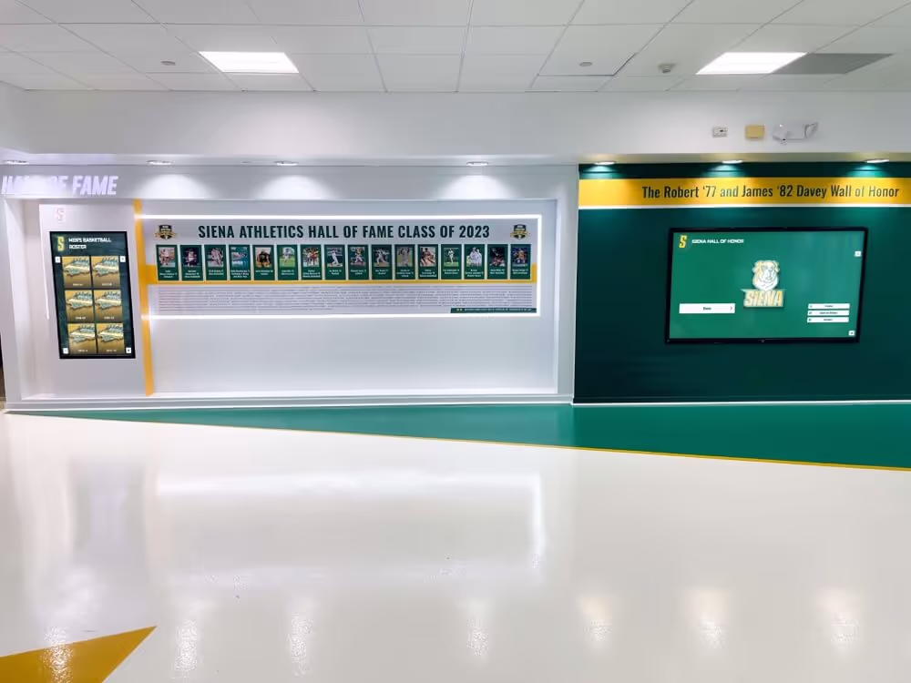
Grid-Based Gallery Layouts
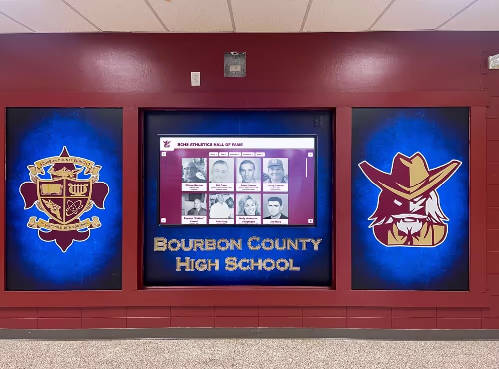
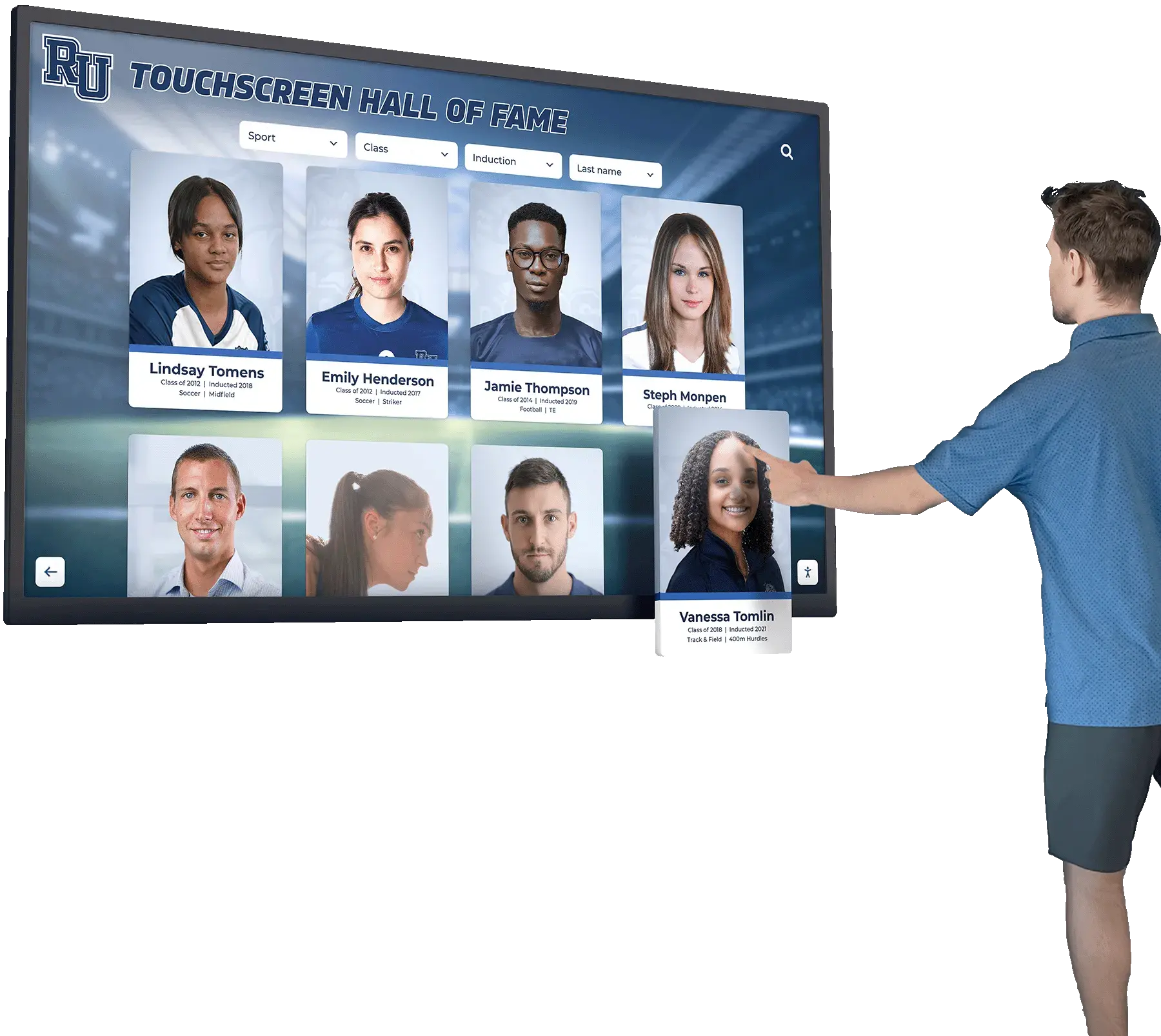
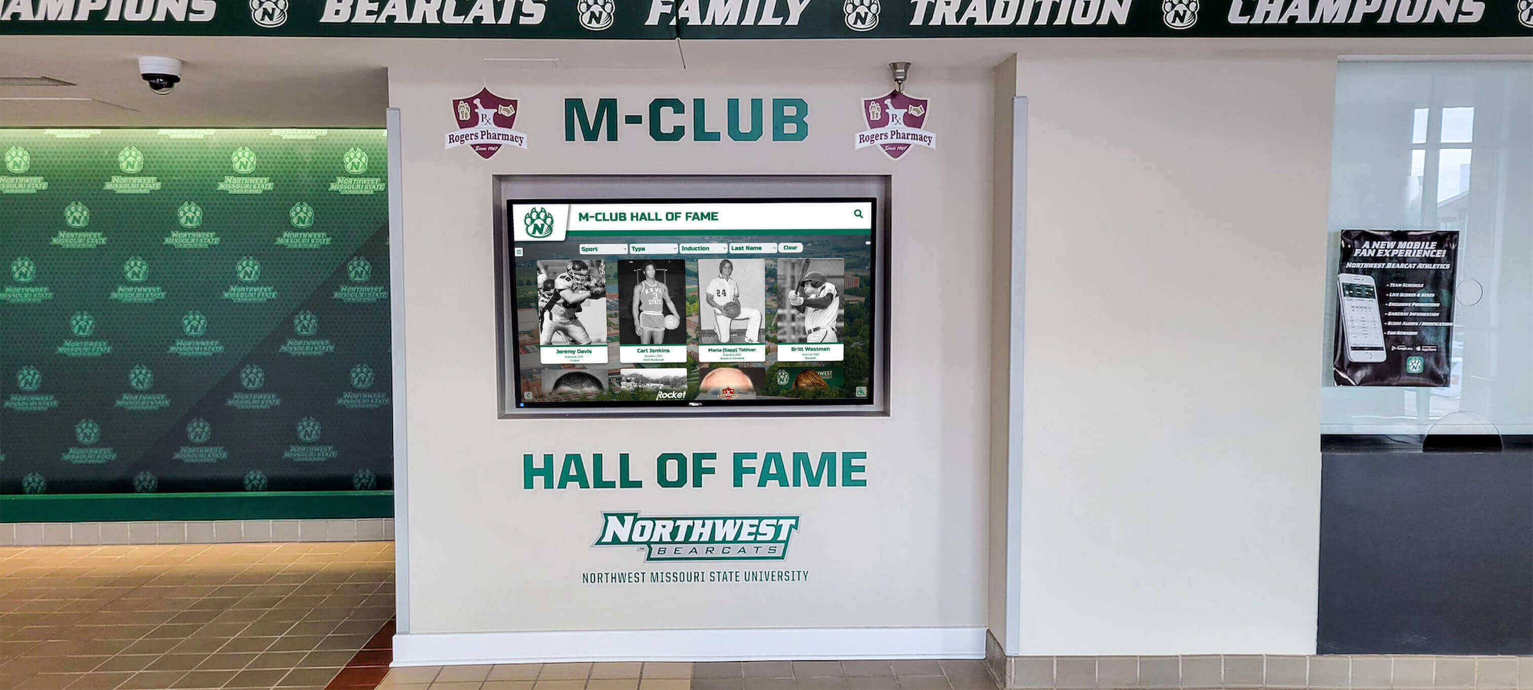
The most common recognition display layout presents honorees in grid-based galleries:
Layout Pattern:
- Top navigation bar: Home button, search, and primary category filters
- Breadcrumb trail: Current location within navigation hierarchy
- Content grid: 3-4 columns of honoree cards showing photos, names, and primary achievements
- Bottom pagination: Scrollable or paginated navigation for large honoree collections
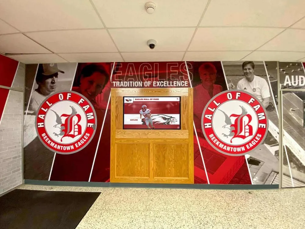
When This Pattern Works: This straightforward approach excels for large recognition databases where browsing and discovery are primary use cases. It’s particularly effective for athletic halls of fame, alumni recognition, and achievement walls with hundreds or thousands of honorees.
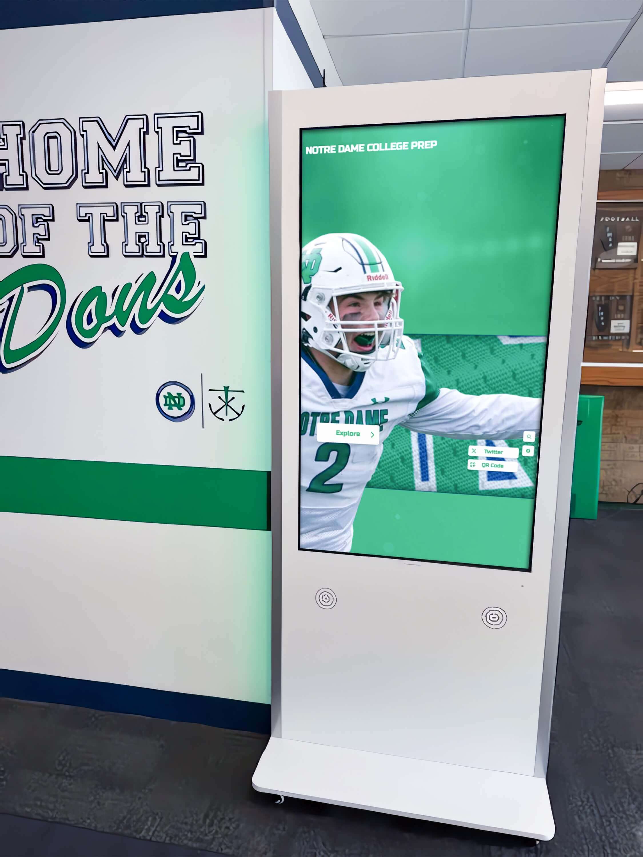
Feature-Focused Storytelling Layouts
Alternative layouts emphasize storytelling over comprehensive browsing:
Layout Pattern:
- Large hero section: Featured honoree with prominent photo and compelling story excerpt
- Supporting content: 3-4 “featured” honorees or recent additions
- Browse invitation: “Explore All Honorees” call-to-action leading to gallery view
- Thematic organization: Content grouped by stories or achievements rather than pure chronology
When This Pattern Works: This approach suits smaller, curated recognition displays where each honoree has rich multimedia content. It’s ideal for rotating featured content and creating emotional engagement before users browse comprehensively.
Timeline-Based Historical Layouts
Chronological organization emphasizes institutional history and evolution:
Layout Pattern:
- Horizontal timeline: Decades or years displayed chronologically
- Milestone markers: Significant achievements highlighted along timeline
- Year selection: Tap decade or year to view honorees from that period
- Historical context: Integration of institutional history with individual achievements
When This Pattern Works: Timeline layouts excel for institutions with rich history wanting to emphasize tradition and evolution. They work particularly well for organizations with clear era definitions (coaching tenures, competitive divisions, facility eras) providing natural organizational structure.
Conclusion: Design as Recognition Investment
Designing stunning digital hall of fame touchscreen displays requires balancing aesthetic beauty with functional usability, honoring tradition while embracing modern interaction patterns, and creating experiences that both inform and inspire. The difference between displays that become community treasures and expensive screens that sit idle often comes down to thoughtful layout design that respects both the achievements being honored and the people who seek to engage with them.
Effective layout design is not a one-time project but an ongoing process of refinement informed by user feedback, analytics insights, and evolving content. The principles outlined in this guide provide foundation for creating interfaces that feel intuitive, look professional, and successfully communicate the significance of the achievements you’re celebrating.
Core Design Success Factors:
- Understand the unique requirements of public touchscreen interaction
- Establish clear visual hierarchy guiding users through content
- Implement grid systems creating professional, organized layouts
- Design navigation that never leaves users feeling lost or confused
- Create accessible experiences serving all community members
- Test designs with real users and iterate based on feedback
- Balance institutional branding with functional clarity
- Animate purposefully, enhancing rather than distracting from content
Ready to create a stunning digital hall of fame display that does justice to the achievements you’re honoring? Platforms like Rocket Alumni Solutions combine beautiful, professionally designed templates with intuitive customization tools, allowing you to create visually striking recognition displays without requiring professional design expertise. The combination of proven design patterns and flexible customization ensures your recognition displays look professional while reflecting your unique institutional identity.
Your honorees deserve recognition presented as impressively as their achievements. Thoughtful layout design transforms digital displays from simple information repositories into engaging experiences that inspire pride, celebrate excellence, and create lasting connections between past achievements and future aspirations.