
Why Disabling Pinch-to-Zoom Matters for Kiosk Deployments
Public-facing touchscreen kiosks require controlled user experiences. When visitors can pinch-to-zoom on your kiosk display, they can disrupt carefully designed layouts, access unintended interface elements, and create confusion for subsequent users who encounter zoomed-in screens.
This comprehensive technical guide provides multiple proven methods to disable pinch-to-zoom functionality using CSS, HTML, and JavaScript. Whether you’re developing custom kiosk software, deploying web-based interactive displays, or implementing touchscreen kiosk solutions for schools, museums, or organizations, mastering zoom prevention ensures professional, reliable deployments.
Understanding Touch Zoom Behavior on Kiosks
Before implementing solutions, it’s essential to understand how pinch-to-zoom works on touchscreen devices and why standard web defaults don’t serve kiosk applications.
How Browsers Handle Touch Zoom
Modern browsers implement touch zoom through several mechanisms:
Multi-Touch Gestures:
- Two-finger pinch gestures to zoom in/out
- Double-tap zoom to predefined levels
- Spread gestures to expand content
- Browser-level viewport scaling
Default Behavior:
- Mobile browsers assume users want zoom capabilities
- Accessibility features preserve zoom for vision-impaired users
- Browser vendors prioritize personal device UX over kiosk scenarios
- Touch events processed at multiple DOM levels
Why Kiosks Need Zoom Disabled
Public touchscreen installations face unique challenges:
User Experience Consistency: Kiosks serve dozens or hundreds of users daily. One visitor zooming content creates confusing experiences for all subsequent users until staff manually reset the display—an unsustainable maintenance burden.
Interface Design Integrity: Interactive touchscreen interfaces are carefully designed with specific hit targets, layouts, and content hierarchies. Zoom disrupts these designs, making navigation buttons inaccessible, misaligning visual elements, and breaking intended user flows.
Security Considerations: Unrestricted zoom can expose unintended interface elements, browser chrome, or system UI that should remain hidden in locked-down kiosk environments. Proper zoom prevention complements broader kiosk security measures.
Performance Implications: Zoom operations trigger expensive browser reflows and repaints, potentially degrading performance on kiosk hardware that may use budget-conscious specifications.
Method 1: HTML Viewport Meta Tag (Primary Solution)
The viewport meta tag provides the simplest, most effective solution for preventing pinch-to-zoom on web-based kiosk applications.
The Complete Viewport Meta Tag
Add this meta tag to your HTML <head> section:
<meta
  name="viewport"
  content="width=device-width, initial-scale=1.0, maximum-scale=1.0, user-scalable=no, interactive-widget=resizes-content"
>
Understanding Each Parameter
width=device-width: Sets viewport width to match the device screen width, ensuring proper responsive design scaling without additional zoom.
initial-scale=1.0: Defines initial zoom level as 1:1 (no zoom). Critical for ensuring content loads at intended size.
maximum-scale=1.0: Prevents zoom beyond 100% scale. Combined with initial scale of 1.0, this effectively locks zoom level.
user-scalable=no: Explicitly disables user-initiated zoom gestures. Most effective parameter for preventing pinch-to-zoom.
interactive-widget=resizes-content: Modern addition that handles virtual keyboards and overlays properly without triggering unwanted zoom.
Browser Support and Compatibility
This viewport approach works across all modern browsers and mobile operating systems:
- iOS Safari: Full support (iOS 10+)
- Chrome/Android: Complete support
- Firefox Mobile: Full support
- Edge Mobile: Complete support
- Samsung Internet: Full support
Older browsers (pre-2016) may have partial support, but modern kiosk deployments use current operating systems where compatibility is universal.
Implementation Example
Complete HTML structure with zoom prevention:
<!DOCTYPE html>
<html lang="en">
<head>
  <meta charset="UTF-8">
  <meta
    name="viewport"
    content="width=device-width, initial-scale=1.0, maximum-scale=1.0, user-scalable=no, interactive-widget=resizes-content"
  >
  <title>Interactive Kiosk Display</title>

  <!-- Additional meta tags for kiosk optimization -->
  <meta name="mobile-web-app-capable" content="yes">
  <meta name="apple-mobile-web-app-capable" content="yes">
  <meta name="apple-mobile-web-app-status-bar-style" content="black-translucent">
</head>
<body>
  <div class="kiosk-content">
    <!-- Your kiosk interface here -->
  </div>
</body>
</html>
The additional meta tags prevent browser UI elements and status bars from appearing, creating a more polished kiosk experience.
Method 2: CSS touch-action Property (Modern Approach)
The CSS touch-action property provides fine-grained control over touch behaviors at the element level, offering a modern, standards-compliant approach to zoom prevention.
Basic CSS Implementation
Apply to your root element or body:
body {
  touch-action: none; /* Disables all touch gestures including zoom */
  -ms-touch-action: none; /* Fallback for older Edge */
}
Understanding touch-action Values
The touch-action property accepts several values for different control levels:
touch-action: none; Completely disables all touch gestures including pinch-zoom, pan, and double-tap zoom. Most restrictive option suitable for completely custom touch interfaces.
touch-action: manipulation; Allows panning and pinching but disables double-tap zoom, providing smoother interactions by eliminating the 300ms click delay browsers add to detect double-taps. Recommended for most kiosk applications.
touch-action: pan-x pan-y; Permits horizontal and vertical panning but prevents pinch zoom. Useful for kiosks with scrollable content that shouldn’t zoom.
touch-action: pinch-zoom; Explicitly enables only pinch zoom (rarely used for kiosks, but documents the opposite behavior).
Recommended Kiosk Implementation
For most kiosk applications, use manipulation:
* {
  touch-action: manipulation;
}

body {
  touch-action: manipulation;
  -ms-touch-action: manipulation;
}
This approach:
- Prevents double-tap zoom (primary accidental zoom trigger)
- Allows intentional scrolling when content exceeds viewport
- Eliminates click delays for responsive interactions
- Maintains accessibility better than complete gesture disabling
Targeting Specific Elements
Apply different touch behaviors to different interface sections:
/* Disable all touch gestures on navigation elements */
.kiosk-navigation {
  touch-action: none;
}

/* Allow vertical scrolling on content sections */
.kiosk-content-scrollable {
  touch-action: pan-y;
}

/* Prevent zoom on interactive buttons */
.kiosk-button {
  touch-action: manipulation;
}
Browser Support
CSS touch-action enjoys excellent modern browser support:
- Chrome 36+ (2014)
- Safari 13+ (2019)
- Firefox 52+ (2017)
- Edge 12+ (2015)
- iOS Safari 13+ (2019)
- Chrome Android 36+ (2014)
For kiosks deployed in the past 3-4 years, browser support is universal. Organizations implementing digital recognition displays benefit from using modern browsers that fully support these properties.
Method 3: JavaScript Event Prevention (Comprehensive Control)
When CSS and HTML solutions need reinforcement or when dealing with legacy systems, JavaScript provides programmatic control over touch events.
Basic JavaScript Zoom Prevention
Add this script to prevent pinch-to-zoom gestures:
// Prevent pinch-to-zoom on document
document.addEventListener('gesturestart', function(e) {
  e.preventDefault();
});

document.addEventListener('gesturechange', function(e) {
  e.preventDefault();
});

document.addEventListener('gestureend', function(e) {
  e.preventDefault();
});

// Prevent double-tap zoom
let lastTouchEnd = 0;
document.addEventListener('touchend', function(event) {
  const now = (new Date()).getTime();
  if (now - lastTouchEnd <= 300) {
    event.preventDefault();
  }
  lastTouchEnd = now;
}, false);
Understanding Touch and Gesture Events
Gesture Events (iOS-specific):
gesturestart: Fired when two or more fingers touch the screengesturechange: Continuously fired during multi-finger gesturesgestureend: Fired when gesture completes
Touch Events (Cross-platform):
touchstart: Finger touches screentouchmove: Finger moves while touchingtouchend: Finger lifts from screen
Comprehensive JavaScript Solution
A production-ready implementation addressing multiple zoom vectors:
(function preventKioskZoom() {
  'use strict';

  // Prevent gesture-based zoom (iOS)
  document.addEventListener('gesturestart', (e) => e.preventDefault());
  document.addEventListener('gesturechange', (e) => e.preventDefault());
  document.addEventListener('gestureend', (e) => e.preventDefault());

  // Prevent double-tap zoom
  let lastTouchEnd = 0;
  document.addEventListener('touchend', (event) => {
    const now = Date.now();
    if (now - lastTouchEnd <= 300) {
      event.preventDefault();
    }
    lastTouchEnd = now;
  }, { passive: false });

  // Prevent pinch zoom using touchmove
  document.addEventListener('touchmove', (event) => {
    if (event.scale !== 1) {
      event.preventDefault();
    }
  }, { passive: false });

  // Prevent Ctrl + scroll zoom (desktop touchscreens)
  document.addEventListener('wheel', (event) => {
    if (event.ctrlKey) {
      event.preventDefault();
    }
  }, { passive: false });

  // Prevent keyboard zoom shortcuts
  document.addEventListener('keydown', (event) => {
    if ((event.ctrlKey || event.metaKey) &&
        (event.key === '+' || event.key === '-' || event.key === '=')) {
      event.preventDefault();
    }
  });

})();
The Passive Event Listener Consideration
Modern browsers default touch and wheel event listeners to passive: true for performance optimization. However, preventDefault() only works with non-passive listeners.
The Issue:
Passive listeners cannot cancel default behaviors, so calling preventDefault() has no effect.
The Solution:
Explicitly set { passive: false } when registering event listeners that need to prevent default behaviors:
document.addEventListener('touchmove', (event) => {
  if (event.scale !== 1) {
    event.preventDefault();
  }
}, { passive: false }); // Critical for preventDefault to work
Browser console warnings like “Unable to preventDefault inside passive event listener” indicate this issue. Always specify { passive: false } when preventing default touch behaviors.
Framework-Specific Implementations
React Component:
import { useEffect } from 'react';

function KioskComponent() {
  useEffect(() => {
    const preventZoom = (e) => {
      if (e.scale !== 1) {
        e.preventDefault();
      }
    };

    document.addEventListener('gesturestart', preventZoom);
    document.addEventListener('gesturechange', preventZoom);
    document.addEventListener('gestureend', preventZoom);
    document.addEventListener('touchmove', preventZoom, { passive: false });

    return () => {
      document.removeEventListener('gesturestart', preventZoom);
      document.removeEventListener('gesturechange', preventZoom);
      document.removeEventListener('gestureend', preventZoom);
      document.removeEventListener('touchmove', preventZoom);
    };
  }, []);

  return (
    <div style={{ touchAction: 'manipulation' }}>
      {/* Kiosk content */}
    </div>
  );
}
Vue.js Directive:
// In your main.js or plugin file
app.directive('prevent-zoom', {
  mounted(el) {
    const preventZoom = (e) => {
      if (e.scale !== 1) e.preventDefault();
    };

    el.addEventListener('gesturestart', preventZoom);
    el.addEventListener('gesturechange', preventZoom);
    el.addEventListener('gestureend', preventZoom);
    el.addEventListener('touchmove', preventZoom, { passive: false });

    el._preventZoom = preventZoom; // Store for cleanup
  },
  unmounted(el) {
    const preventZoom = el._preventZoom;
    el.removeEventListener('gesturestart', preventZoom);
    el.removeEventListener('gesturechange', preventZoom);
    el.removeEventListener('gestureend', preventZoom);
    el.removeEventListener('touchmove', preventZoom);
  }
});

// Usage in templates
<div v-prevent-zoom>
  <!-- Kiosk interface -->
</div>
Method 4: Combined Approach (Maximum Compatibility)
For production kiosk deployments requiring bulletproof zoom prevention across diverse hardware and browsers, combine multiple methods.
The Complete Stack
Implement all three primary methods simultaneously:
1. HTML Viewport Meta Tag:
<meta
  name="viewport"
  content="width=device-width, initial-scale=1.0, maximum-scale=1.0, user-scalable=no"
>
2. CSS touch-action:
* {
  touch-action: manipulation;
}

body {
  touch-action: manipulation;
  -ms-touch-action: manipulation;
}
3. JavaScript Event Prevention:
(function() {
  document.addEventListener('gesturestart', (e) => e.preventDefault());
  document.addEventListener('gesturechange', (e) => e.preventDefault());
  document.addEventListener('gestureend', (e) => e.preventDefault());

  let lastTouchEnd = 0;
  document.addEventListener('touchend', (e) => {
    const now = Date.now();
    if (now - lastTouchEnd <= 300) e.preventDefault();
    lastTouchEnd = now;
  }, { passive: false });

  document.addEventListener('touchmove', (e) => {
    if (e.scale !== 1) e.preventDefault();
  }, { passive: false });
})();
Why Layered Defense Works
Each method addresses different zoom triggers:
- Viewport meta tag: Handles browser-level zoom configuration
- CSS touch-action: Prevents gesture-based zoom via CSS interpretation
- JavaScript events: Programmatically intercepts zoom attempts at runtime
Browser implementation inconsistencies mean a method fully effective in Chrome might have edge cases in Safari. Layering ensures comprehensive coverage across all scenarios.
Testing Across Platforms
Test your combined implementation on:
iOS Devices:
- iPad (various generations) running Safari
- iPhone in kiosk mode
Android Tablets:
- Samsung Galaxy Tab with Chrome
- Amazon Fire tablets
- Generic Android tablets with WebView
Windows Touchscreens:
- Surface devices running Edge
- All-in-one PCs with Chrome
- Dedicated kiosk hardware
Organizations deploying interactive kiosk installations benefit from testing on actual deployment hardware to identify platform-specific issues before production rollout.
Platform-Specific Considerations
Different operating systems and browsers present unique challenges requiring tailored approaches.
iOS and iPadOS Kiosks
Apple devices have specific quirks requiring attention:
WKWebView Behavior: iOS kiosk apps using WKWebView need both HTML and JavaScript zoom prevention. The viewport meta tag alone may not suffice due to WebView implementation differences.
Guided Access Mode: For dedicated iOS kiosk deployments, enable Guided Access to lock the device to your app and disable hardware zoom gestures:
Settings > Accessibility > Guided Access > Enable
This system-level control complements code-based zoom prevention.
Safari-Specific Fixes: Safari on iOS sometimes ignores zoom prevention on certain form inputs. Add this CSS:
input, textarea, select {
  font-size: 16px; /* Prevents iOS zoom on focus */
  touch-action: manipulation;
}
iOS Safari automatically zooms when focusing input fields with font sizes below 16px. Setting minimum 16px font prevents this auto-zoom behavior.
Android Kiosk Deployments
Android presents different considerations:
WebView vs. Chrome Custom Tabs: Android apps using WebView have different zoom controls than browser-based kiosks. For WebView apps, disable zoom programmatically:
// In your Android WebView setup
WebSettings webSettings = webView.getSettings();
webSettings.setBuiltInZoomControls(false);
webSettings.setSupportZoom(false);
webSettings.setDisplayZoomControls(false);
Kiosk Mode Apps: Dedicated Android kiosk launcher apps provide system-level gesture disabling that complements web-based prevention. Solutions like comprehensive kiosk software platforms include Android kiosk mode configuration.
Samsung Devices: Samsung tablets may have additional gesture controls in Knox or Samsung Kiosk mode requiring separate configuration.
Windows Touchscreen Kiosks
Desktop browsers on Windows touch-enabled devices have unique characteristics:
Edge and Chrome: Modern Edge and Chrome handle touch-action CSS properly, making the combined CSS + viewport meta tag approach highly effective.
Internet Explorer 11:
If supporting IE11 (not recommended for new deployments), use the -ms-touch-action vendor prefix exclusively, as the standard property isn’t supported:
body {
  -ms-touch-action: manipulation;
}
Precision Touchpad Gestures: Windows precision touchpads can trigger zoom via pinch gestures. Disable in Windows settings or through kiosk management software rather than relying solely on web code.
Tablet Mode: Windows tablet mode may interpret certain gestures differently. Test thoroughly on actual deployment hardware running Windows 10/11 tablet mode.
Common Issues and Troubleshooting
Even with proper implementation, some edge cases require additional attention.
Issue 1: Zoom Still Works on iOS
Symptoms: Pinch-to-zoom continues functioning despite viewport meta tag and CSS.
Causes:
- JavaScript event listeners set to passive mode
- Meta tag not properly closed or contains typos
- CSS not applied to all elements
Solutions:
// Ensure non-passive event listeners
document.addEventListener('touchmove', (e) => {
  if (e.touches.length > 1) {
    e.preventDefault();
  }
}, { passive: false }); // Critical

// Verify meta tag has no typos
<meta name="viewport" content="width=device-width, initial-scale=1.0, maximum-scale=1.0, user-scalable=no">

// Apply CSS to all elements
* {
  touch-action: manipulation;
}
Issue 2: Double-Tap Zoom Persists
Symptoms: Users can still zoom by double-tapping despite pinch zoom being disabled.
Causes:
- Double-tap prevention JavaScript not implemented
- CSS touch-action not set to manipulation
Solutions:
// Comprehensive double-tap prevention
let lastTouchEnd = 0;
document.addEventListener('touchend', (event) => {
  const now = Date.now();
  if (now - lastTouchEnd <= 300) {
    event.preventDefault();
  }
  lastTouchEnd = now;
}, { passive: false });
/* Prevents double-tap zoom via CSS */
body {
  touch-action: manipulation;
}
Issue 3: Input Fields Trigger Auto-Zoom on iOS
Symptoms: Focusing text inputs causes Safari to auto-zoom despite zoom prevention.
Cause: iOS Safari automatically zooms on input fields with font-size below 16px.
Solution:
input[type="text"],
input[type="email"],
input[type="number"],
input[type="tel"],
textarea {
  font-size: 16px; /* Minimum to prevent iOS auto-zoom */
  touch-action: manipulation;
}
If 16px appears too large for your design, use CSS transform to visually scale down while maintaining 16px actual size:
input {
  font-size: 16px;
  transform: scale(0.875); /* Appears as 14px */
  transform-origin: left top;
}
Issue 4: Zoom Works with External Mice/Trackpads
Symptoms: Ctrl+scroll or pinch gestures on trackpads still zoom the page.
Cause: Mouse wheel and trackpad events not intercepted.
Solution:
// Prevent Ctrl+scroll and trackpad pinch zoom
document.addEventListener('wheel', (event) => {
  if (event.ctrlKey) {
    event.preventDefault();
  }
}, { passive: false });

// Prevent keyboard zoom shortcuts
document.addEventListener('keydown', (event) => {
  if ((event.ctrlKey || event.metaKey) &&
      (event.key === '+' || event.key === '-' || event.key === '0' || event.key === '=')) {
    event.preventDefault();
  }
});
Issue 5: Scrolling Stops Working After Disabling Zoom
Symptoms: Content no longer scrolls after implementing zoom prevention.
Cause:
Using touch-action: none instead of touch-action: manipulation.
Solution:
/* Wrong - blocks all touch including scroll */
body {
  touch-action: none;
}

/* Correct - allows scroll but prevents zoom */
body {
  touch-action: manipulation;
}

/* For scrollable containers */
.scrollable-content {
  touch-action: pan-y; /* Vertical scroll only */
  overflow-y: auto;
}
Accessibility Considerations
Disabling zoom creates accessibility concerns requiring thoughtful solutions.
Vision Accessibility Standards
The Web Content Accessibility Guidelines (WCAG) 2.1 Level AA specifically addresses zoom in Success Criterion 1.4.4 (Resize Text), which states users must be able to resize text up to 200% without loss of content or functionality.
The Tension: Kiosks need zoom disabled for UX consistency, but accessibility standards require zoom capability for vision-impaired users.
Accessible Kiosk Design Solutions
Built-in Accessibility Mode: Provide an explicit accessibility button that enables an alternate high-contrast, large-text interface rather than relying on zoom:
function enableAccessibilityMode() {
  document.body.classList.add('accessibility-mode');
  // Optionally re-enable zoom for this session
  document.querySelector('meta[name="viewport"]').setAttribute('content',
    'width=device-width, initial-scale=1.0, user-scalable=yes'
  );
}
.accessibility-mode {
  font-size: 1.5rem;
  line-height: 1.8;
  color: #000;
  background: #fff;
}

.accessibility-mode button,
.accessibility-mode .interactive {
  min-height: 60px; /* Larger touch targets */
  min-width: 60px;
}
Audio Assistance Integration: Implement screen reader support and audio descriptions as alternatives to visual zoom for accessibility compliance.
Physical Accessibility Controls: For permanent kiosk installations, consider hardware accessibility buttons that trigger high-contrast, large-text modes without relying on zoom.
Organizations implementing accessible digital recognition solutions balance zoom prevention with alternative accessibility features meeting WCAG standards.
Performance Implications
Zoom prevention methods have varying performance characteristics worth understanding.
Viewport Meta Tag: Zero Performance Cost
The HTML viewport meta tag has no runtime performance impact. It’s read once during initial page load and affects browser zoom configuration without ongoing processing.
Recommendation: Always include viewport meta tag as your primary zoom prevention regardless of other methods.
CSS touch-action: Minimal Performance Cost
The CSS touch-action property is highly performant. Browsers optimize touch event handling based on declared touch-action values, actually improving performance by eliminating unnecessary event processing.
When touch-action is set to manipulation, browsers can:
- Skip 300ms double-tap detection delay (faster responses)
- Optimize touch event processing pathways
- Reduce unnecessary gesture calculations
Recommendation: Use CSS touch-action as your second layer for both zoom prevention and performance optimization.
JavaScript Event Prevention: Moderate Performance Cost
JavaScript event listeners have modest performance implications:
Runtime Overhead:
- Each touch event fires multiple times during gestures
- Event handlers execute on every touchmove event (potentially hundreds of times per gesture)
- Non-passive listeners can’t be optimized by browser (necessary for preventDefault)
Performance Optimization:
// Debounce touchmove for better performance
let touchMoveThrottled = false;
document.addEventListener('touchmove', (event) => {
  if (!touchMoveThrottled) {
    touchMoveThrottled = true;
    if (event.scale !== 1) {
      event.preventDefault();
    }
    setTimeout(() => {
      touchMoveThrottled = false;
    }, 16); // ~60fps
  }
}, { passive: false });
Recommendation: Use JavaScript as your third layer for comprehensive coverage, but implement performance-conscious patterns shown above.
Testing Performance Impact
Measure actual performance on your target kiosk hardware:
// Performance monitoring
const perfStart = performance.now();

document.addEventListener('touchmove', (event) => {
  const touchProcessTime = performance.now();
  if (event.scale !== 1) {
    event.preventDefault();
  }
  const processDuration = performance.now() - touchProcessTime;

  if (processDuration > 16) { // Longer than one frame at 60fps
    console.warn(`Touch handler took ${processDuration}ms`);
  }
}, { passive: false });
Organizations deploying interactive displays at scale should performance-test on actual deployment hardware to ensure smooth 60fps interactions.
Security Implications of Zoom Control
Zoom prevention is one component of comprehensive kiosk security.
Zoom as a Security Vector
Uncontrolled zoom can expose security vulnerabilities:
Browser Chrome Exposure: Extreme zoom can reveal browser UI elements (address bar, bookmarks, settings) that should remain hidden in locked-down kiosks. Users discovering these elements might navigate away from your kiosk application or access browser settings.
Hidden Interface Elements: Zooming may reveal unintended interface elements positioned outside the normal viewport, including debug controls, admin functions, or navigation not intended for public users.
URL Exposure: Zoomed interfaces may show URLs in link previews or hover states, potentially exposing backend system paths or internal routing structures.
Comprehensive Kiosk Lockdown
Zoom prevention should be part of broader kiosk security:
Browser Lockdown:
- Run in kiosk mode (
--kioskflag in Chrome) - Disable right-click context menus
- Block keyboard shortcuts (F11, Alt+F4, Ctrl+W, etc.)
- Hide browser chrome and navigation elements
System-Level Controls:
- Disable operating system gestures (three-finger swipe, etc.)
- Lock task switching (Alt+Tab, Cmd+Tab)
- Prevent access to system settings
- Disable physical keyboard when not needed
Network Security:
- Restrict network access to required services only
- Implement VPN for management traffic
- Monitor unusual access patterns
- Regular security audits
Professional touchscreen kiosk security implementations address zoom control within comprehensive security frameworks.
Testing Your Zoom Prevention Implementation
Thorough testing ensures your solution works across all scenarios.
Manual Testing Checklist
Perform these tests on actual kiosk hardware:
Basic Zoom Tests:
- Two-finger pinch gesture (zoom in and out)
- Two-finger spread gesture
- Double-tap on text, images, and buttons
- Triple-tap zoom (iOS)
- Reverse pinch zoom out
Edge Case Testing:
- Rapid double-taps in quick succession
- Pinch zoom on input fields
- Zoom during content scrolling
- Zoom on iframes and embedded content
- Zoom with external mouse + Ctrl+scroll
- Keyboard zoom shortcuts (Ctrl/Cmd + Plus/Minus/Zero)
Cross-Browser Testing:
- Chrome/Chromium (desktop and Android)
- Safari (iOS and iPadOS)
- Firefox (desktop and mobile)
- Edge (desktop and mobile)
- Samsung Internet
- WebView implementations
Platform-Specific Testing:
- iOS Guided Access mode
- Android kiosk mode apps
- Windows tablet mode
- Chrome OS tablet mode
Automated Testing
Implement automated tests for zoom prevention:
// Cypress test example
describe('Zoom Prevention', () => {
  beforeEach(() => {
    cy.visit('/kiosk');
  });

  it('should have correct viewport meta tag', () => {
    cy.get('meta[name="viewport"]')
      .should('have.attr', 'content')
      .and('include', 'user-scalable=no')
      .and('include', 'maximum-scale=1.0');
  });

  it('should have touch-action CSS applied', () => {
    cy.get('body')
      .should('have.css', 'touch-action', 'manipulation');
  });

  it('should prevent double-tap zoom', () => {
    cy.get('.kiosk-content')
      .dblclick()
      .should('not.have.css', 'transform', 'scale(2)'); // Verify no zoom
  });
});
Testing Tools and Utilities
Browser DevTools:
- Chrome DevTools device emulation with touch support
- Safari Responsive Design Mode
- Firefox Responsive Design Mode
Testing Devices: Maintain a device lab with representative hardware:
- At least one iPad (current and previous gen)
- Android tablet (Samsung or generic)
- Windows touchscreen device
- Your actual deployment kiosk hardware
Automated Testing Services:
- BrowserStack for cross-browser testing
- Sauce Labs for device cloud testing
- AWS Device Farm for Android testing
Real-World Kiosk Implementation Examples
Learn from production implementations.
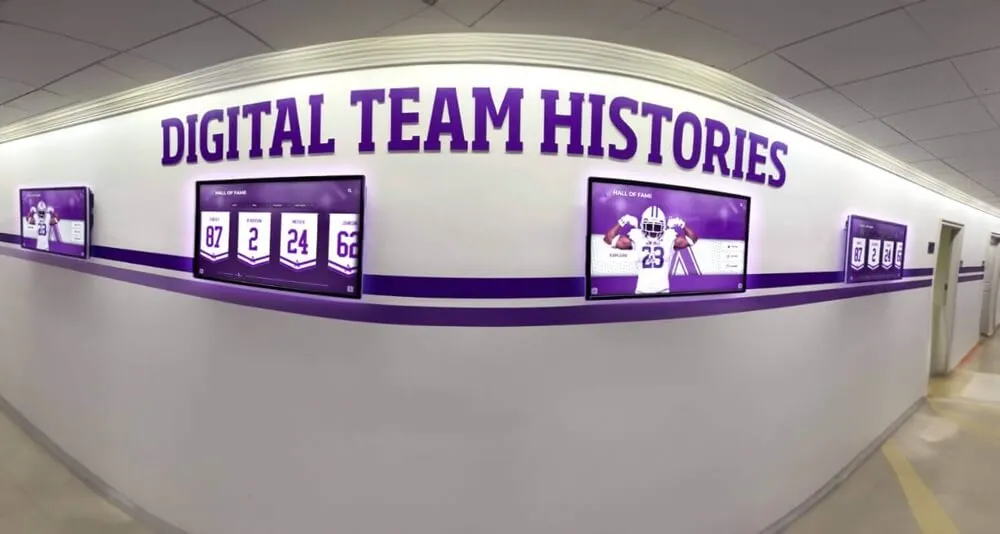
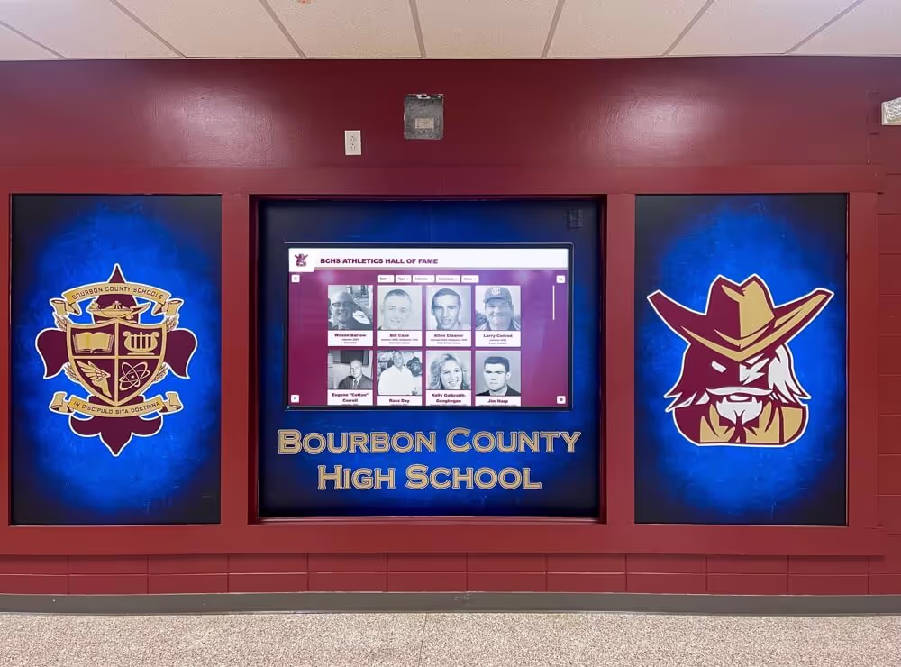
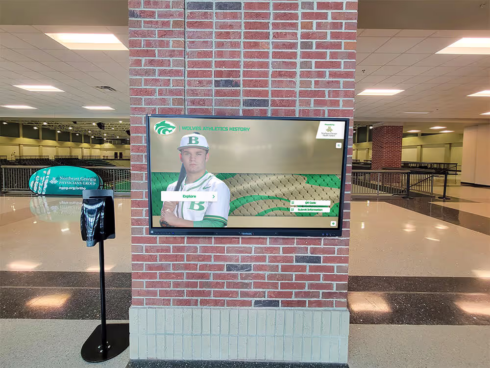
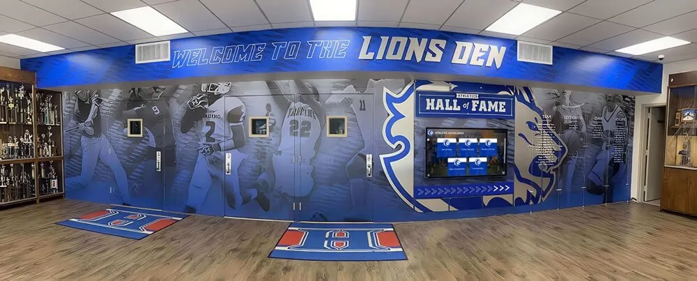
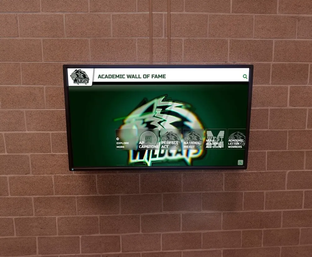
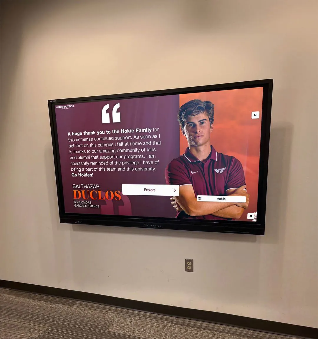
Example 1: Educational Institution Hall of Fame
Scenario: University implementing interactive alumni hall of fame kiosks in student center.
Requirements:
- 55" touchscreen displays
- Web-based content management
- No zoom to maintain interface integrity
- Accessibility mode for vision-impaired visitors
Implementation:
<!DOCTYPE html>
<html lang="en">
<head>
  <meta charset="UTF-8">
  <meta name="viewport" content="width=device-width, initial-scale=1.0, maximum-scale=1.0, user-scalable=no">
  <title>Alumni Hall of Fame</title>
  <style>
    * { touch-action: manipulation; }
    body {
      margin: 0;
      font-family: sans-serif;
      touch-action: manipulation;
    }
    .accessibility-toggle {
      position: fixed;
      bottom: 20px;
      right: 20px;
      padding: 15px 25px;
      background: #007bff;
      color: white;
      border: none;
      border-radius: 5px;
      font-size: 16px;
      cursor: pointer;
      z-index: 1000;
    }
    .accessibility-mode {
      font-size: 1.5rem !important;
      line-height: 1.8 !important;
    }
    .accessibility-mode button {
      min-height: 60px;
      font-size: 1.25rem;
    }
  </style>
</head>
<body>
  <button class="accessibility-toggle" onclick="toggleAccessibility()">
    Accessibility Mode
  </button>

  <div class="kiosk-content">
    <!-- Hall of Fame content -->
  </div>

  <script>
    // Prevent all zoom attempts
    (function() {
      document.addEventListener('gesturestart', (e) => e.preventDefault());
      document.addEventListener('gesturechange', (e) => e.preventDefault());
      document.addEventListener('gestureend', (e) => e.preventDefault());

      let lastTouchEnd = 0;
      document.addEventListener('touchend', (e) => {
        const now = Date.now();
        if (now - lastTouchEnd <= 300) e.preventDefault();
        lastTouchEnd = now;
      }, { passive: false });

      document.addEventListener('touchmove', (e) => {
        if (e.scale !== 1) e.preventDefault();
      }, { passive: false });
    })();

    // Accessibility mode toggle
    function toggleAccessibility() {
      document.body.classList.toggle('accessibility-mode');
    }
  </script>
</body>
</html>
Educational institutions deploying touchscreen halls of fame benefit from balancing zoom prevention with accessibility features.
Example 2: Museum Interactive Exhibit
Scenario: Museum deploying touchscreen kiosks for artifact exploration.
Requirements:
- iPad kiosks in Guided Access mode
- Rich multimedia content
- Scrollable content areas
- No zoom interference with custom gestures
Implementation:
<meta name="viewport" content="width=device-width, initial-scale=1.0, maximum-scale=1.0, user-scalable=no">

<style>
  * {
    touch-action: manipulation;
  }

  .exhibit-scrollable {
    touch-action: pan-y; /* Allow vertical scroll */
    overflow-y: auto;
    height: 80vh;
  }

  .exhibit-gallery {
    touch-action: pan-x; /* Allow horizontal scroll */
    overflow-x: auto;
    white-space: nowrap;
  }

  input, button {
    font-size: 16px; /* Prevent iOS input zoom */
    touch-action: manipulation;
  }
</style>

<script>
  // Comprehensive zoom prevention with scroll preservation
  document.addEventListener('touchmove', (e) => {
    // Allow scrolling on specific elements
    const scrollableElements = ['exhibit-scrollable', 'exhibit-gallery'];
    const isScrollable = scrollableElements.some(className =>
      e.target.closest(`.${className}`)
    );

    // Prevent zoom but allow scroll
    if (e.scale !== 1 && !isScrollable) {
      e.preventDefault();
    }
  }, { passive: false });
</script>
Museums implementing interactive exhibit technology balance zoom prevention with rich content exploration.
Example 3: Corporate Donor Recognition Wall
Scenario: Corporate foundation implementing touchscreen donor recognition in lobby.
Requirements:
- Windows touchscreen display
- Professional appearance
- No maintenance burden from zoomed states
- Corporate branding consistency
Implementation:
<!DOCTYPE html>
<html>
<head>
  <meta name="viewport" content="width=device-width, initial-scale=1.0, maximum-scale=1.0, user-scalable=no, interactive-widget=resizes-content">
  <title>Donor Recognition</title>
  <style>
    * {
      touch-action: manipulation;
      -ms-touch-action: manipulation; /* IE11 fallback */
    }

    body {
      margin: 0;
      padding: 0;
      overflow: hidden; /* No scroll bars */
      touch-action: manipulation;
    }

    .donor-grid {
      display: grid;
      grid-template-columns: repeat(auto-fit, minmax(300px, 1fr));
      gap: 20px;
      padding: 40px;
      touch-action: manipulation;
    }

    .donor-card {
      background: linear-gradient(135deg, #667eea 0%, #764ba2 100%);
      padding: 30px;
      border-radius: 10px;
      color: white;
      touch-action: manipulation;
      cursor: pointer;
      transition: transform 0.2s;
    }

    .donor-card:active {
      transform: scale(0.98); /* Provide touch feedback */
    }
  </style>
</head>
<body>
  <div class="donor-grid">
    <!-- Donor cards -->
  </div>

  <script>
    (function preventAllZoom() {
      // Touch gesture prevention
      ['gesturestart', 'gesturechange', 'gestureend'].forEach(event => {
        document.addEventListener(event, (e) => e.preventDefault());
      });

      // Double-tap prevention
      let lastTouchEnd = 0;
      document.addEventListener('touchend', (e) => {
        const now = Date.now();
        if (now - lastTouchEnd <= 300) e.preventDefault();
        lastTouchEnd = now;
      }, { passive: false });

      // Pinch zoom prevention
      document.addEventListener('touchmove', (e) => {
        if (e.scale !== 1) e.preventDefault();
      }, { passive: false });

      // Desktop zoom prevention (trackpad/mouse)
      document.addEventListener('wheel', (e) => {
        if (e.ctrlKey) e.preventDefault();
      }, { passive: false });

      // Keyboard shortcut prevention
      document.addEventListener('keydown', (e) => {
        if ((e.ctrlKey || e.metaKey) &&
            ['+', '-', '=', '0'].includes(e.key)) {
          e.preventDefault();
        }
      });
    })();

    // Automatic timeout reset to home screen
    let inactivityTimer;
    function resetInactivityTimer() {
      clearTimeout(inactivityTimer);
      inactivityTimer = setTimeout(() => {
        window.location.reload(); // Reset to home screen
      }, 120000); // 2 minutes
    }

    document.addEventListener('touchstart', resetInactivityTimer);
    resetInactivityTimer();
  </script>
</body>
</html>
Corporate deployments of donor recognition walls require robust zoom prevention to maintain professional presentation.
Advanced Techniques and Edge Cases
Handle sophisticated scenarios beyond basic implementations.
Conditional Zoom Control
Allow zoom in specific contexts while preventing it globally:
// Allow zoom on specific content types
const zoomAllowedElements = document.querySelectorAll('.zoom-enabled');

document.addEventListener('touchmove', (event) => {
  // Check if touch is within zoom-allowed element
  const isZoomAllowed = Array.from(zoomAllowedElements).some(element =>
    element.contains(event.target)
  );

  if (!isZoomAllowed && event.scale !== 1) {
    event.preventDefault();
  }
}, { passive: false });
Dynamic Zoom Control
Enable/disable zoom based on application state:
class ZoomController {
  constructor() {
    this.zoomEnabled = false;
    this.initEventListeners();
  }

  initEventListeners() {
    this.preventZoom = (e) => {
      if (!this.zoomEnabled && e.scale !== 1) {
        e.preventDefault();
      }
    };

    document.addEventListener('touchmove', this.preventZoom, { passive: false });
    document.addEventListener('gesturestart', this.preventZoom);
    document.addEventListener('gesturechange', this.preventZoom);
    document.addEventListener('gestureend', this.preventZoom);
  }

  enableZoom() {
    this.zoomEnabled = true;
    // Update viewport meta tag
    const viewport = document.querySelector('meta[name="viewport"]');
    viewport.setAttribute('content',
      'width=device-width, initial-scale=1.0, maximum-scale=3.0, user-scalable=yes'
    );
  }

  disableZoom() {
    this.zoomEnabled = false;
    const viewport = document.querySelector('meta[name="viewport"]');
    viewport.setAttribute('content',
      'width=device-width, initial-scale=1.0, maximum-scale=1.0, user-scalable=no'
    );
  }
}

// Usage
const zoomController = new ZoomController();

// Enable zoom for accessibility mode
document.querySelector('.accessibility-toggle').addEventListener('click', () => {
  zoomController.enableZoom();
});
iframe Zoom Prevention
Prevent zoom within embedded iframes:
<!-- Parent page -->
<iframe
  id="kiosk-iframe"
  src="content.html"
  sandbox="allow-scripts allow-same-origin"
  style="touch-action: manipulation;"
></iframe>

<script>
  // Apply zoom prevention to iframe content
  const iframe = document.getElementById('kiosk-iframe');
  iframe.addEventListener('load', () => {
    const iframeDoc = iframe.contentDocument || iframe.contentWindow.document;

    // Add viewport meta to iframe
    const meta = iframeDoc.createElement('meta');
    meta.name = 'viewport';
    meta.content = 'width=device-width, initial-scale=1.0, maximum-scale=1.0, user-scalable=no';
    iframeDoc.head.appendChild(meta);

    // Apply touch-action CSS
    const style = iframeDoc.createElement('style');
    style.textContent = '* { touch-action: manipulation; }';
    iframeDoc.head.appendChild(style);
  });
</script>
Progressive Web App (PWA) Considerations
PWAs installed to home screen have different zoom behaviors:
{
  "name": "Kiosk Application",
  "display": "standalone",
  "orientation": "landscape",
  "start_url": "/",
  "scope": "/",
  "theme_color": "#000000",
  "background_color": "#ffffff",
  "icons": [...],
  "prefer_related_applications": false
}
<!-- In your HTML head -->
<meta name="apple-mobile-web-app-capable" content="yes">
<meta name="apple-mobile-web-app-status-bar-style" content="black-translucent">
<meta name="mobile-web-app-capable" content="yes">
PWAs in standalone mode behave more like native apps, where zoom prevention is generally more reliable. Organizations building DIY touchscreen kiosk solutions can leverage PWA capabilities for improved zoom control.
Conclusion: Implementing Bulletproof Zoom Prevention
Disabling pinch-to-zoom for touchscreen kiosk deployments requires a multi-layered approach combining HTML viewport configuration, CSS touch-action properties, and JavaScript event prevention. The most reliable implementations use all three methods simultaneously, ensuring comprehensive coverage across diverse browsers, operating systems, and hardware configurations.
The Recommended Implementation Stack
For production kiosk deployments, implement this complete solution:
1. HTML Viewport Meta Tag (Primary):
<meta name="viewport" content="width=device-width, initial-scale=1.0, maximum-scale=1.0, user-scalable=no, interactive-widget=resizes-content">
2. CSS touch-action (Secondary):
* {
  touch-action: manipulation;
}
3. JavaScript Event Prevention (Tertiary):
(function() {
  document.addEventListener('gesturestart', (e) => e.preventDefault());
  document.addEventListener('gesturechange', (e) => e.preventDefault());
  document.addEventListener('gestureend', (e) => e.preventDefault());

  let lastTouchEnd = 0;
  document.addEventListener('touchend', (e) => {
    const now = Date.now();
    if (now - lastTouchEnd <= 300) e.preventDefault();
    lastTouchEnd = now;
  }, { passive: false });

  document.addEventListener('touchmove', (e) => {
    if (e.scale !== 1) e.preventDefault();
  }, { passive: false });
})();
Beyond Zoom Prevention
Remember that zoom control is one component of comprehensive kiosk software design. Professional kiosk deployments also require:
- System-level lockdown: Kiosk mode browsers, OS gesture disabling
- Security hardening: Network restrictions, browser lockdown, system updates
- Content management: Easy updates without disrupting operations
- Analytics and monitoring: Track usage patterns and detect issues
- Accessibility features: Alternative solutions meeting WCAG standards
- Maintenance protocols: Automated resets, remote management, health monitoring
Organizations implementing touchscreen kiosks at scale benefit from comprehensive platforms like Rocket Alumni Solutions that handle zoom prevention alongside complete kiosk management, content delivery, and security features purpose-built for public interactive displays.
Whether you’re deploying a single kiosk or managing hundreds of interactive displays across multiple locations, the techniques covered in this guide provide the technical foundation for reliable, professional touchscreen experiences free from disruptive zoom behaviors.