

Designing a touchscreen experience that truly engages users requires understanding the fundamental differences between traditional interfaces and touch-based interaction. Research consistently demonstrates that successful touchscreen experiences prioritize immediate feedback, intuitive gestures, appropriate target sizing, and content architecture that anticipates user behavior. In environments ranging from educational institutions to corporate recognition displays, the quality of touchscreen design directly determines whether users engage deeply or abandon interactions within seconds.
This comprehensive guide explores the principles, strategies, and best practices for creating touchscreen experiences that maximize user engagement and satisfaction. Whether you're implementing interactive displays in schools, museums, retail environments, or institutional settings, understanding how to design for touch interaction ensures your investment delivers measurable results through sustained user engagement.
Why Touchscreen User Experience Design Demands Specialized Approach
Before examining specific design techniques, understanding why touchscreen interfaces require fundamentally different approaches than traditional mouse-and-keyboard or passive display designs helps frame appropriate priorities throughout your design process.
The Fundamental Differences of Touch Interaction
Touch interfaces introduce unique constraints and opportunities that distinguish them from other interaction paradigms.
Direct Manipulation Creates Higher Expectations
Unlike mouse-based interfaces where users manipulate a pointer as an intermediary tool, touchscreens enable direct manipulation—users touch precisely what they want to interact with. This directness creates expectations for immediate, proportional responses. When you drag content with your finger, you expect it to move exactly as your finger moves, at the same speed, with zero delay.
According to research on touchscreen response times, humans perceive delays exceeding 100 milliseconds as laggy, while delays beyond 300 milliseconds cause measurable drops in engagement and task completion. This creates a fundamental design constraint: every interaction must provide feedback within 100ms or users perceive the system as unresponsive.
Fingers Are Not Cursors
The average adult fingertip measures approximately 10-12mm in diameter, substantially larger than pixel-precise mouse cursors. This creates two critical design implications:
First, touch targets must be significantly larger than traditional interface elements. Research demonstrates that targets below 44x44 pixels (approximately 7mm) significantly increase error rates, with users missing intended targets up to 40% more frequently than with properly sized elements.
Second, fingers obscure what they’re touching. Unlike cursors that hover above content, fingers cover portions of the screen during interaction. This demands thoughtful placement of feedback, tooltips, and contextual information above or beside touch points rather than directly underneath them.

Physical Ergonomics Matter
Touchscreen interaction involves physical effort absent from other interfaces. Reaching across large displays, maintaining arm positions during extended interactions, and repeatedly tapping can create fatigue that limits engagement duration.
Research on large touchscreen ergonomics reveals that users find content above 60 inches from the ground difficult or impossible to reach comfortably, while content below 36 inches requires uncomfortable bending. For displays mounted vertically, the comfortable interaction zone typically spans waist to shoulder height for average adults—a constraint that doesn’t exist for mouse-based interfaces.
Understanding these fundamental differences ensures designs accommodate rather than fight against the realities of touch interaction.
Context of Use Shapes Design Priorities
Touchscreen displays serve diverse contexts, each creating specific design requirements that influence appropriate approaches.
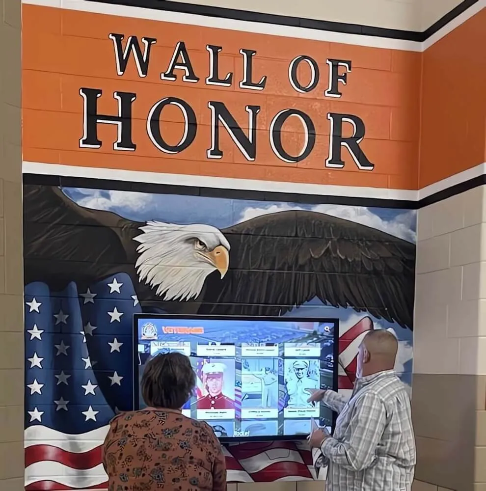
Public Kiosks and High-Traffic Environments
Interactive displays in lobbies, hallways, and public spaces face unique challenges. Users are often first-time users with no training, encountering displays during brief windows between other activities. They may be distracted, rushed, or uncertain whether the display is interactive.
These contexts demand designs that:
- Clearly communicate interactivity through visual invitation (“Tap to Explore”)
- Provide obvious starting points that guide initial interaction
- Support task completion in under 60 seconds for primary use cases
- Recover gracefully from abandonment with automatic reset to attract mode
- Function intuitively without instructions or explanatory text
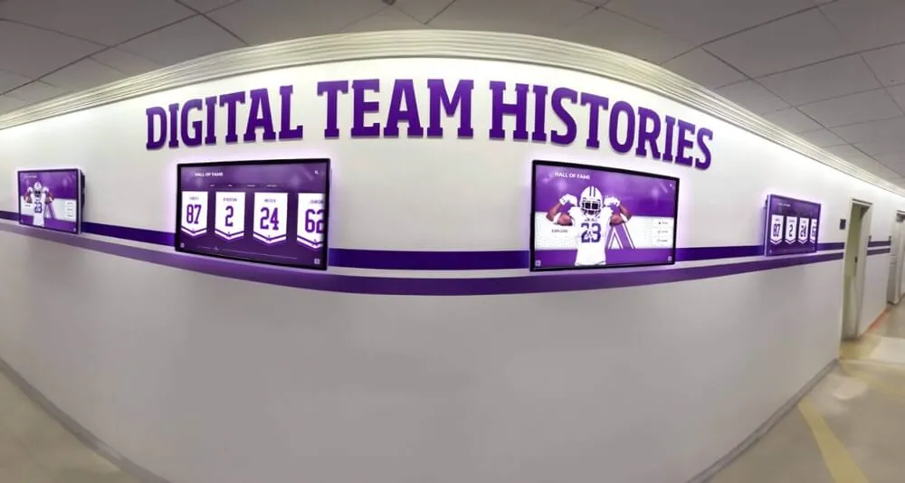
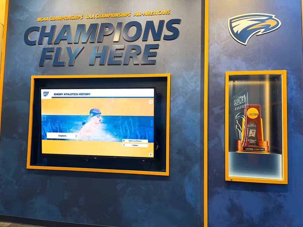
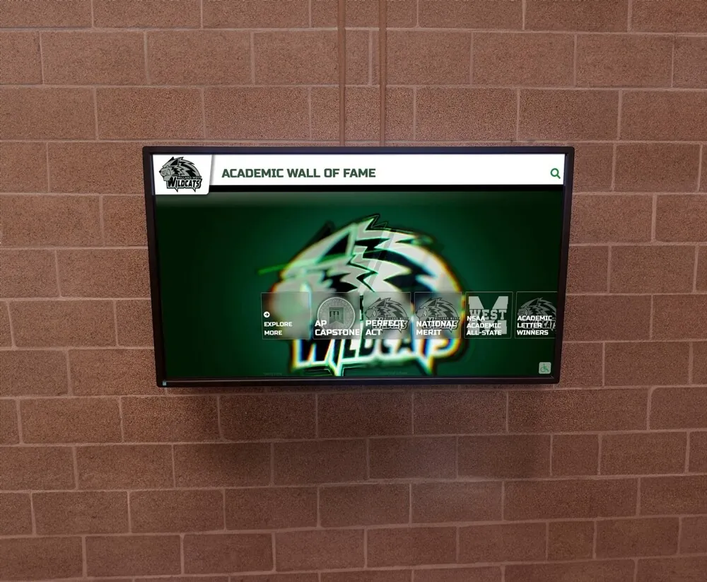
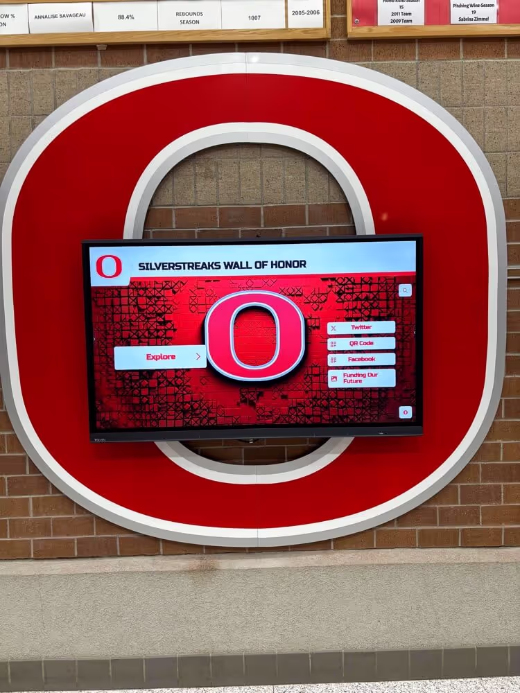
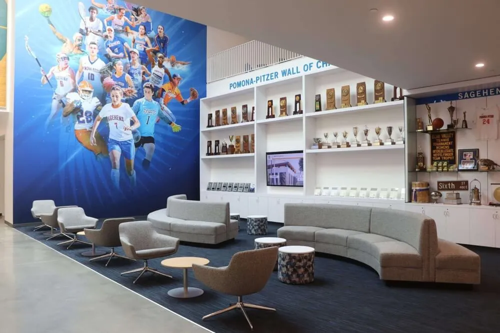
Schools implementing interactive touchscreen displays for student recognition report that displays meeting these criteria achieve 3-5x higher engagement than those requiring users to discover functionality through trial and error.
Extended Exploration Experiences
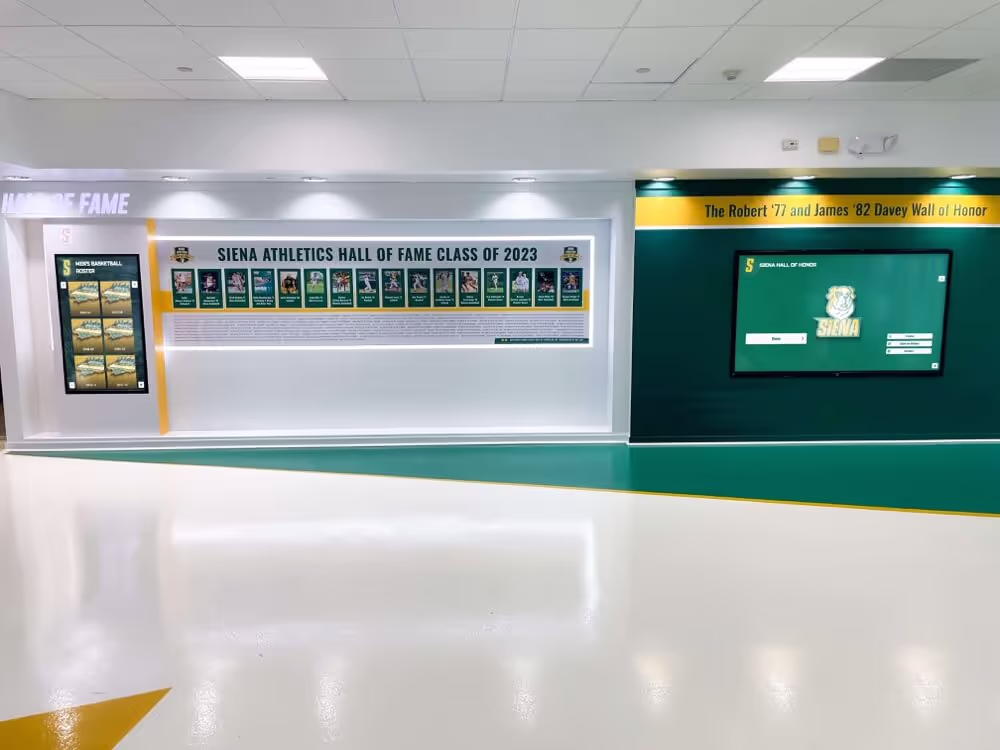
Museum exhibits, educational content, and comprehensive recognition displays serve users willing to invest several minutes exploring detailed content. These contexts allow more complex navigation, deeper content hierarchies, and sophisticated features.
However, even exploratory experiences must provide clear wayfinding, avoid cognitive overload at each decision point, and maintain responsive feedback throughout extended sessions. Digital recognition systems that balance depth with discoverability achieve average session durations of 3-7 minutes versus under 30 seconds for poorly structured alternatives.
Core Principles of Engaging Touchscreen Design
Successful touchscreen experiences consistently implement fundamental design principles that accommodate the unique characteristics of touch interaction while maximizing user engagement.
Principle 1: Design for Fingers, Not Pixels
Every element users interact with must accommodate the physical realities of fingertip-based interaction.
Minimum Touch Target Sizing
Research on touch target sizing establishes clear guidelines:
- Minimum target size: 44x44 pixels (approximately 7mm) for any tappable element
- Comfortable target size: 48x48 pixels (approximately 9mm) for frequently used controls
- Optimal target size: 57x57 pixels (approximately 10mm) for primary actions
Increasing touch targets from minimum to optimal sizes reduces error rates by up to 40% while improving task completion speed by 25%. For educational displays where users range from young children to elderly community members, larger targets approaching 10-12mm create more inclusive experiences.
Adequate Spacing Between Targets
Adjacent touch targets require sufficient spacing to prevent accidental activation of neighboring elements. Minimum spacing of 8 pixels between interactive elements reduces mis-tap rates, while 16+ pixel spacing provides comfortable margins that further improve accuracy.
Consider the common pattern of a list where each item is tappable. Insufficient spacing between list items causes users to accidentally tap wrong items, creating frustration and requiring corrective actions that increase interaction time and cognitive load.
Touch Target Shape Considerations
While square targets work effectively, rectangular targets should maintain minimum dimensions in both axes. A 100x30 pixel button may seem large enough horizontally, but the 30-pixel vertical dimension falls below minimum comfortable targets, increasing missed taps.
For buttons containing text, ensure the entire button area is tappable, not just the text itself. Users expect that touching anywhere within the visual button boundary activates the control.
Principle 2: Provide Immediate, Obvious Feedback
Every touch interaction must produce instant visual confirmation that the system detected and is responding to user input.
The 50 Millisecond Rule
Visual feedback acknowledging touch must appear within 50 milliseconds of initial contact. This immediate acknowledgment satisfies psychological needs for cause-and-effect confirmation even when completing the requested action requires additional time.
Effective immediate feedback includes:
- Button state changes: Visual highlight, color shift, or shadow adjustment
- Ripple effects: Animated circular wave emanating from touch point
- Press animations: Subtle scale reduction creating impression of physical button press
- Sound effects: Brief audio confirmation (when appropriate for environment)
The specific visual treatment matters less than the timing—any visible change within 50ms dramatically improves perceived responsiveness compared to systems that only show results after completing operations.
Progressive Disclosure During Longer Operations
When operations require longer than 100 milliseconds—loading content, processing searches, rendering complex layouts—explicit progress communication maintains user confidence.
Effective progress indicators include:
- Skeleton screens: Layouts showing structure of loading content with animated placeholders
- Progress bars: For operations with measurable completion percentage
- Loading animations: Spinners or animated icons indicating active processing
- Incremental results: Displaying partial results while continuing to load additional content
Research on perceived performance demonstrates that users tolerate substantially longer delays when systems clearly communicate progress versus identical delays with no status feedback. A 500ms content load with a visible progress indicator feels more responsive than a 300ms load with no communication.
Principle 3: Support Natural Gestures Intuitively
Modern users expect touchscreens to support standard gestures learned from smartphones and tablets. Implementing familiar gestures reduces learning curves while creating more fluid, natural experiences.
Essential Gesture Support
Minimum gesture support for engaging touchscreen experiences includes:
- Tap: Single finger touch for activation, selection, and navigation
- Scroll/Swipe: Single finger drag for vertical or horizontal content movement
- Pinch/Spread: Two-finger gesture for zooming in and out of zoomable content
- Pan: Drag gesture for moving around within zoomed or panned content
Implementing these standard gestures ensures users can transfer knowledge from familiar devices rather than learning display-specific interaction methods.
Gesture Discovery and Affordances
While many users understand standard gestures, explicit visual cues help ensure all users discover available interactions:
- Scroll indicators: Visual cues showing content extends beyond current view
- Zoom indicators: Icons or instructional text explaining pinch-to-zoom capability
- Swipeable content cues: Partial visibility of off-screen content suggesting swipe gestures
- Animation demonstrations: Subtle automated animations showing available gestures during idle states
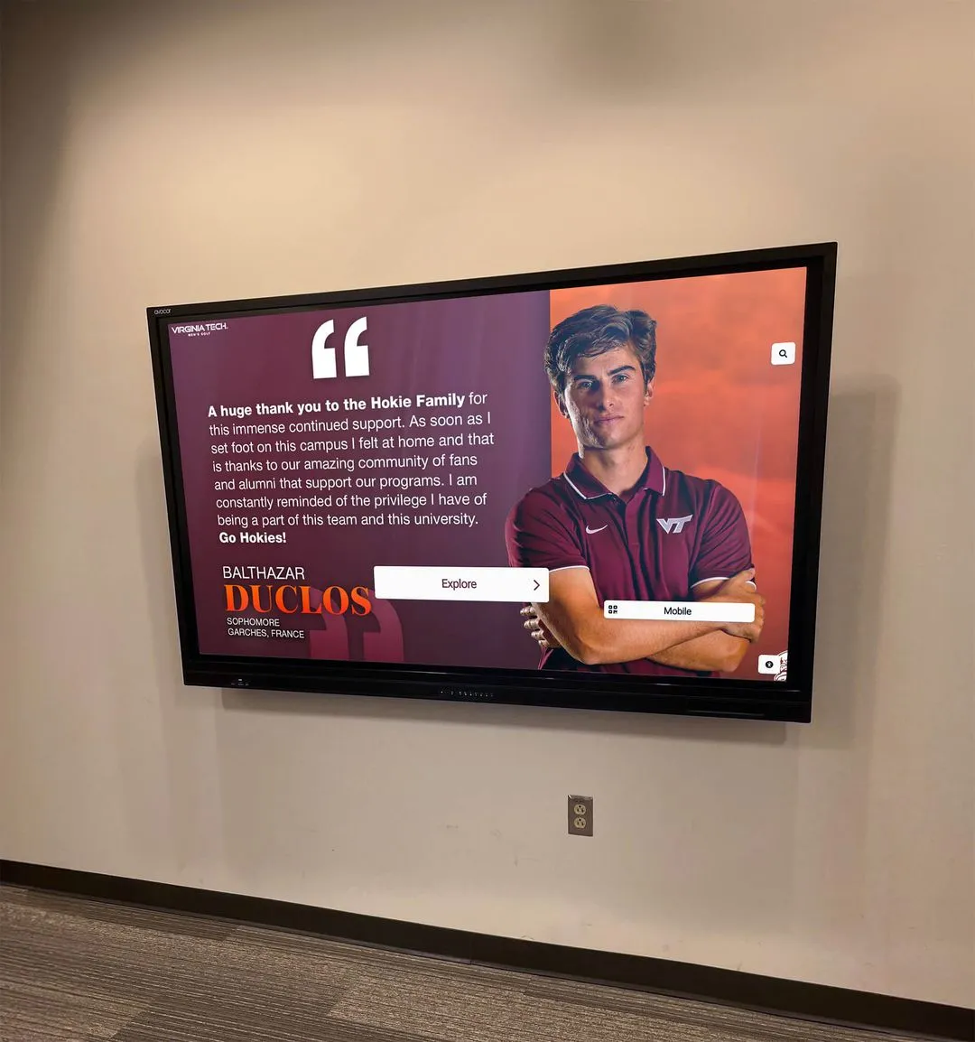
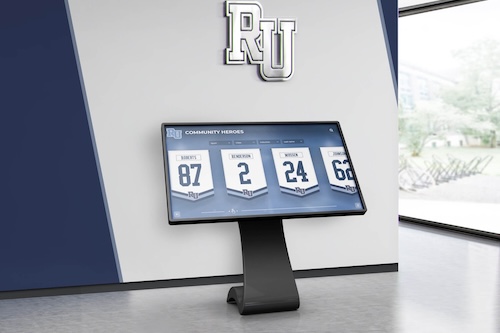
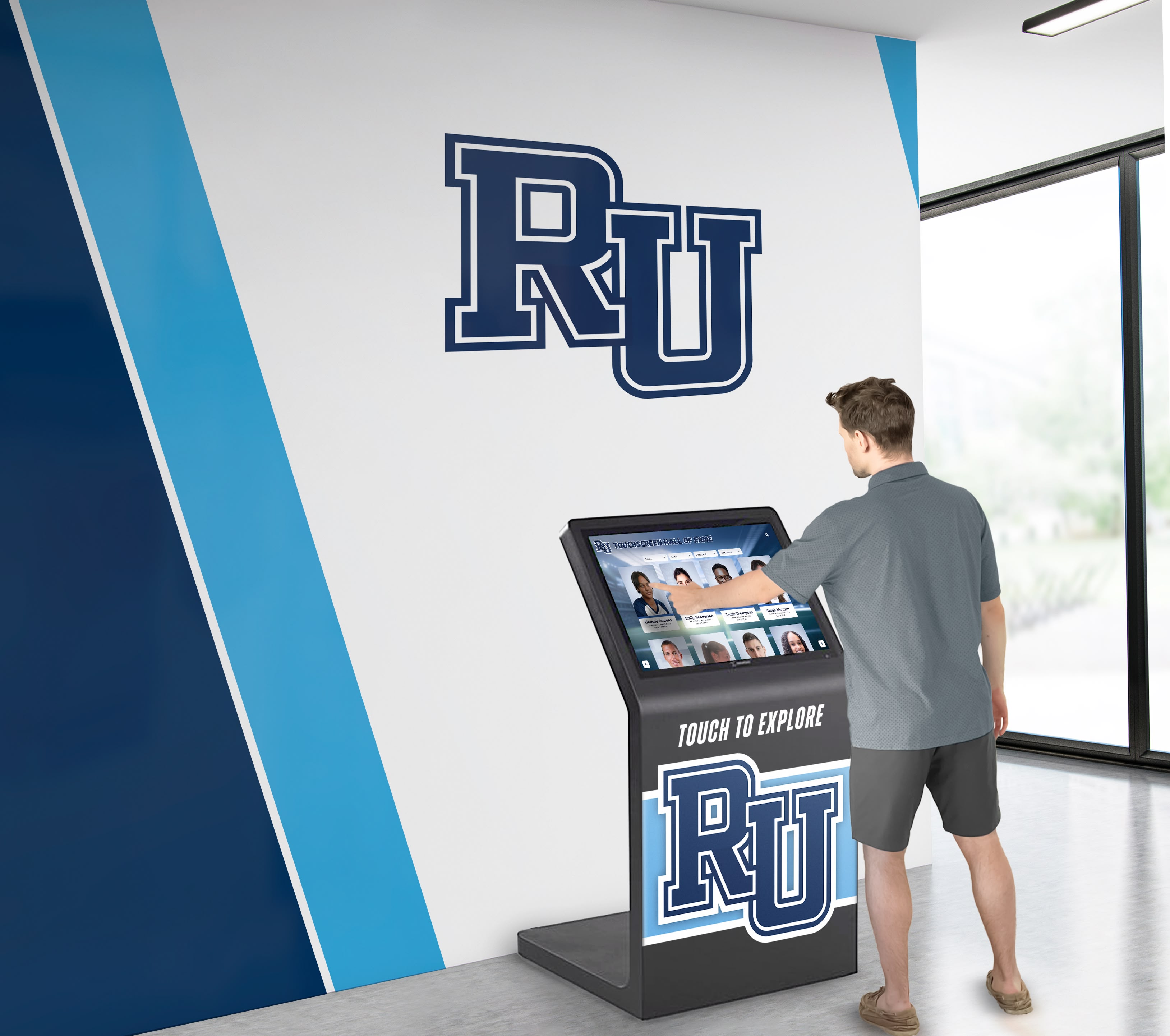
Solutions like Rocket Alumni Solutions incorporate intuitive gesture design with clear affordances, ensuring both experienced and novice users engage successfully with recognition displays.
Principle 4: Simplify Navigation and Minimize Cognitive Load
Touchscreen interfaces should minimize the mental effort required to understand options and complete tasks.
The Five-Element Rule
Research on decision-making demonstrates that limiting choices to five or fewer actionable items per screen reduces cognitive load, leading to approximately 25% higher task completion rates compared to screens presenting 7+ simultaneous choices.
This doesn’t mean limiting total content to five items, but rather organizing information hierarchies so users face no more than five decision points at any navigation level. Large content libraries should be organized through progressive disclosure—broad categories leading to subcategories, then specific items—rather than presenting overwhelming arrays of simultaneous choices.
Clear Visual Hierarchy
Visual design should guide users to the most important information and actions first through:
- Size differentiation: Primary actions larger than secondary options
- Color emphasis: Important elements using contrast and brand colors
- Positioning: Critical content and navigation in prime screen real estate
- White space: Generous spacing around important elements draws attention
- Typography: Hierarchy of heading sizes guiding information scanning
Effective visual hierarchy enables users to understand screen organization within 2-3 seconds, immediately identifying how to proceed toward their goals.
Persistent Wayfinding Elements
Users should never feel lost or uncertain how to return to familiar states. Essential wayfinding includes:
- Home button: Always-accessible control returning to the main menu or start screen
- Back button: Allowing users to undo navigation and return to previous screens
- Breadcrumb trails: For deeper hierarchies, visual indication of current location within structure
- Consistent navigation placement: Standard locations for navigation controls across all screens
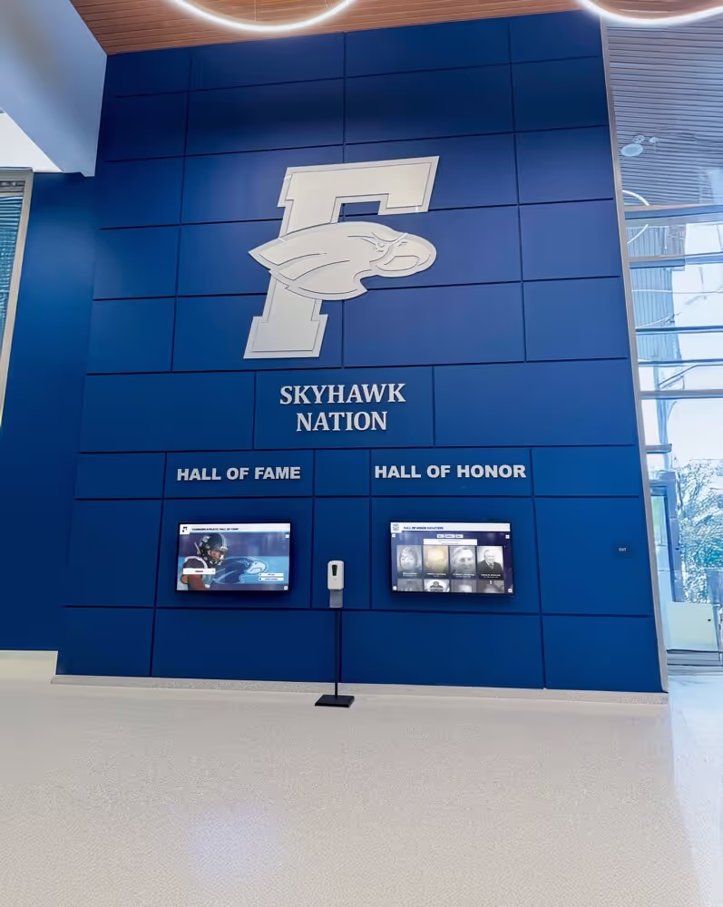
Educational institutions implementing interactive recognition displays report that persistent wayfinding elements dramatically increase exploration depth, with users confidently navigating to 4-6 screens versus 1-2 screens in designs lacking clear navigation.
Principle 5: Optimize for Physical Ergonomics
The physical demands of touchscreen interaction significantly impact engagement duration and user satisfaction.
The Comfortable Zone
For large vertical touchscreens, research establishes optimal interaction zones:
- Primary zone (36-60 inches height): Comfortable reach for most adults and children
- Secondary zone (24-36 inches): Accessible but requires bending for adults
- Tertiary zone (60-72 inches): Requires reaching for most users, quickly fatiguing
Place all critical navigation, primary content, and frequently accessed features within the 36-60 inch zone. Reserve secondary and tertiary zones for occasional-use features or passive content that doesn’t require interaction.
For horizontal or angled displays, similar principles apply—keep interactive elements within comfortable reach considering the display mounting position and expected user postures.
Minimize Repetitive Actions
Gestures requiring repeated physical motion create fatigue that limits engagement. Design patterns that minimize repetitive actions include:
- Efficient scrolling: Present enough content per screen to reduce scroll requirements
- Jump navigation: Provide shortcuts to jump multiple levels rather than requiring incremental navigation
- Bookmarking: Allow users to save locations for quick return without retracing navigation paths
- Smart defaults: Pre-select common choices to reduce required taps
These optimizations become particularly important for educational touchscreen displays where session durations may extend several minutes as students explore comprehensive achievement histories.
Content Architecture for Touchscreen Engagement
How content is organized and structured fundamentally impacts whether users successfully find desired information and discover valuable content they weren’t initially seeking.
Shallow, Broad Hierarchies Over Deep, Narrow Structures
Information architecture research demonstrates that users prefer broad, shallow hierarchies with many top-level categories leading directly to content versus narrow, deep hierarchies requiring multiple navigation levels to reach specific items.
Optimal Structure
For most touchscreen applications, organize content in 2-3 levels maximum:
- Level 1: Broad categories (5-8 options) representing major content divisions
- Level 2: Subcategories or content groupings within each broad category
- Level 3: Specific content items or detailed information
This structure enables users to reach any specific content through 2-3 taps, maintaining engagement momentum while preventing the disorientation that occurs when users navigate through 5+ levels of hierarchy.
Category Design Considerations
Top-level categories should be:
- Mutually exclusive: Clear boundaries between categories minimize confusion about where to find specific content
- Comprehensively exhaustive: All content fits logically into available categories
- Intuitively labeled: Category names match how users think about content, not internal organizational structures
- Visually distinctive: Icons or imagery helping users quickly distinguish categories
Progressive Disclosure Reveals Complexity Gradually
Rather than presenting all available information and features simultaneously, progressive disclosure reveals capabilities gradually as users demonstrate interest and engagement.
Starting Simple
Initial screens should present essential information and primary actions only. Additional details, advanced features, and optional content remain accessible through clear pathways but don’t overwhelm users during initial orientation.
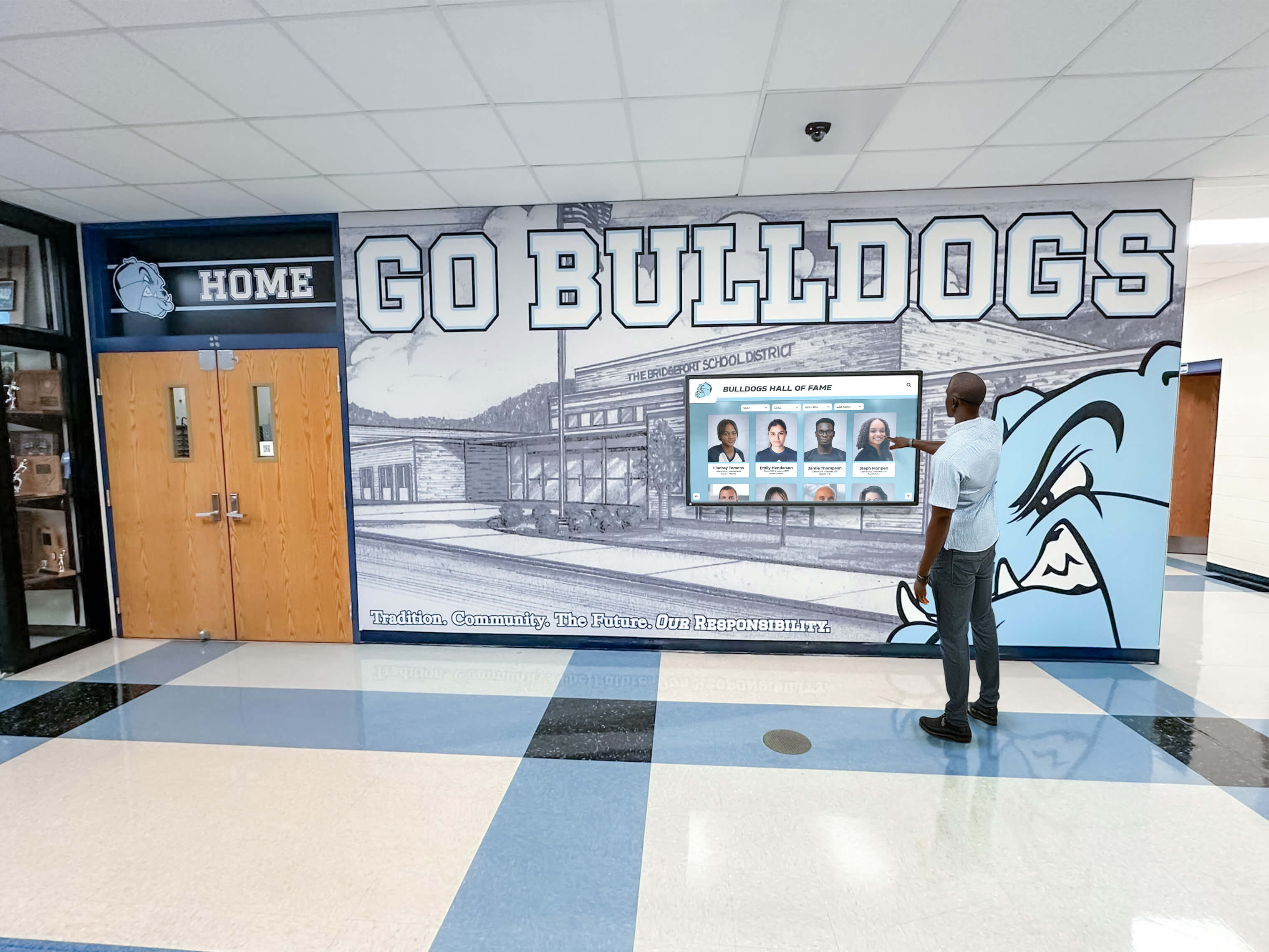
For example, a student profile in a recognition display might initially show:
- Name and photo
- Primary achievement being recognized
- Year and category
- Simple navigation to related profiles or back to search
Tapping the profile reveals additional details:
- Complete biographical information
- Multiple achievement records
- Related content and connections
- Media galleries and detailed narratives
This approach serves casual browsers who want quick overview information while enabling interested users to access comprehensive details.
Obvious Pathways to More Information
Progressive disclosure only works when users understand how to access additional details. Clear affordances include:
- Expand arrows: Visual indicators that elements contain additional information
- “Tap for details” prompts: Explicit instructions guiding discovery
- Partial content preview: Showing beginnings of additional content that’s accessible through interaction
- Consistent interaction patterns: Similar gestures revealing more information throughout the interface
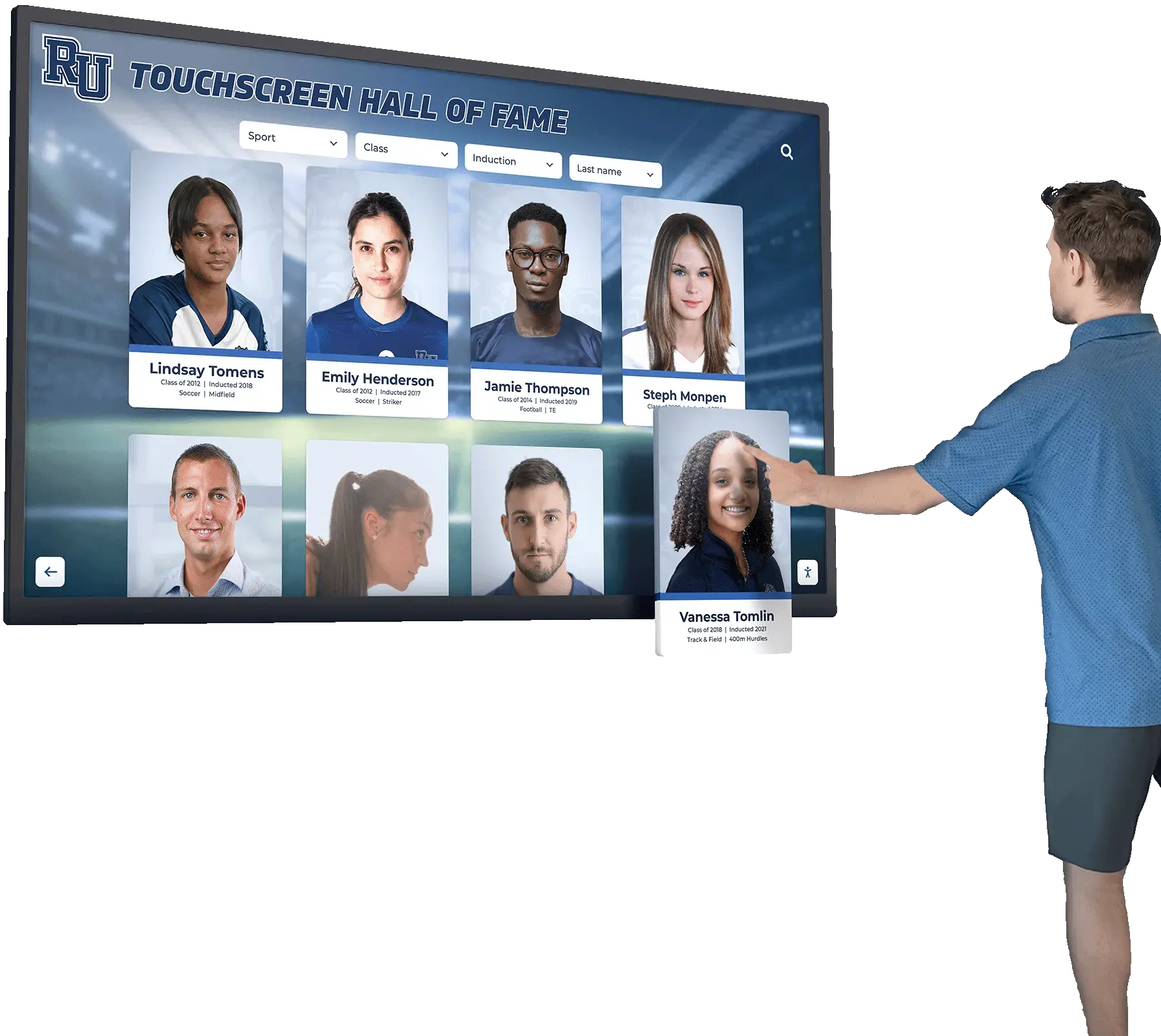
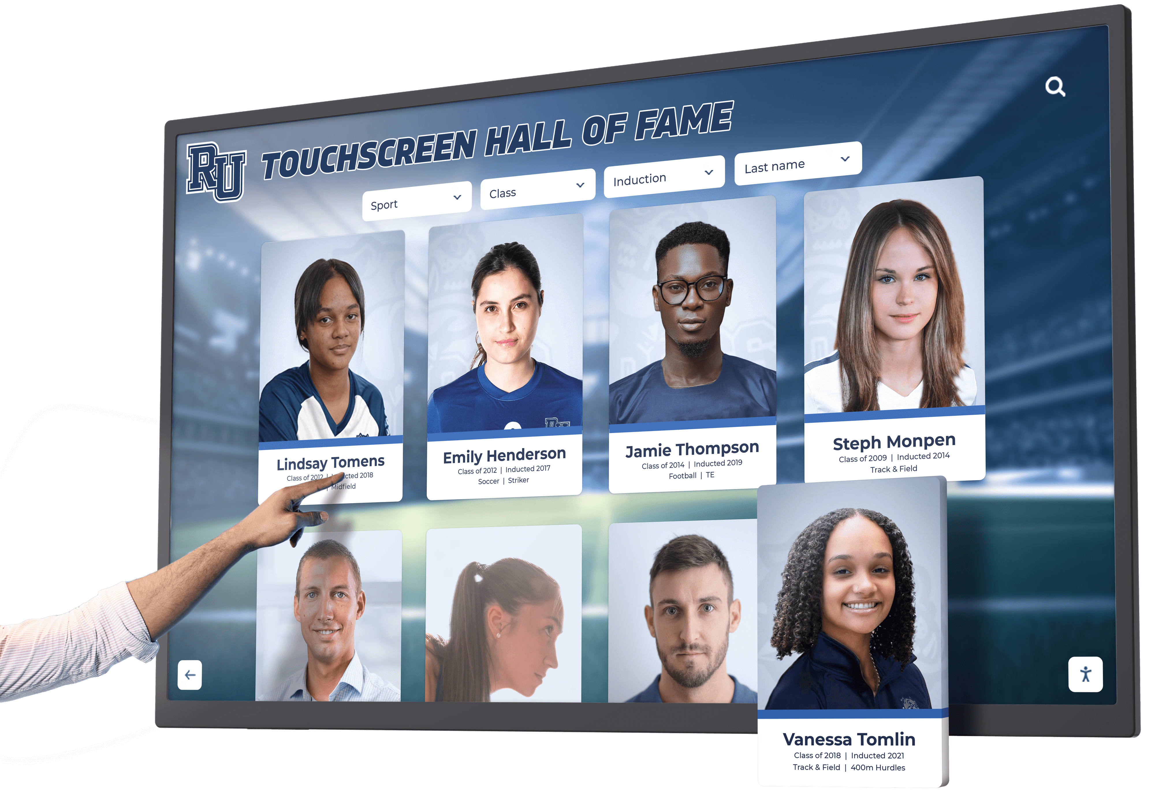
Search and Filter as Primary Navigation
For displays containing hundreds or thousands of content items, browsing alone proves insufficient. Robust search and filtering capabilities become essential navigation tools.
Effective Search Implementation
Touchscreen search requires careful design to accommodate on-screen keyboard limitations:
- Large keyboard targets: On-screen keyboard keys matching minimum 44px target guidelines
- Autocomplete suggestions: Displaying likely matches as users type reduces required input
- Voice input option: Speech-to-text reduces typing burden on touchscreens
- Recent searches: Quick access to previously entered queries
- Search within results: Allowing refinement of initial result sets without starting over
Intuitive Filtering
Filter controls should enable users to narrow large content sets through easily understood criteria:
- Visual filter options: Large, clear buttons for filter categories
- Multi-select capability: Applying multiple filter criteria simultaneously
- Active filter indicators: Clear display of currently applied filters
- One-tap filter clearing: Quick removal of filters to return to full content set
Institutions implementing digital hall of fame displays report that robust search and filtering increase average content items viewed per session by 200-300% compared to browse-only navigation.
Visual Design Strategies for Maximum Engagement
Beyond interaction design and information architecture, visual design choices significantly impact how engaging and effective touchscreen experiences become.
High Contrast and Readability
Touchscreen displays often exist in environments with variable lighting conditions, viewing angles, and ambient distractions. Visual design must overcome these challenges.
Color Contrast Requirements
Text and interface elements require sufficient contrast against backgrounds for readability:
- Minimum contrast ratio: 4.5:1 for normal text (WCAG AA standard)
- Preferred contrast ratio: 7:1 for optimal readability (WCAG AAA standard)
- Large text flexibility: Headings and large interface elements can use slightly lower contrast (3:1) while remaining readable
High contrast benefits all users but particularly assists users with vision impairments, older adults, and anyone viewing displays in bright ambient lighting.
Typography Considerations
Text rendered on touchscreens should prioritize readability:
- Minimum body text size: 16-18px for content meant to be read
- Heading hierarchy: Clear size differentiation between heading levels
- Line spacing: 1.5x leading for body text improves scanning and comprehension
- Line length: 50-75 characters per line optimizes reading speed
- Sans-serif fonts: Generally more readable on screens than serif alternatives
Color Beyond Contrast
While contrast ensures readability, thoughtful color application supports navigation and engagement:
- Brand consistency: Using organizational colors creates cohesive experiences
- Category differentiation: Consistent color coding helps users navigate content areas
- Interactive element identification: Distinct colors for buttons and interactive elements
- State communication: Color changes indicating selection, active states, and disabled controls
Animation and Transitions
Thoughtfully implemented animations enhance touchscreen experiences by communicating system state, guiding attention, and creating perceptions of fluid responsiveness.
Effective Animation Principles
Research on interface animation establishes guidelines for engagement without annoyance:
- Duration: Most transitions should complete in 150-300ms—long enough to perceive but brief enough not to delay
- Easing curves: Start fast and decelerate smoothly rather than linear motion
- Purpose: Every animation should communicate information or guide attention, not merely decorate
- Performance: Maintain 60fps throughout animations or eliminate them during performance constraints
Common Animation Applications
Effective touchscreen animations include:
- Page transitions: Sliding, fading, or zooming between screens maintains spatial context
- Element appearance: New content fading in or sliding into place rather than appearing instantly
- Loading states: Animated placeholders or progress indicators during content loading
- Touch feedback: Subtle scale or highlight animations confirming touch detection
- Attention direction: Motion guiding user focus to important information or next steps
Avoid excessive or overly complex animations that feel gimmicky or delay interaction—animation should enhance rather than impede user goals.
Imagery and Media Integration
Visual content significantly impacts engagement, with research showing that pages including relevant imagery receive 94% more views than text-only alternatives.
Strategic Image Use
Effective imagery in touchscreen interfaces:
- Illustrates content: Photos and graphics helping users understand options and content
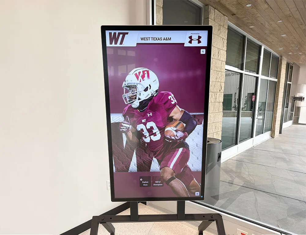
- Creates emotional connection: People photography particularly engaging for recognition displays
- Supports navigation: Visual category representations aiding quick scanning
- Fills screen real estate: Appropriate use of imagery creates visual interest on large displays
Image Quality Considerations
Touchscreen displays demand high-quality media assets:
- Resolution: Images should display sharply at intended sizes without pixelation
- Aspect ratio: Crop images appropriately for display dimensions rather than stretching
- Load optimization: Progressive loading displays low-resolution placeholders while high-res versions load
- File size balance: Compress images to minimize load times while maintaining quality
Video Content Integration
Video creates highly engaging touchscreen experiences when implemented effectively:
- Autoplay muted: Ambient video playing automatically when users approach attracts attention
- Tap for sound: Users can activate audio for videos they’re interested in viewing
- Clear video controls: Play, pause, and scrubbing controls sized for touch interaction
- Preview thumbnails: Static image previews before video loads improves perceived performance
Educational institutions implementing video-enhanced recognition displays report that video content increases average session duration by 40-60% compared to static photo-only alternatives.
Accessibility and Inclusive Design Practices
Touchscreen experiences should accommodate diverse users including children, elderly adults, individuals with disabilities, and users with varying technology experience.
Physical Accessibility
Height and Reach Considerations
As previously discussed, mounting heights and interaction zones significantly impact who can successfully use touchscreen displays. Beyond optimal placement, consider:
- Multiple interaction heights: For permanent installations, consider dual displays or angled mounting serving different height users
- Seated accessibility: Ensure at least primary functions remain accessible to wheelchair users
- Child accommodation: Recognize that elementary-age children have shorter reach than adults
Motor Control Accommodations
Users with motor control challenges benefit from:
- Larger touch targets: Exceeding minimum sizes with 12-15mm targets
- Increased spacing: Extra padding between interactive elements reduces mis-taps
- Simplified gestures: Minimize reliance on complex multi-touch or precise gestures
- Adjustable timing: Configurable touch-and-hold durations and double-tap speeds
Sensory Accessibility
Visual Accommodations
Support users with vision impairments through:
- High contrast modes: Alternative color schemes with enhanced contrast
- Adjustable text size: User-controlled text scaling without breaking layouts
- Screen reader compatibility: Proper semantic markup for assistive technologies
- Audio descriptions: Spoken alternatives to visual information
Audio Alternatives
Recognize that many public touchscreen environments are noisy or require quiet:
- Never require audio: Critical information should always have visual alternatives
- Closed captions: Text alternatives for any video or audio content
- Visual feedback: Every audio cue should have corresponding visual indication
Cognitive Accessibility
Clear, Simple Language
Write interface text at accessible reading levels:
- Short sentences: Avoid complex grammatical structures
- Common vocabulary: Use familiar words rather than jargon or technical terms
- Active voice: Direct, active phrasing improves comprehension
- Helpful instructions: Clear guidance without condescension
Consistent Patterns
Maintain consistent interaction patterns throughout:
- Predictable navigation: Similar actions produce similar results across all screens
- Consistent element positioning: Place common controls in same locations
- Familiar conventions: Follow standard patterns users know from other touchscreen devices
Error Prevention and Recovery
Design interfaces that prevent errors and enable easy recovery:
- Confirmation for destructive actions: Verify before irreversible operations
- Clear error messages: Explain what went wrong and how to fix it
- Undo capability: Allow users to reverse accidental actions
- Forgiving selection: Accept touches near intended targets when intent is clear
Environmental Design Considerations
The physical environment surrounding touchscreen displays significantly impacts user engagement and experience quality.
Lighting and Glare Management
Touchscreen visibility depends heavily on ambient lighting conditions.
Display Brightness
Commercial displays offer various brightness specifications:
- Standard brightness (300-350 nits): Adequate for controlled indoor lighting
- High brightness (500-700 nits): Necessary for bright lobbies or areas with natural light
- Outdoor brightness (1000+ nits): Required for outdoor installations or window-adjacent locations
Insufficient brightness creates displays that appear washed out and difficult to read, significantly harming engagement.
Glare Reduction Strategies
Beyond display brightness, environmental design reduces glare:
- Anti-reflective coatings: Specialized screen treatments minimize reflections
- Tilted mounting: Angling displays slightly reduces direct overhead light reflection
- Recessed installation: Setting displays slightly into walls removes them from direct light paths
- Controlled lighting: Positioning displays away from windows or using adjustable lighting
Attract Mode and Passive Content
When not actively used, touchscreen displays should attract attention and communicate interactivity.
Effective Attract Modes
Idle displays should show:
- Motion and animation: Movement attracts attention in peripheral vision
- Featured content: Compelling preview of available content and capabilities
- Clear call-to-action: Explicit invitation to touch and interact
- Instructional preview: Brief demonstration of basic interaction gestures
Research on kiosk engagement reveals that effective attract modes increase spontaneous user initiation by 40-60% compared to static idle screens.
Proximity Activation
Advanced implementations use sensors to detect approaching users:
- Motion detection: Transition from passive attract mode to active interface as users approach
- Proximity-based brightness: Adjust display brightness based on ambient light as users arrive
- Welcome animations: Greeting animations drawing attention and inviting interaction
Maintenance and Durability
Touchscreen displays in high-traffic environments require design consideration for long-term operation.
Touch Technology Selection
Different touch sensing technologies offer varying durability characteristics:
- Capacitive touch: Superior durability with sealed glass surfaces resistant to wear
- Infrared touch: Excellent reliability with no screen-surface components to wear out
- Resistive touch: Flexible surfaces wear out quickly, typically requiring replacement after 2-3 years
For institutional installations expecting years of heavy use, capacitive or infrared technologies prove most reliable. Learn more about selecting appropriate touchscreen technology for different environments and use cases.
Cleaning and Maintenance Accessibility
Design installations that facilitate regular maintenance:
- Accessible power and connections: Service access without removing displays
- Cleanable surfaces: Smooth glass surfaces without gaps collecting dirt
- Status monitoring: Remote diagnostics identifying issues before they impact users
- Modular components: Replaceable elements reducing repair costs
Performance Optimization for Responsive Experiences
Even excellent visual and interaction design fails when systems respond slowly. Performance optimization ensures designs deliver engaging experiences.
Response Time Targets
Different interaction types demand specific performance standards:
- Touch acknowledgment: Visual feedback within 50ms of touch
- Navigation: Screen transitions completing within 100ms
- Search results: Initial results appearing within 100ms, complete within 300ms
- Content loading: Preview content within 100ms, detailed content within 300ms
- Animation frame rate: Consistent 60fps (16.7ms per frame) for smooth motion
Achieving these targets requires attention throughout the design and implementation process. Detailed guidance on optimizing touchscreen responsiveness addresses hardware selection, software architecture, and caching strategies that enable ultra-responsive experiences.
Content Optimization
Efficient content delivery supports responsive performance:
- Image optimization: Compress images appropriately balancing quality and file size
- Progressive loading: Display low-resolution placeholders while high-resolution versions load
- Lazy loading: Load content as it becomes visible rather than pre-loading everything
- Local caching: Store frequently accessed content locally rather than retrieving repeatedly
Scalability Considerations
Design systems that maintain performance as content libraries grow:
- Efficient databases: Use database technologies and indexing strategies that scale
- Search optimization: Implement search algorithms maintaining sub-100ms results across thousands of items
- Content delivery networks: Distribute media assets for faster loading
- Regular optimization: Monitor performance metrics and optimize as content volume increases
Testing and Iteration
Creating truly engaging touchscreen experiences requires iterative testing and refinement based on actual user behavior.
Usability Testing Methods
Observational Testing
Watch actual users interact with touchscreen systems:
- Task completion studies: Can users successfully complete primary tasks?
- Error identification: Where do users make mistakes or get confused?
- Time measurement: How long do tasks require versus expectations?
- Satisfaction assessment: How do users feel about the experience?
A/B Testing
For systems with sufficient usage volume, test design alternatives:
- Navigation structures: Compare engagement with different organizational approaches
- Visual designs: Test alternative color schemes, layouts, or styling
- Content presentation: Evaluate different approaches to displaying information
- Feature variations: Measure impact of different feature implementations
Analytics and Metrics
Instrumentation provides quantitative data about engagement patterns:
Essential Metrics
Track key performance indicators revealing engagement quality:
- Session duration: Average time users spend interacting
- Session depth: Number of screens or content items viewed per session
- Task completion rate: Percentage of users successfully completing primary tasks
- Return usage: How many users return for multiple sessions
- Popular content: Which content receives most attention
- Navigation patterns: Common pathways through information architecture
Engagement Optimization
Use analytics to identify improvement opportunities:
- High-exit screens: Pages where users frequently abandon sessions
- Unused features: Capabilities users never discover or use
- Search queries: What users look for reveals content gaps
- Error rates: Where users make mistakes suggests design problems
Continuous Improvement
Treat touchscreen experiences as evolving systems:
- Regular content updates: Keep information current and add new content
- Feature refinement: Improve capabilities based on usage patterns
- Performance monitoring: Maintain responsive operation as systems age
- Feedback integration: Incorporate user feedback and suggestions
Organizations that continuously refine touchscreen experiences based on data and feedback see 40-60% higher long-term engagement than those deploying systems without ongoing optimization.
Implementation Best Practices
Translating design principles into successful deployed systems requires attention to implementation details.
Selecting Appropriate Solutions
Not all touchscreen software and hardware solutions effectively support engaging experience design.
Evaluate Core Capabilities
When assessing touchscreen solutions, verify:
- Gesture support: Does the system support all standard touch gestures intuitively?
- Responsiveness: Do interactions feel instant with sub-100ms feedback?
- Content management: Can non-technical staff easily update content?
- Customization: Does the platform support your specific design requirements?
- Analytics: What usage data does the system provide?
- Support: What implementation assistance and ongoing support is included?
Consider Total Solution Approaches
Comprehensive solutions like Rocket Alumni Solutions provide integrated hardware, software, design services, and ongoing support—ensuring all elements work together to deliver engaging experiences rather than requiring you to coordinate multiple vendors and technologies.
Design Process Integration
Successful touchscreen implementations integrate UX design throughout the project:
Early User Research
Before designing interfaces, understand:
- User demographics: Who will interact with the system?
- Use contexts: When and why will users engage?
- Existing behaviors: What are users’ current information-seeking patterns?
- Content requirements: What information is most valuable?
Iterative Design
Develop designs through multiple refinement cycles:
- Wireframes: Low-fidelity sketches exploring layout and navigation
- Prototypes: Interactive mockups testing interaction patterns
- Visual design: High-fidelity designs establishing visual direction
- User testing: Validation with representative users before final implementation
Post-Launch Optimization
After deployment, continue improving:
- Monitor analytics: Track actual usage patterns
- Gather feedback: Collect user comments and observations
- Iterate designs: Refine based on real-world usage data
- Update regularly: Keep content and features current
Common Pitfalls to Avoid
Understanding frequent touchscreen design mistakes helps prevent predictable problems.
Pitfall 1: Treating Touchscreens Like Websites
Desktop websites and touchscreen interfaces require different approaches. Common mistakes include:
- Small click targets: Web buttons often measure 20-30px—far too small for comfortable touch
- Hover-dependent interactions: Touch interfaces lack hover states—all functionality must work through direct touch
- Cursor-precise interactions: Dragging small sliders or clicking tiny elements frustrates touch users
- Text-heavy pages: Long-form reading works better on websites than vertical touchscreens
Pitfall 2: Insufficient Visual Feedback
Users abandon systems that feel unresponsive, even when operations complete quickly:
- No touch confirmation: Lack of immediate visual response to touch creates perception of lag
- Unclear loading states: Users can’t tell if system is working or frozen during delays
- Ambiguous active states: Users don’t know which element is selected or focused
- Missing error feedback: Users don’t understand when mistakes occur or how to recover
Pitfall 3: Over-Complex Navigation
Intricate navigation structures prevent casual users from successfully accessing content:
- Too many hierarchy levels: Requiring 5+ taps to reach content causes abandonment
- Unclear category labels: Abstract or jargon-heavy naming confuses users
- Hidden navigation: Non-obvious paths to important features go undiscovered
- Inconsistent patterns: Different sections using different navigation approaches
Pitfall 4: Neglecting Performance
Beautiful designs fail when systems respond slowly:
- Inadequate hardware: Undersized computing resources can’t maintain responsive operation
- Unoptimized content: Oversized images and videos cause long loading delays
- Network dependencies: Cloud-dependent systems suffer from network latency
- Poor caching strategies: Repeatedly loading identical content wastes time
Pitfall 5: Ignoring Context of Use
Designs failing to account for actual usage environments disappoint:
- Insufficient brightness: Displays washed out by ambient lighting go unused
- Poor viewing angles: Displays visible only from narrow angles limit access
- Inaccessible mounting: Displays mounted too high or low exclude users
- Noisy environments: Systems requiring audio feedback fail in loud spaces
Real-World Success Patterns
Examining successful touchscreen implementations reveals common patterns that contribute to engaging experiences.
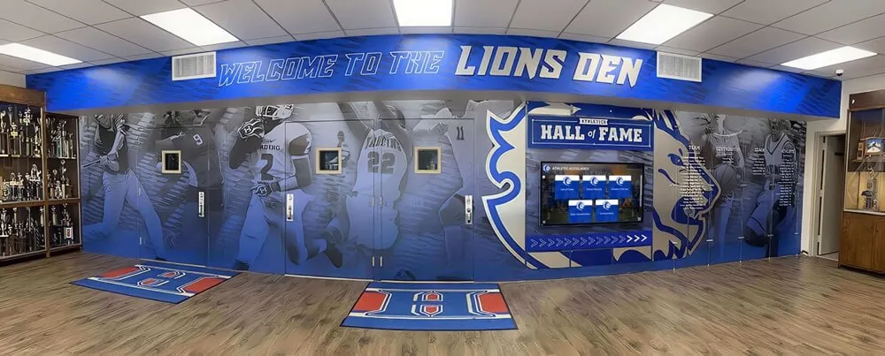
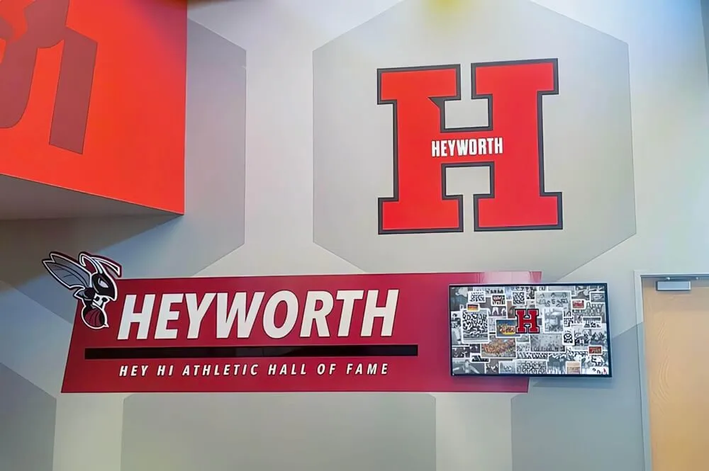
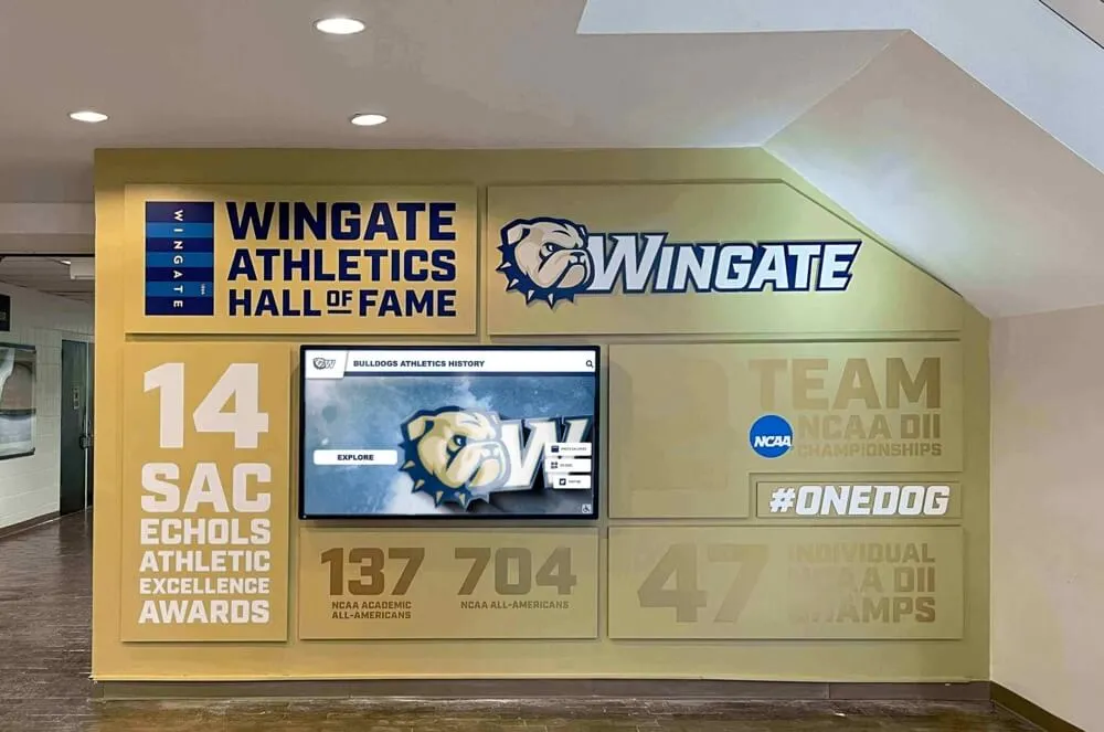
Educational Recognition Displays
Schools implementing interactive recognition displays consistently achieve high engagement through:
- Student-centric content: Focus on celebrating student achievements creates natural interest
- Visual richness: Extensive photo and video content increases emotional connection
- Comprehensive search: Robust search enabling students to find themselves and friends quickly
- Exploration encouragement: Related content suggestions and browsing features promoting discovery
- Regular updates: Frequently adding current achievements maintains relevance
Schools report that properly designed recognition displays achieve 60-80% student interaction rates throughout school years, with students voluntarily returning during unstructured time to explore achievements and share discoveries with peers.
Museum and Exhibit Installations
Engaging museum touchscreens share key characteristics:
- Compelling attract modes: Dynamic idle content drawing attention from passing visitors
- Multiple entry points: Various ways to begin exploring based on different interests
- Layered information: Progressive disclosure serving both casual browsers and deeply interested learners
- Contextual media: Rich imagery, video, and audio creating immersive experiences
- Social interaction support: Designs accommodating multiple simultaneous users
Successful museum interactives see average dwell times of 4-7 minutes versus under 60 seconds for poorly designed alternatives—dramatically different impact on educational outcomes.
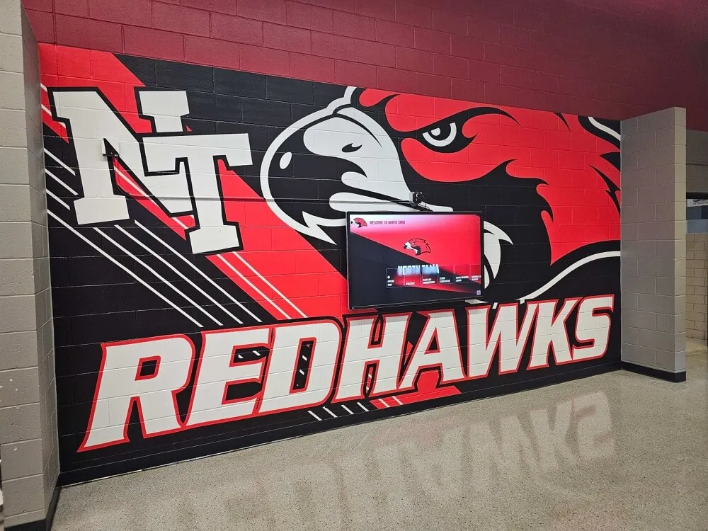
Corporate Recognition and Wayfinding
Professional environments benefit from touchscreen designs emphasizing:
- Professional aesthetics: Visual design reflecting organizational brand and culture
- Efficiency: Quick paths to frequently accessed information
- Personalization: Content relevant to specific users or roles
- Enterprise integration: Connections to existing data systems and workflows
- Accessibility: Inclusive design serving all employees and visitors
Conclusion: Designing for True Engagement
Creating touchscreen experiences that truly engage users requires understanding the fundamental differences between touch interaction and other interface paradigms, implementing core UX principles that accommodate physical and cognitive realities of touch, organizing content architecture for efficient access and delightful discovery, and maintaining responsive performance that meets users’ expectations for instantaneous feedback.
The most successful touchscreen implementations share common attributes: properly sized touch targets with adequate spacing, immediate visual feedback acknowledging every interaction, intuitive gesture support matching user expectations from familiar devices, simplified navigation with clear wayfinding, visual design prioritizing readability and contrast, and performance optimization delivering responsive experiences.
Organizations achieving the highest engagement recognize that touchscreen design is not a one-time project but an ongoing process of testing, measuring, learning, and refining. They instrument systems to understand actual usage patterns, gather qualitative feedback from users, continuously update content maintaining freshness and relevance, and iteratively improve designs based on real-world performance.
Whether you’re implementing interactive displays in educational institutions, corporate environments, museums, or public spaces, prioritizing user experience throughout the design process ensures your investment delivers measurable value through sustained engagement. Partner with experienced providers who understand that engaging touchscreen experiences require careful integration of hardware selection, software optimization, content architecture, visual design, and interaction design.
The difference between touchscreen systems that users enthusiastically engage with and those that sit idle despite quality content often comes down to fundamental UX design decisions made during planning and implementation. In 2026, creating truly engaging touchscreen experiences isn’t optional—it’s the baseline expectation determining whether interactive displays achieve their communication, education, and celebration potential.
Ready to create a touchscreen experience that truly engages your audience? Contact Rocket Alumni Solutions to explore how their expertise in interactive display design can transform your vision into an engaging reality that delivers measurable results.